

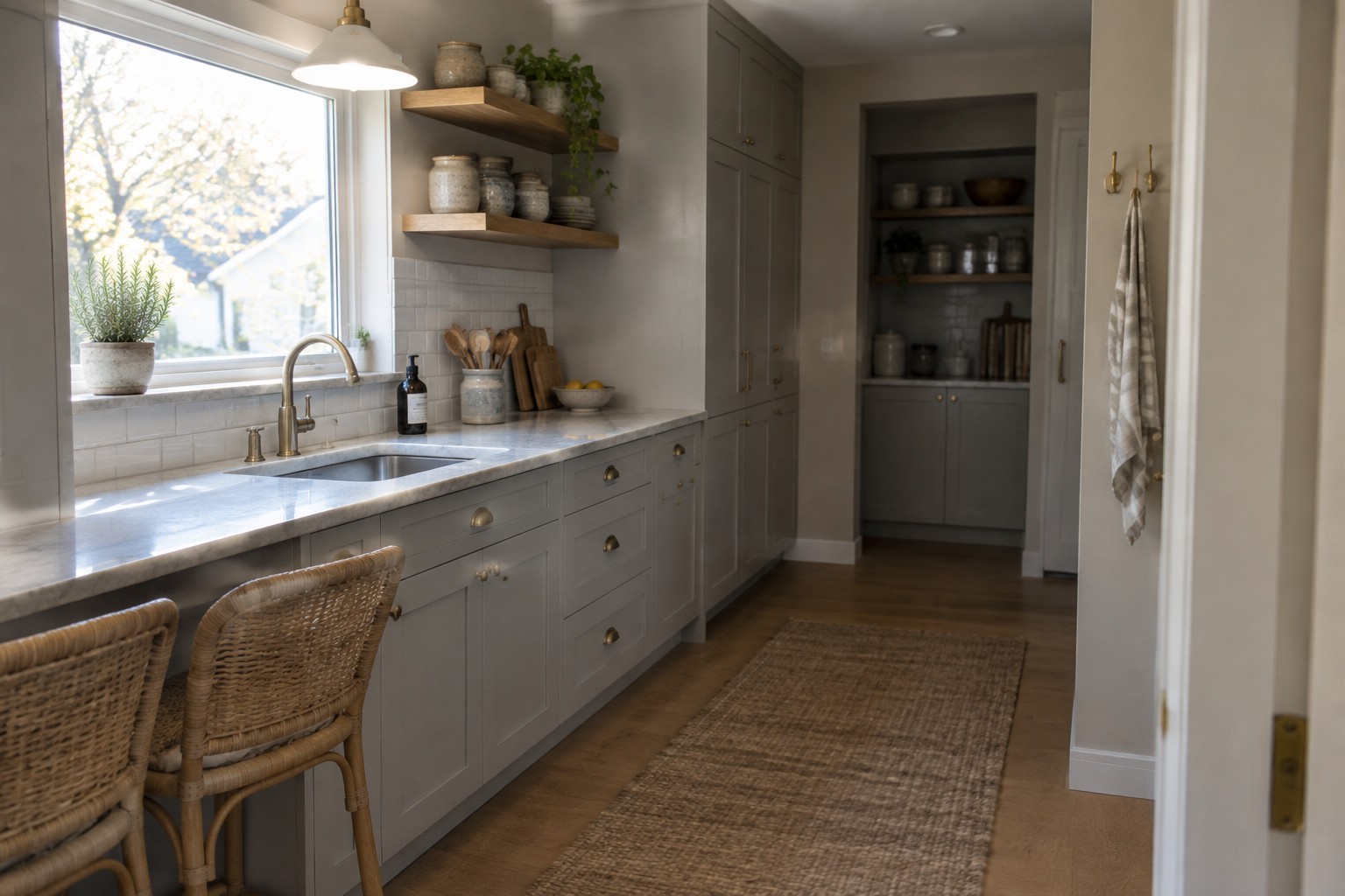
Gray cabinets can make a kitchen feel calm and grounded, but the wall color around them has a big say in whether the room feels warm, cool, or a little flat.
I’ve found that undertones matter most once a paint sample sits beside the cabinets, countertop, flooring, and trim, especially when daylight changes across the room.
Soft whites and muted greens can bring out different sides of gray, while warmer shades often help balance cabinets that read blue or stark.
Even a color that looks gentle on a swatch can shift under evening lights.
I’d test a few options on the wall before choosing, since the best shade is the one that still feels right beside your kitchen’s finishes throughout the day.
Warm Gray Cabinets With White Tile
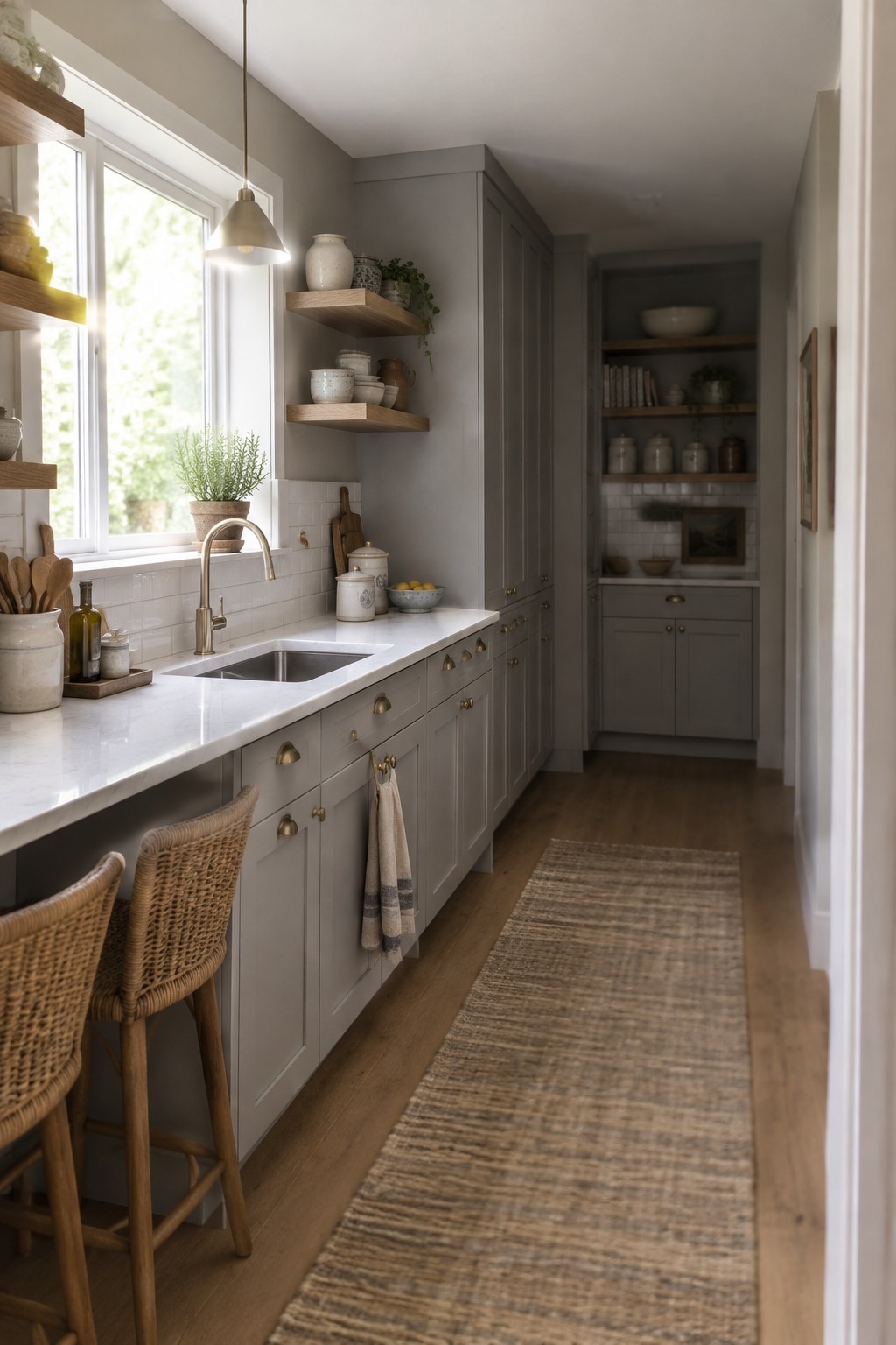
The cabinets read as a warm, muted gray, close to Benjamin Moore Amherst Gray in a much lighter-looking finish, though the exact match is uncertain. This kind of gray feels softer than a blue-based shade and works well for a long, narrow kitchen where you want color without making the cabinetry feel too dark.
White backsplash tile and the pale countertop keep the gray from reading heavy. Warm wood flooring suits it nicely, too. If your kitchen gets less daylight, test a sample first, since this gray may look deeper in the shade.
Warm Gray Walls With Wood Counters
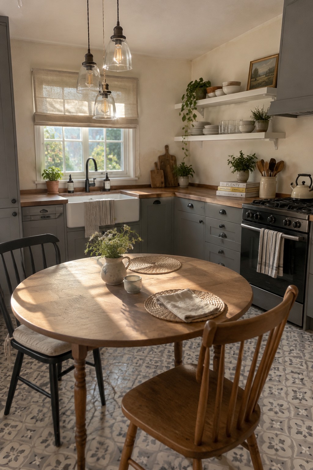
The walls look like a warm, pale greige, a quiet neutral that suits gray kitchen cabinets without making the room feel too cool. For similar shades, I’d look at Benjamin Moore Pale Oak, Sherwin-Williams Agreeable Gray, or Behr Wheat Bread. The color is subtle, but it gives the gray cabinetry a softer backdrop.
The warm wood counters help bring out the beige side of the paint. In a kitchen with less daylight, sample a few shades first, since this kind of neutral can look grayer in dim light.
Muted Blue-Gray Walls Beside White Cabinets
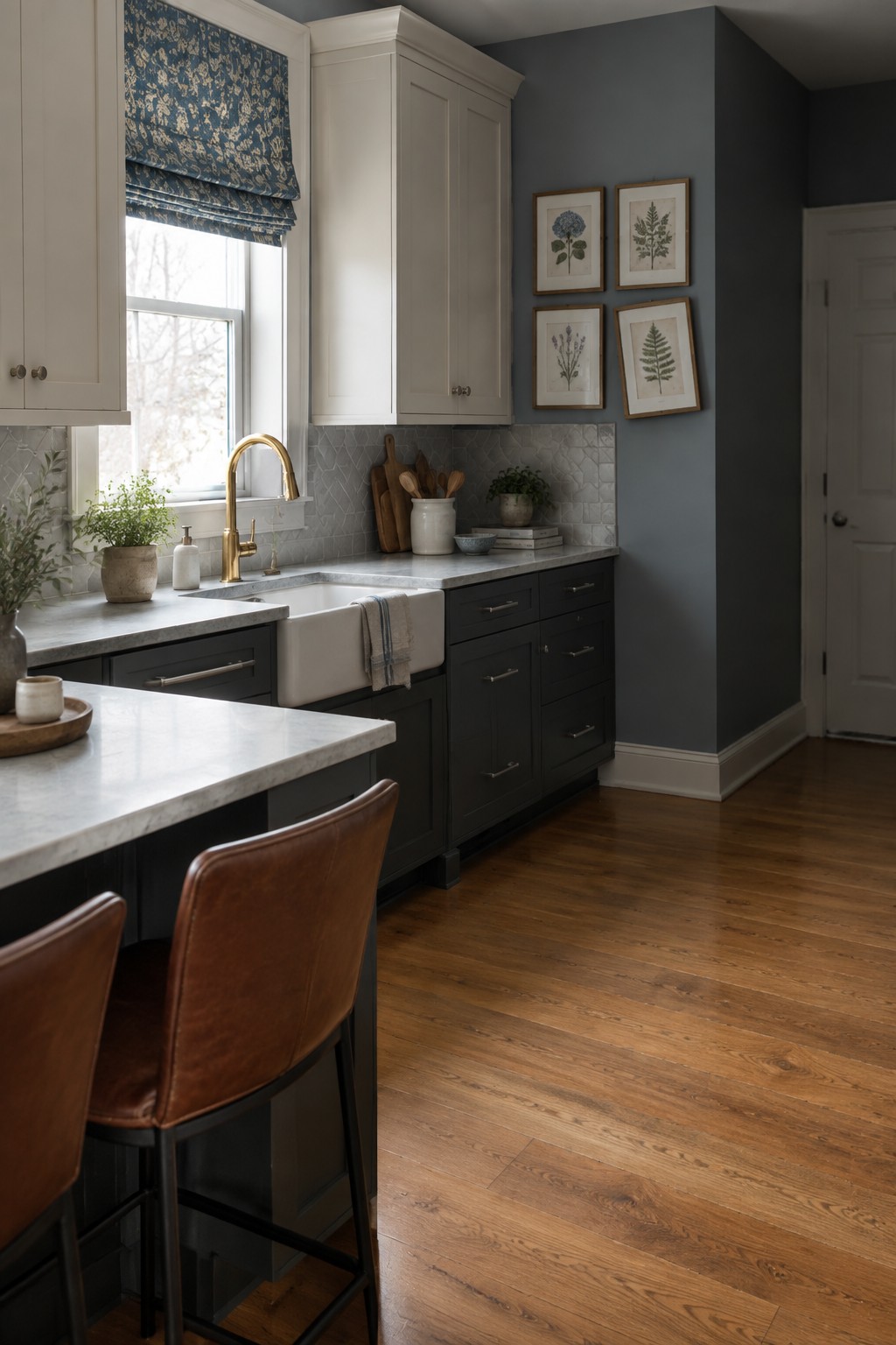
The wall color looks like a muted blue-gray, close to Benjamin Moore Boothbay Gray, Sherwin-Williams Smoky Blue, or Farrow & Ball De Nimes. It gives this kitchen a cooler backdrop for gray cabinets without making the room feel dark.
The shade can shift bluer in daylight, so test a sample beside the cabinets before painting. White tile and warm wood flooring help it feel at home in a traditional kitchen.
Inky Blue-Black Walls Beside White Marble
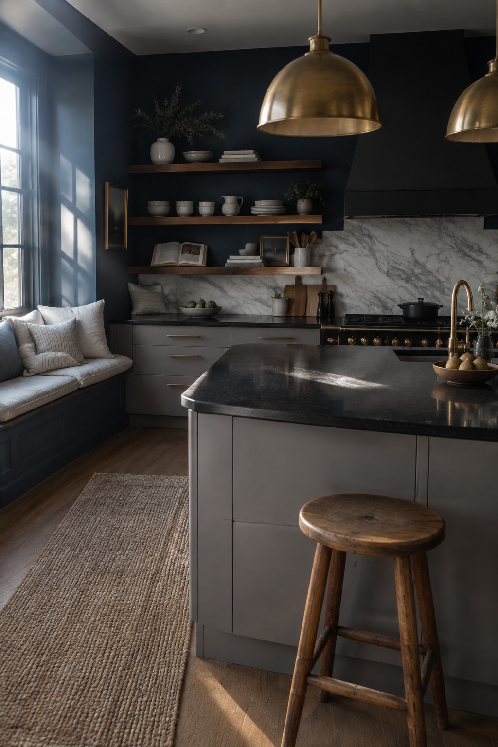
This deep blue-black looks closest to a muted navy, with enough gray in it to keep the kitchen from feeling too bright or too formal. For similar shades, consider Benjamin Moore Hale Navy, Sherwin-Williams Inkwell, or Farrow & Ball Hague Blue. It’s a useful choice when you want gray cabinetry to feel a little richer without adding another light neutral.
The color may look nearly black in a dim kitchen, so test a sample on more than one wall before committing. White marble gives it a clear contrast, while brass hardware or warm wood can keep the overall scheme from feeling cold.
Muted Olive Walls Above Cream Tile
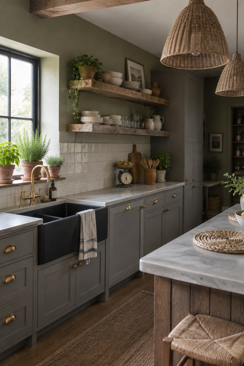
The wall color looks like a muted olive green, close to Benjamin Moore Saybrook Sage, Sherwin-Williams Clary Sage, or Farrow & Ball Lichen. It has a gray, earthy cast that keeps the green from feeling too bright, and it gives a gray-cabinet kitchen a softer look than a crisp white wall would.
The color reads especially well above the cream tile, where the warmer surface brings out its olive undertone. It should suit a kitchen with natural wood, though I’d test a sample in your own light first since this green can look grayer in a dim room.
Pale Yellow Walls Beside Gray Cabinets
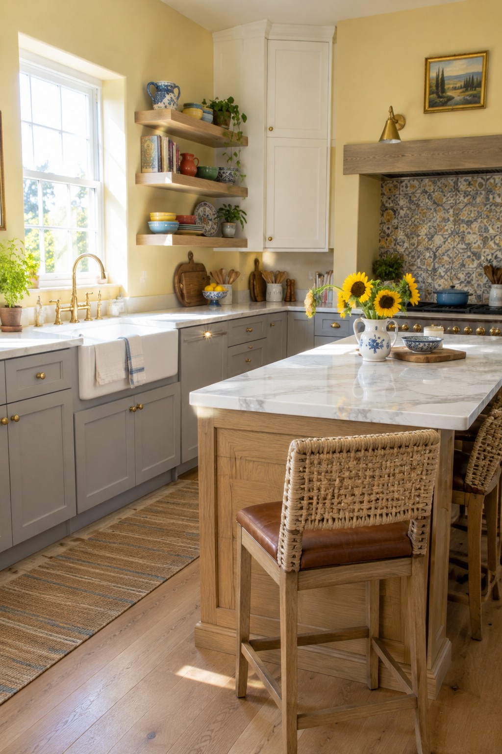
The walls look like a soft, warm yellow, close to Benjamin Moore Hawthorne Yellow or Sherwin-Williams Friendly Yellow. It is sunny without being too strong, and it gives gray cabinets a gentler feel than a crisp white wall would.
This color works well in a kitchen with natural wood and plenty of daylight. Choose a muted yellow rather than a bright, saturated one, which can look harsh across a large wall.
Warm Gray Cabinets With a Round Wood Table
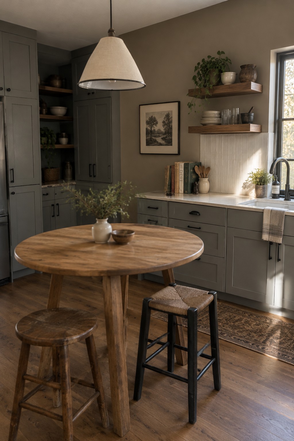
The cabinets look like a muted warm gray, close to Benjamin Moore’s Amherst Gray or Sherwin-Williams’ Dovetail, though the exact match is hard to tell from a photo. It’s a useful middle ground between beige and charcoal, with enough softness for a kitchen that gets mixed light.
The warm wood table and white backsplash keep this gray from reading too cool. It could suit a traditional kitchen especially well, but test a sample beside your counters first, since gray can shift noticeably with the light.
Soft Greige Walls With Blush Tile
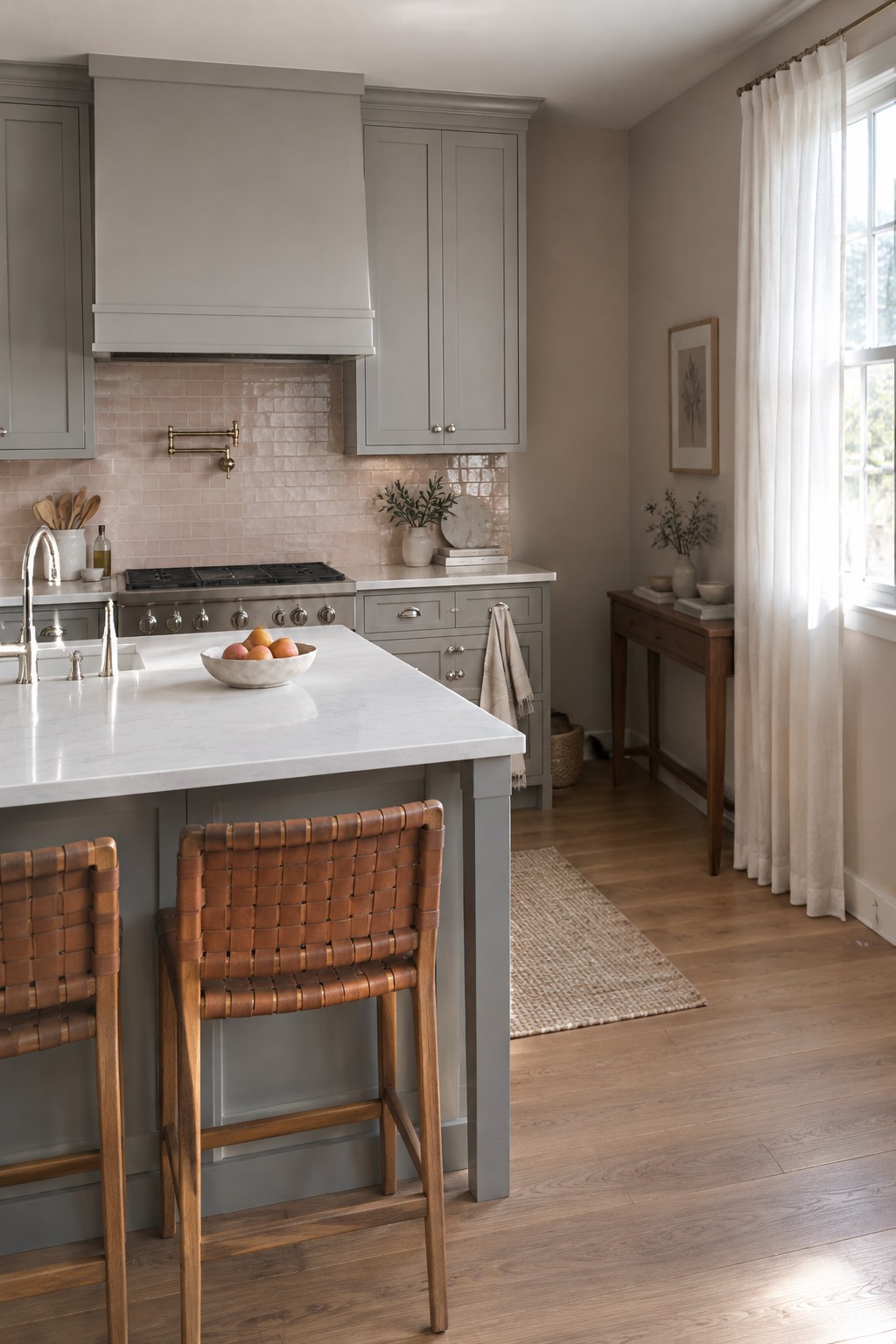
A warm greige is a good match for gray kitchen cabinets when you want the room to feel softer than it would with a crisp white. This shade looks closest to Sherwin-Williams Accessible Beige, Benjamin Moore Edgecomb Gray, or Behr Wheat Bread, though the exact match is hard to confirm from a photo.
Its beige undertone sits comfortably beside the blush-pink tile and wood flooring, while the gray cabinetry keeps the palette from feeling too warm. Try samples on the wall and check them at different times of day, since greige can look much cooler or more beige as the light changes.
Terracotta Walls With Warm Wood
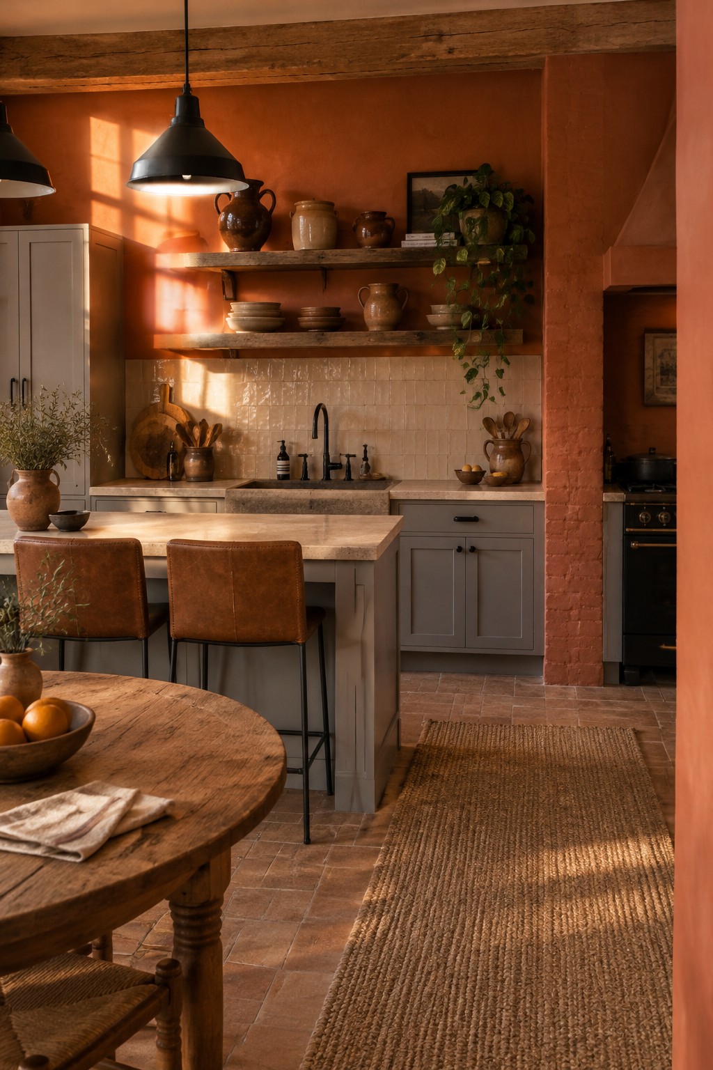
For this kitchen, the walls read as a muted terracotta or burnt orange, a warm earthy color rather than a bright red. In this unbranded palette, likely matches include Benjamin Moore Terra Cotta Tile, Sherwin-Williams Cavern Clay, and Farrow & Ball Red Earth. It’s a strong choice if you want color on the walls without giving up a relaxed, lived-in feel.
The shade works especially well with warm wood and cream tile, both of which keep it from feeling too sharp. It can look darker in a room with little natural light, so test a sample before painting the whole kitchen.
Dusty Rose Walls Beside Gray Cabinets
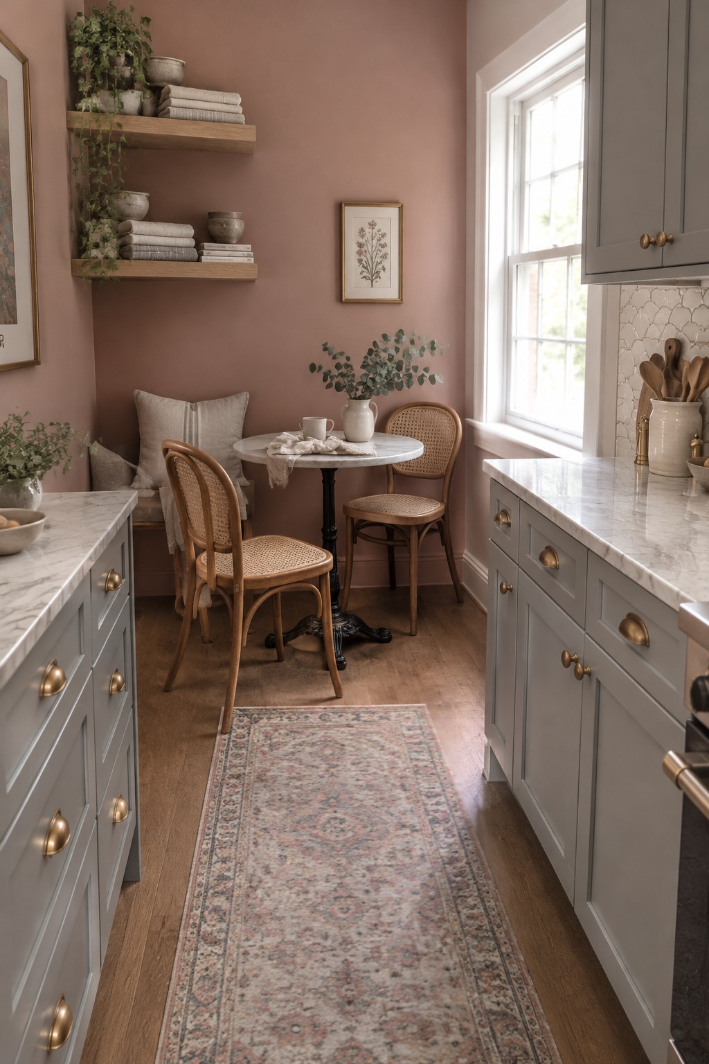
Dusty rose is the main wall color here, with a warm, muted look rather than a bright pink. It reads close to a soft clay pink; possible matches include Benjamin Moore First Light, Sherwin-Williams Intimate White, or Farrow & Ball Setting Plaster. This kind of color can make a kitchen feel less stark while still working with gray cabinetry.
The warm wood floor and shelves suit the rosy undertone, and daylight helps keep it from feeling too heavy. I’d test a sample beside the cabinets first, since some pinks can look stronger in a smaller room.
Charcoal Walls With White Herringbone Tile
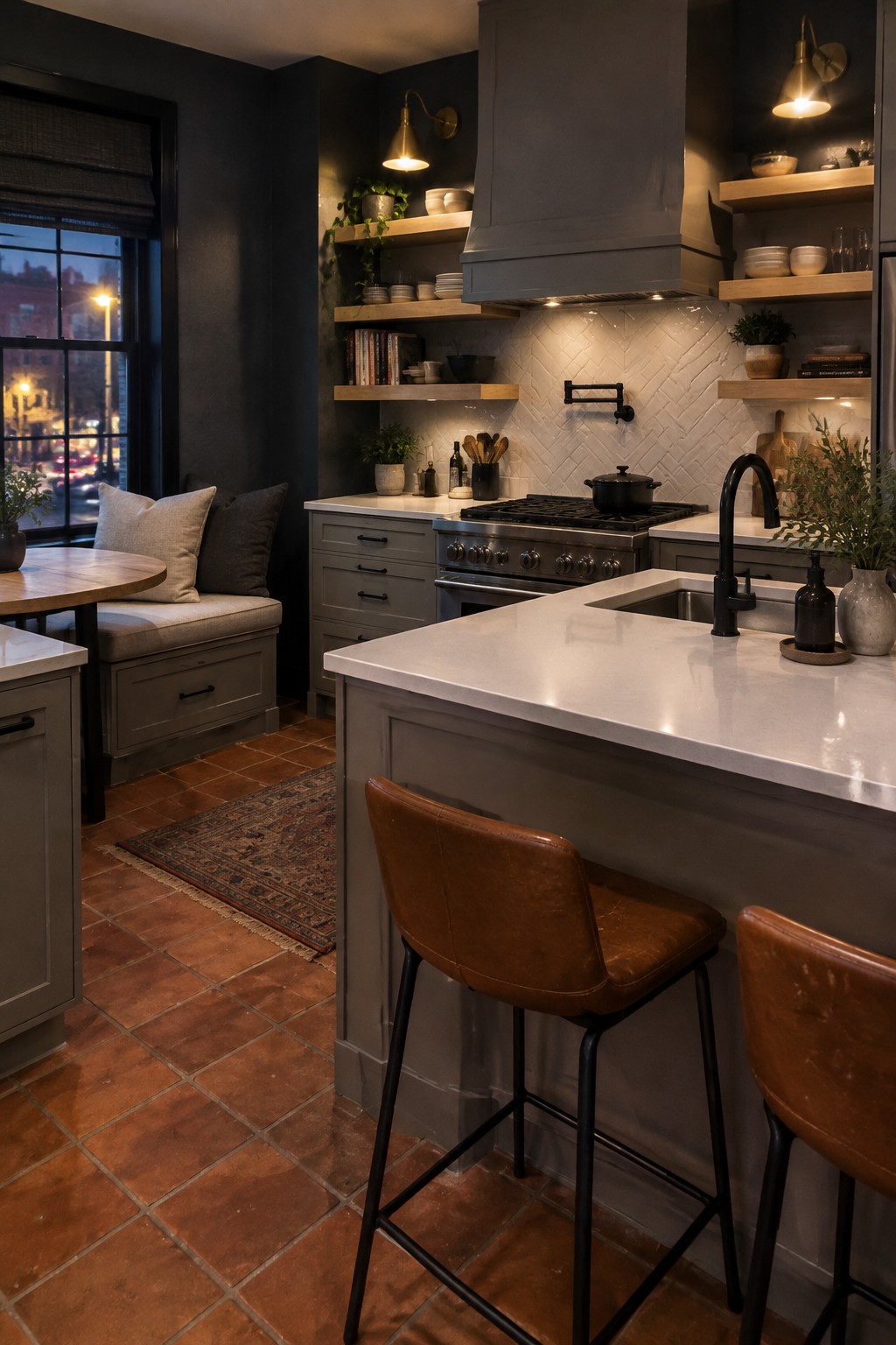
A deep charcoal gray on the kitchen walls reads nearly black in the darker areas, but it still feels softer than true black. It’s a useful choice for a kitchen with gray cabinets because it gives the room a clear contrast without introducing another strong color.
The white herringbone tile keeps the charcoal from feeling too heavy, while terracotta flooring adds a warm note. This kind of dark gray works best with good task lighting and lighter surfaces nearby; in a dim kitchen, it may look close to black.
Muted Green Walls Above White Tile
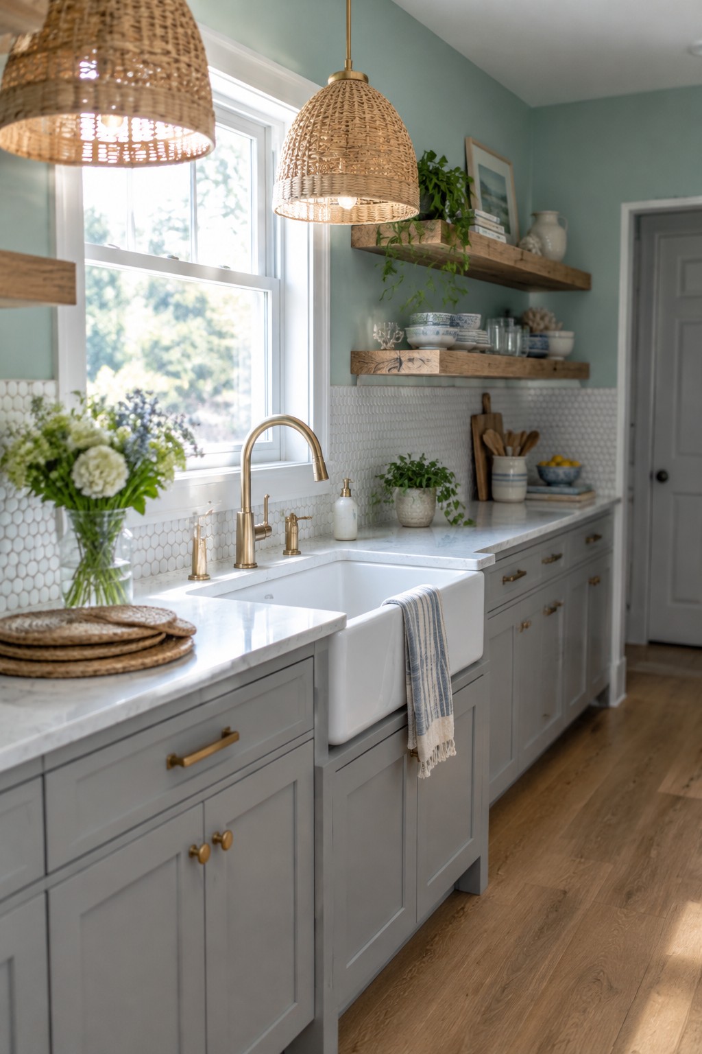
A muted, gray-leaning green looks like the closest color direction here. It is soft rather than bright, and it gives gray cabinets a little more color without making the kitchen feel busy. For similar shades, look at Benjamin Moore October Mist, Sherwin-Williams Clary Sage, or Behr Jojoba.
This kind of green works well with white tile and a pale marble-look counter. In a bright kitchen, it may read lighter and cooler, so test a sample beside the cabinets before painting; a warmer, olive-leaning shade may suit dimmer rooms better.
Muted Sage Cabinets Beside Warm Wood
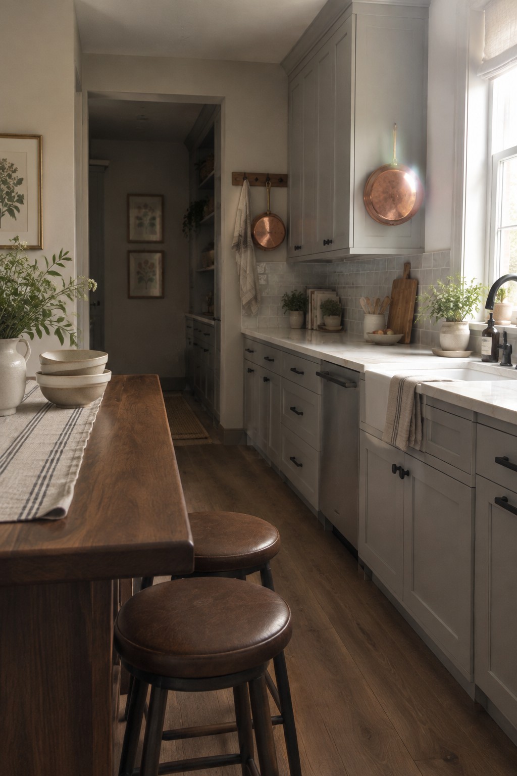
Muted sage green is the main paint idea here. It looks closest to Benjamin Moore October Mist, though Sherwin-Williams Clary Sage is another possible match. This soft, gray-leaning green is a gentle way to bring color to a kitchen without making the cabinets feel too bold.
The warm wood table helps the sage read less cool, while the white tile keeps the combination feeling light. This color tends to suit kitchens with good natural light, but sample it on the cabinets first since shaded areas can make it look grayer.
Rust-Toned Walls Beside Gray Cabinets
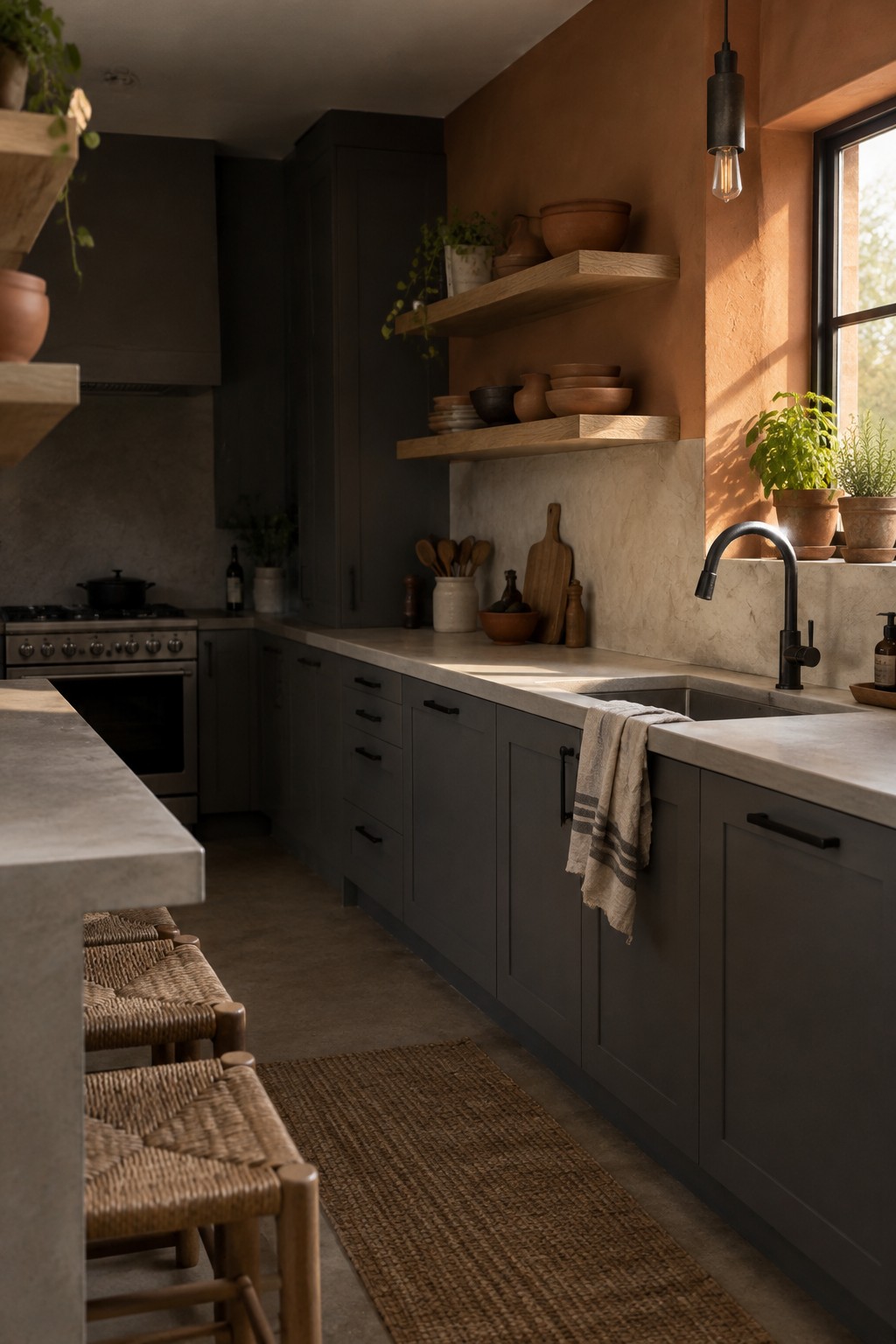
A muted terracotta or clay color looks like the closest fit here. It is a warm, earthy wall color that gives gray cabinets a softer feel without making the kitchen look too bright or too rustic. The match is only an estimate, but Benjamin Moore Terra Cotta Tile, Sherwin-Williams Cavern Clay, and Behr Canyon Dusk are worth sampling.
This color leans orange-brown, so it works especially well with gray that has a warm or neutral undertone. Pale stone counters help keep the combination from feeling too heavy. Check a sample in your kitchen first, since clay shades can look much stronger in a sunny spot.
Warm Gray Cabinets With White Marble
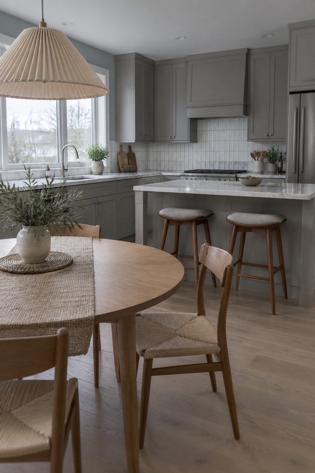
Warm gray is the main paint color here, and it looks closest to Sherwin-Williams Repose Gray, Benjamin Moore Revere Pewter, or Behr Silver Drop. This soft, middle-depth neutral gives gray cabinets a little warmth without making them look beige. It’s a useful choice for a kitchen that already has plenty of natural texture.
The white marble counters and backsplash keep the gray from reading too dark, while the wood floor adds a warmer note. In a kitchen with limited daylight, test samples first, since some warm grays can turn greige or look noticeably darker.
Muted Brown Walls With Dark Marble
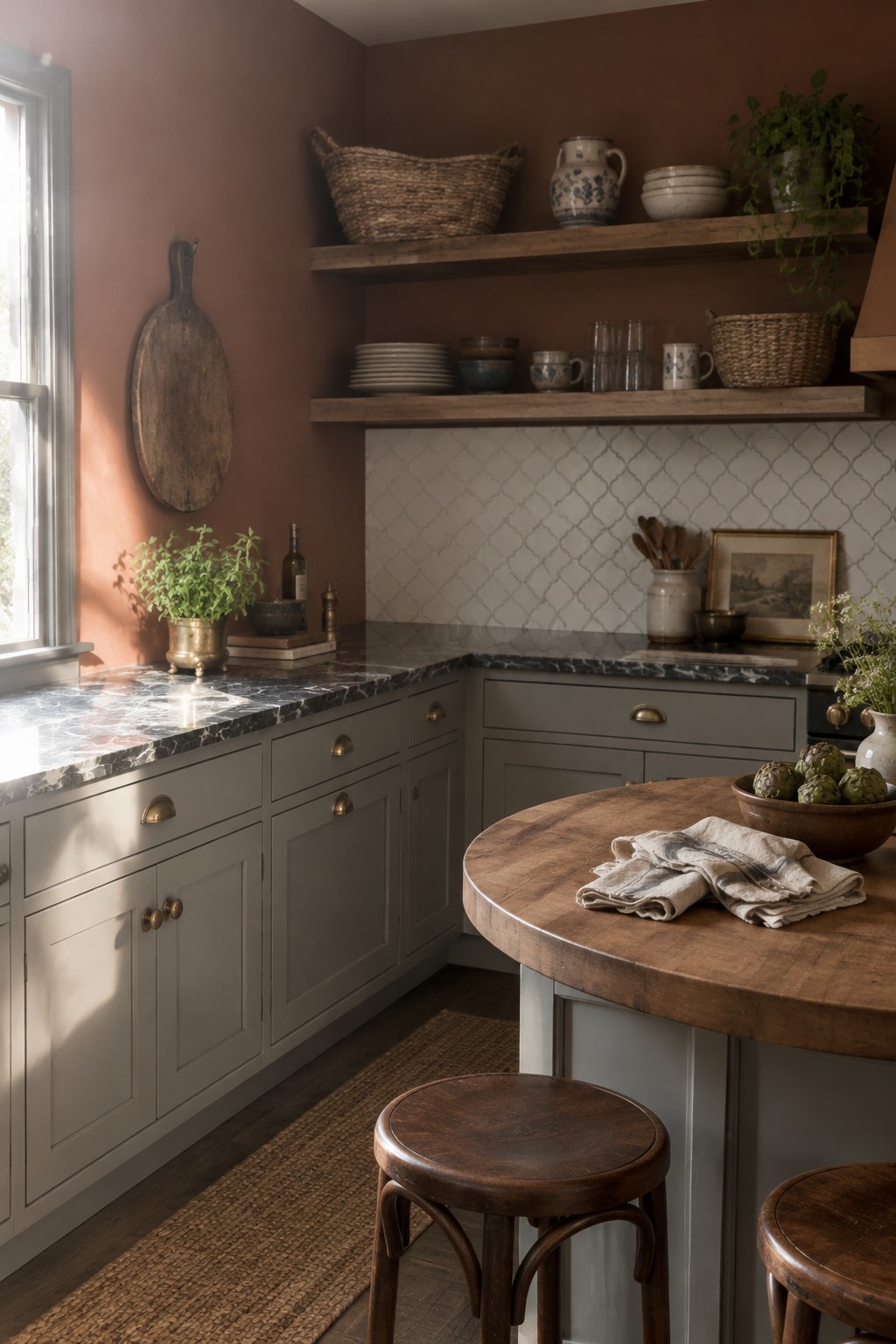
For the walls, a muted brown with a soft, earthy cast looks like a good fit. In an unbranded palette, I’d compare it with Benjamin Moore Alexandria Beige, Sherwin-Williams Smokehouse, or Farrow & Ball Jitney. It gives gray cabinets a warmer backdrop without making the kitchen feel too light or stark.
The color works well beside the dark marble counters, which have pale veining. In a kitchen with less window light, test a sample first, since brown can read deeper and more subdued on the wall.
Muted Olive Walls Beside Warm Wood
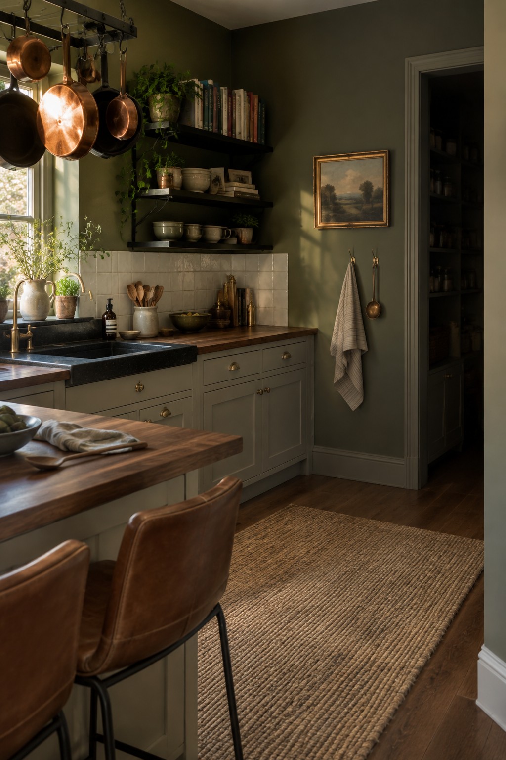
This muted olive green looks closest to a soft, earthy shade like Benjamin Moore October Mist, though the exact match is hard to confirm from a photo. It gives the kitchen a quieter, more settled feel than a brighter green, and it works especially well with the warm wood counters.
The color has a slightly gray cast, which helps it sit comfortably beside gray cabinetry without looking too yellow. In a dimmer kitchen it may read deeper, so test a sample on the wall before painting the whole room.
Soft Mauve-Gray Walls With White Tile
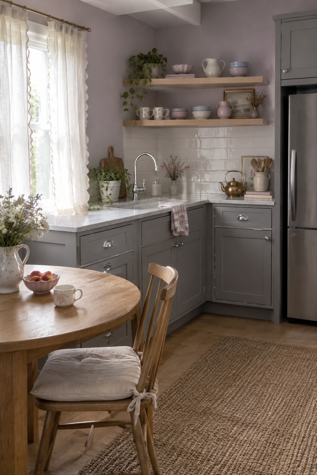
These walls look like a soft mauve-gray, a gentle gray with a faint purple cast. For similar shades, I’d look at Benjamin Moore’s Cement Gray, Sherwin-Williams’ Grayish, or Farrow & Ball’s Peignoir. It’s a quiet color that gives gray cabinets a little more warmth and character than a plain cool gray.
The glossy white tile helps keep the wall color from feeling too heavy. Try this muted shade in a kitchen with steady natural light, and test a sample first since the purple undertone may show more clearly in a dim room.
Deep Rust Walls Beside Gray Cabinets
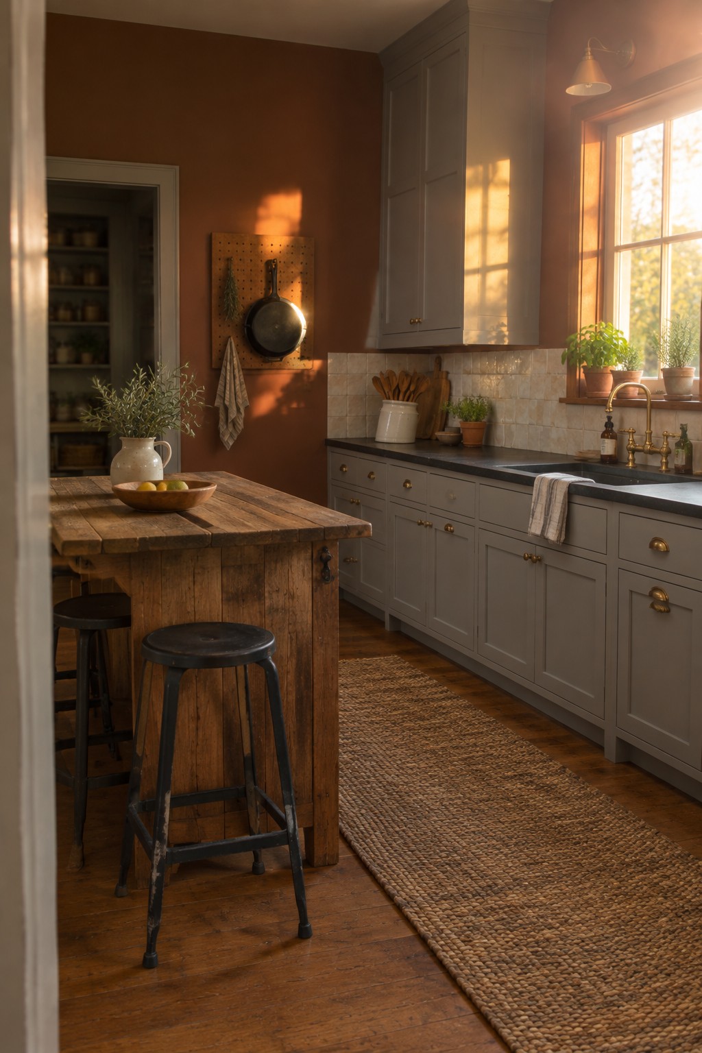
This wall color looks like a deep rust or burnt sienna, a warm reddish brown that gives a gray-cabinet kitchen a more lived-in feel. For similar shades, I’d look at Sherwin-Williams Cavern Clay, Benjamin Moore Terra Cotta Tile, or Farrow & Ball Red Earth. The color is strongest on the walls, so it adds warmth without taking over the cabinetry.
Rust tones can shift more orange in bright daylight, so test a sample beside the gray cabinets before painting the whole room. They pair naturally with warm wood, while a subdued shade helps keep the kitchen from feeling too dark.
Muted Blue-Gray Walls With Gray Cabinets
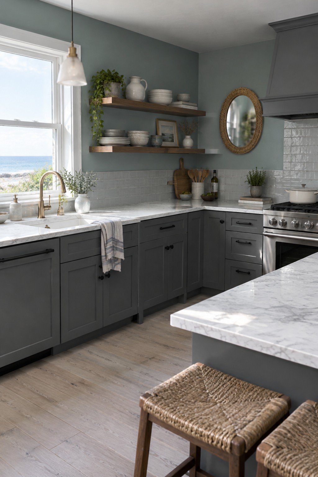
This wall color reads as a muted blue-gray, a cool choice that works well with gray kitchen cabinets without making the room feel too stark. It looks closest to Benjamin Moore Boothbay Gray, Sherwin-Williams Smoky Blue, or Behr Light Drizzle, though the exact match is hard to tell from a photo.
The white tile and marble counters keep the palette light, while the blue cast gives the walls a little more color than a plain gray would. Try samples in your own kitchen first, since this shade may look bluer in strong daylight and grayer in dimmer light.
Pale Gray Cabinets Beside Warm Wood
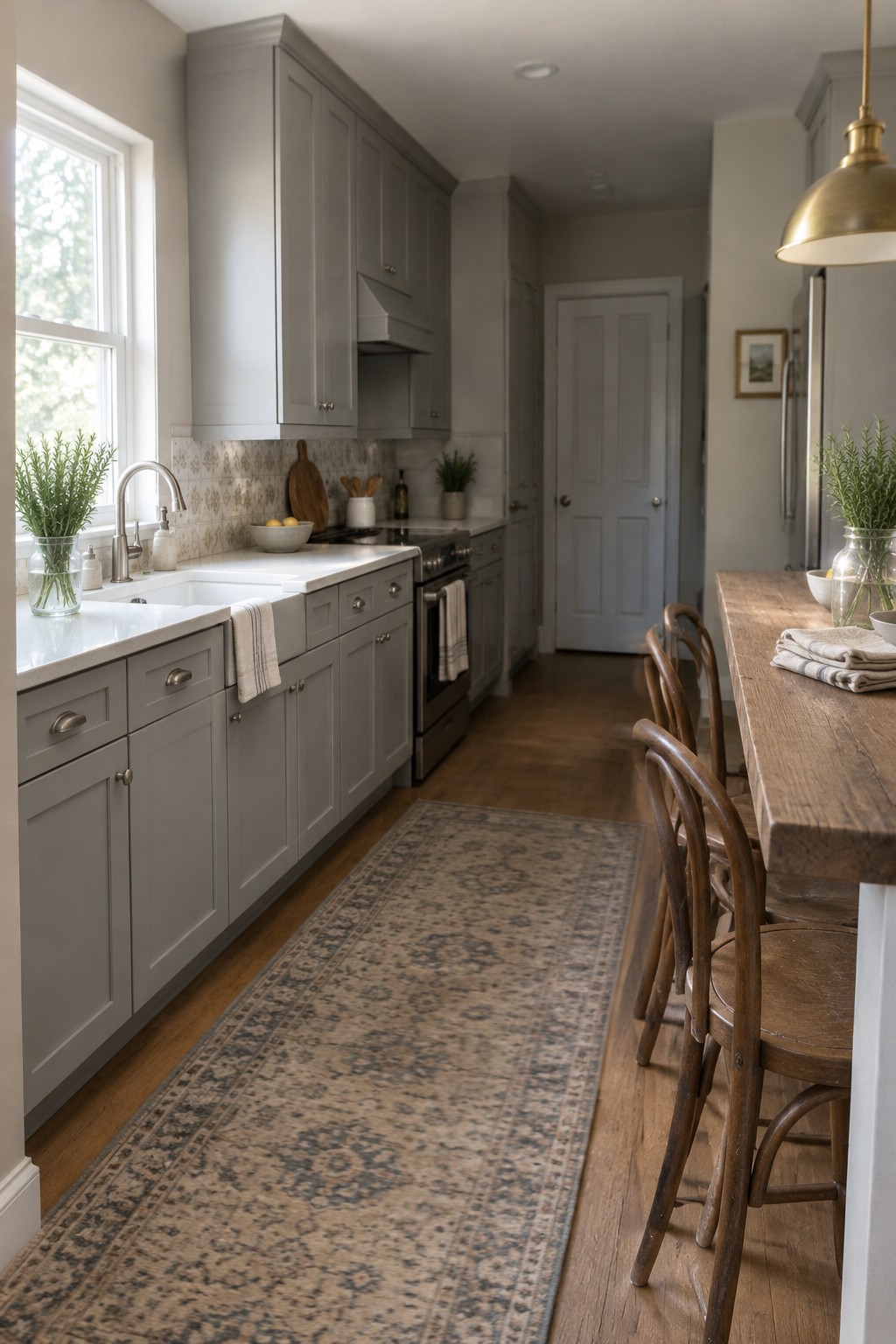
A soft, warm gray is the main paint idea here, and it would pair well with gray kitchen cabinets. It reads as a light greige rather than a cool, blue-gray, so it feels easy to live with and less stark than white.
Warm wood flooring and a wood table help bring out the gray’s gentle beige undertone. For a similar look, try Benjamin Moore Classic Gray, Sherwin-Williams Gossamer Veil, or Behr Seagull Gray; test a sample in your kitchen first, since window light can shift the color.
Muted Mauve-Gray Walls With Gray Cabinets
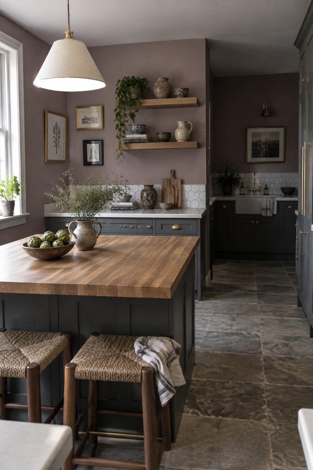
A muted mauve-gray paint color gives this kitchen a soft, warm-neutral look. It seems closest to shades like Benjamin Moore Mauve Mist, Sherwin-Williams Enigma, or Farrow & Ball Peignoir, though the match is only an estimate. The color has enough gray in it to sit comfortably with gray cabinets without making the room feel too cool.
White tile keeps the wall color from feeling heavy, while warm wood adds a little contrast. This kind of muted shade suits a kitchen with limited direct sunlight, but it’s worth testing a sample first since mauve undertones can look stronger in some light.
Warm Greige Walls Beside Gray Cabinets
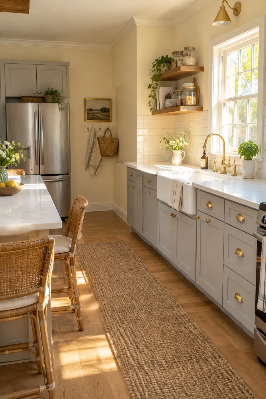
A warm greige is a good wall color to consider with gray cabinets. It sits between beige and gray, so it feels softer than a cool white without making the kitchen look too yellow. Here, it works well as a quiet backdrop for the gray cabinetry.
Look for a shade with a gentle beige undertone, especially if your kitchen has warm wood floors. White tile and brass hardware suit it too. Test a sample in your own light, since some greiges can turn noticeably gray in a cooler room.
Cool Gray Walls Above Glossy White Tile
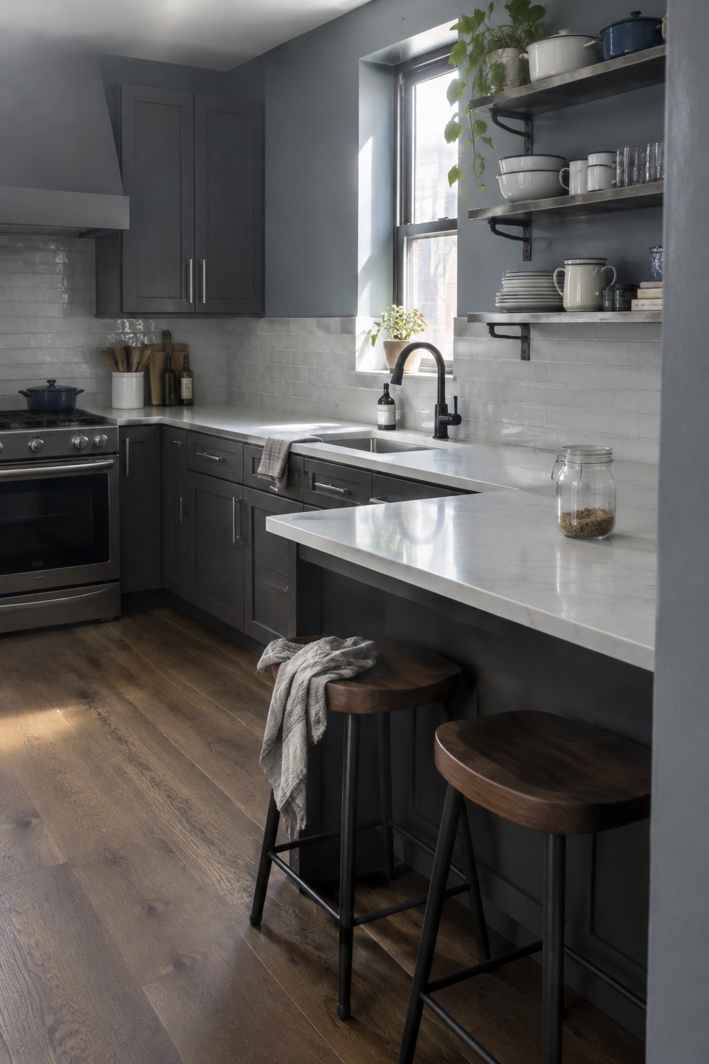
A cool, muted gray is the main wall color here, and it looks closest to matches like Benjamin Moore Stonington Gray, Sherwin-Williams On the Rocks, or Behr Silver Drop. It’s a useful choice with gray cabinets because the walls feel related without making the kitchen one solid block of gray.
The white tile helps show the gray’s cooler side, while daylight can make it look lighter near the window. Try a sample beside your cabinets first, since some cool grays can read a little blue in certain light.
Frequently Asked Questions
Q: What wall color works best with gray cabinets in a small kitchen?
A: Soft white or a pale warm greige keeps the room feeling open without making the gray look cold. If your cabinets have cool undertones, test a few shades first, since some whites can look stark beside them.
Q: Should I choose a warm or cool wall color for gray cabinets?
A: Match the wall color to the cabinets’ undertone. Warm gray cabinets pair nicely with creamy whites and muted beige, while cooler grays often look good with soft blue or crisp white.
Q: Can I use a bold color on the walls with gray cabinets?
A: Yes, especially if the cabinets are a simple, neutral gray. Deep green or navy can add character, but try the color on a small section first and check it in both daylight and evening light.
Q: How do I choose a backsplash color when the walls and cabinets are both gray?
A: Bring a sample of the cabinet finish and wall paint when you shop. A backsplash with a little warmth or texture can keep the kitchen from feeling too flat.