Have you ever stared at a blank wall, unsure how to bring your vision to life? Mixing colors in interior decorating can feel overwhelming, especially with so many shades and tones to choose from. You might worry about clashing hues or creating a space that feels chaotic instead of cozy.
Key Takeaways
- Understand Color Theory: Familiarize yourself with primary, secondary, and tertiary colors to create harmonious designs.
- Utilize the Color Wheel: Use the color wheel to identify complementary, analogous, and triadic color schemes for balanced interiors.
- Choose Your Color Scheme: Select between monochromatic and complementary schemes to establish a cohesive ambiance.
- Incorporate Neutrals: Use neutral shades as a foundation to enhance and balance bolder accent colors in your space.
- Balance Colors Thoughtfully: Employ the 60-30-10 rule to achieve an effective balance of dominant, secondary, and accent colors.
- Test Colors in Natural Light: Always visualize your color selections in different lighting to ensure they resonate well in your intended space.
Understanding Color Theory
Understanding color theory helps you mix colors effectively in interior decorating. It provides a framework for choosing shades that complement each other, creating a harmonious and appealing space.
Primary, Secondary, and Tertiary Colors
Colors fall into three categories: primary, secondary, and tertiary.
- Primary Colors: Red, blue, and yellow are primary colors. They serve as the foundation for all other colors.
- Secondary Colors: Green, orange, and purple are secondary colors. You create these by mixing equal parts of two primary colors. For example, mix red and blue to get purple.
- Tertiary Colors: Tertiary colors result from mixing a primary color with a secondary color. Examples include red-orange or yellow-green.
Using these color categories, you can choose a balance of hues to create engaging visuals in your interior spaces.
Color Wheel and Its Importance
The color wheel visually represents how colors relate to one another. It’s an essential tool for interior decorating, guiding you in selecting color combinations.
- Complementary Colors: These colors sit opposite each other on the wheel, like blue and orange. Pairing them creates a vibrant contrast that energizes a space.
- Analogous Colors: Located next to each other on the wheel, like blue, blue-green, and green, these colors offer a serene and comfortable feel when used together.
- Triadic Colors: This scheme involves choosing three colors evenly spaced around the wheel, like red, yellow, and blue. It creates a balanced yet dynamic look.
Referring to the color wheel simplifies your color selection process and ensures cohesive design throughout your interior decorating projects.
Choosing a Color Scheme
Selecting a color scheme sets the tone for your space. Understanding different schemes helps you create a cohesive and inviting environment.
Recommended Products
Note:Compatible with different types of pens. Multiple layers using water-based pens may result in minor surface pilling.
Monochromatic Color Schemes
Monochromatic color schemes use variations of a single color. You can achieve these by incorporating different shades, tints, and tones. For example, if you choose blue, you can use navy, sky blue, and powder blue to create depth. This approach ensures a unified look, making spaces feel calm and sophisticated.
Tips for Achieving a Monochromatic Look:
- Start with a Base Color: Choose a foundational color that resonates with you.
- Explore Shades and Tints: Experiment with lighter and darker variations to add interest.
- Add Texture: Use fabrics and materials like velvet and linen to create visual variety within the same color palette.
Complementary Color Schemes
Complementary color schemes consist of colors located directly opposite each other on the color wheel. This approach creates dynamic contrast, enhancing visual appeal. For instance, pairing blue with orange brings vibrancy to a room.
- Balance the Colors: Use one color predominantly and the other as an accent. For example, paint walls in a soft blue and use orange in decorative elements.
- Use Neutrals for Balance: Introduce whites, grays, or beiges to soften the contrast.
- Test Before Committing: Use swatches or digital tools to visualize how the colors interact in your space.
By understanding monochromatic and complementary schemes, you can confidently choose colors that elevate your interior design.
Mixing Colors Effectively
Mixing colors effectively enhances your interior space while ensuring a cohesive and inviting atmosphere. Understanding the role of neutrals and balancing bold and subtle colors greatly contributes to your design success.
Recommended Products
Thick, creamy with satin finish; Good pigment load
The Role of Neutrals
Neutrals serve as a foundation in color mixing. They create a calming backdrop, allowing other colors to shine without overwhelming the senses. Common neutral shades include beige, gray, taupe, and white.
- Use Neutrals to Anchor Colors: Choose a neutral shade for larger surfaces, like walls or furniture. This serves as a base for brighter hues. For instance, a soft gray wall complements vibrant artworks or colorful cushions.
- Incorporate Textures: Mix different textures within your neutral palette. Textured fabrics like linen, wool, or leather add depth to a space. A canvas neutral sofa paired with a chunky knit throw can elevate the visual appeal.
- Balance with Accent Colors: Limit your accent colors to two or three for a polished feel. For example, if you choose a beige base, consider pairing it with navy blue and mustard yellow accents to create a striking contrast.
Balancing Bold and Subtle Colors
Balancing bold and subtle colors creates dynamic yet harmonious interiors. The key lies in the thoughtful pairing of hues to avoid overwhelming decor.
- Identify Dominant and Accent Colors: Designate one bold color as the focal point in a room. For instance, a rich emerald green chair can serve as a statement piece in an otherwise muted space.
- Use Subtle Colors to Soften Bold Shades: Introduce softer shades to counteract bold colors. Light pastels or muted tones help create cohesiveness. A bright red accent wall can benefit from soft gray or blush accessories.
- Employ Color Proportion: Stick to the 60-30-10 rule for an effective balance. Occupy 60% of the room with a dominant color, 30% with secondary colors, and 10% with accent shades. For example, 60% in soft beige, 30% in cool blue, with a few red accents brings a lively yet balanced environment.
Utilizing these strategies allows for creative and effective color mixing in your interior spaces. By incorporating neutrals and balancing bold with subtle hues, you create a well-designed atmosphere that reflects your personal style.
Practical Tips for Mixing Colors
Mixing colors can transform a space when done thoughtfully. Here are practical tips to help you create a harmonious design.
Recommended Products
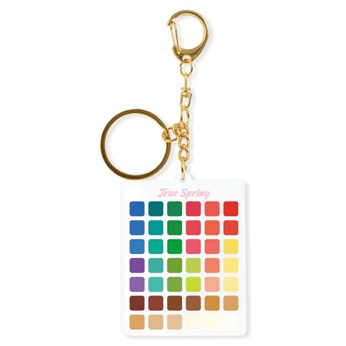
All-in-One Seasonal Color Guide: This keychain features seasonal color palettes (true spring) with curated swatches, making it your on-the-go reference for identifying your best colors for clothing, makeup, and accessories.
PERFECT SAMPLES: These 12" x 9" white, styrene panels provide a smooth, warp-free surface for testing up to 5 color samples with paint, stain or other coatings.
Samples and Swatches
- Gather Samples: Collect paint samples, fabric swatches, or wallpaper samples that represent your chosen colors. This helps visualize how different shades interact.
- Create a Color Board: Arrange the samples on a board or wall in the intended space. This allows you to see how colors look together in the specific lighting.
- Test in Natural Light: Observe samples during different times of day. Colors can change significantly with varying light conditions, so evaluate them in both natural and artificial lighting.
- Collaborate with Others: Seek feedback from friends or family. Fresh perspectives may highlight combinations you hadn’t considered.
- Understand Light Sources: Note that different light sources (e.g., incandescent, fluorescent, LED) can affect how colors appear. For instance, incandescent lights can warm up cool tones.
- Use Dimmer Switches: Installing dimmer switches allows you to adjust brightness, influencing the mood and color appearance in your space. Experiment with different settings to find what works best.
- Consider Window Orientation: North-facing windows provide cooler, softer light, while south-facing windows offer warm, bright light. Adjust your color choices based on the natural light orientation.
- Incorporate Layered Lighting: Utilize a mix of ambient, task, and accent lighting. Layered lighting enhances color depth and creates inviting spaces, making colors pop.
These tips empower you to mix colors effectively in your interior decorating projects, achieving a cohesive and attractive environment.
Conclusion
Mixing colors in your interior space doesn’t have to be daunting. With a little understanding of color theory and some practical strategies you can create a home that feels both inviting and stylish. Remember to lean on neutrals as a foundation and choose your accent colors wisely.
Don’t shy away from experimenting with different shades and textures. Gathering samples and creating a color board can make a world of difference. Trust your instincts and have fun with the process. After all your home should reflect your personality and make you feel at ease. Happy decorating!
Frequently Asked Questions
What challenges do people face when mixing colors in interior decorating?
Mixing colors can be overwhelming due to the vast selection of shades and tones available. Many people worry about color clashing or creating a chaotic atmosphere instead of a cozy one. Understanding color theory is essential to navigate these issues successfully.
How does color theory help with decorating?
Color theory provides a framework for selecting complementary shades. It categorizes colors into primary, secondary, and tertiary groups, which aids in creating harmonious and engaging visuals in your space, helping eliminate uncertainty in color selection.
What is the significance of the color wheel in decoration?
The color wheel is a vital tool for understanding color relationships. It helps in selecting complementary, analogous, and triadic color schemes. Utilizing these schemes can lead to effective color combinations that ensure cohesive designs throughout decorating projects.
What are monochromatic color schemes, and how can they be achieved?
Monochromatic color schemes use variations of a single color to create a calm atmosphere. To achieve this look, start with a base color, experiment with shades and tints, and add texture using different materials for depth.
What are complementary color schemes?
Complementary color schemes pair colors that are opposite each other on the color wheel to create dynamic contrast. When using these colors, it’s important to designate one as dominant, incorporate neutrals, and test interactions before finalizing choices.
How can I effectively balance bold and subtle colors?
Balancing bold and subtle colors can be achieved by designating dominant and accent colors. Softer shades can tone down bold hues, while limiting accent colors to two or three helps maintain a polished look in your decor.
What is the 60-30-10 rule in color proportion?
The 60-30-10 rule offers a guideline for color proportions in a space: 60% of the room should be a dominant color, 30% a secondary color, and 10% an accent color. This rule helps create a balanced and visually appealing environment.
What practical tips can help with mixing colors?
To mix colors thoughtfully, gather samples and create a color board, test colors in natural light, and understand the impact of different lighting sources. Collaboration with others and using dimmer switches can also enhance your color choices.


