

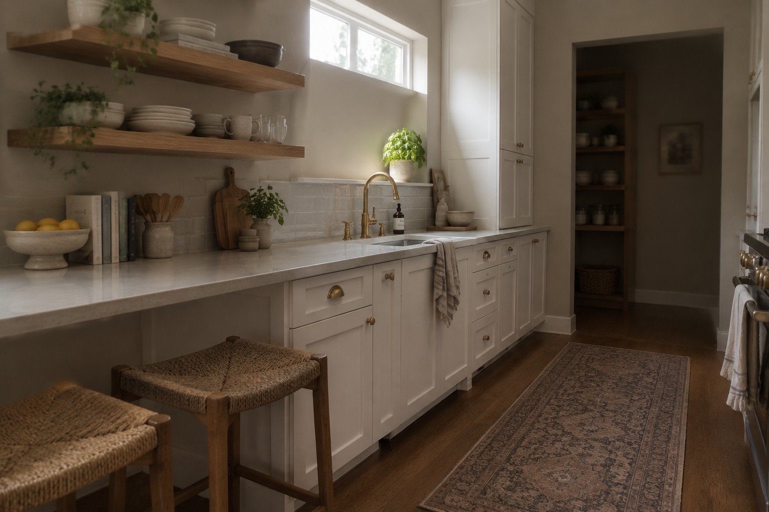
A kitchen with little natural light can make wall color feel more complicated than it looks on a sample card, since bulbs, cabinets, counters, and flooring all affect how a shade reads.
I’ve found that undertones matter most in these rooms, where a gray can turn cool or a cream can look surprisingly yellow once it sits beside the trim.
Lighter colors can help the space feel more open, but they still need enough warmth or depth to keep the walls from looking flat.
I’d test a few options on different walls and check them in both daylight and evening light before settling on one.
The right color should work with the kitchen’s finishes and feel comfortable through the changing light of an ordinary day.
Warm Greige Walls Above White Tile
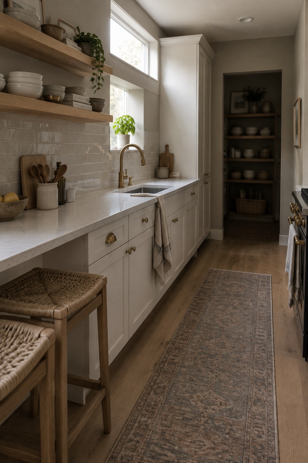
Warm greige is a good fit for a low-light kitchen like this one. The wall color looks closest to Benjamin Moore Edgecomb Gray, Sherwin-Williams Accessible Beige, or Behr Sandstone Cove. It is a light, muted neutral with a beige cast, so it feels softer than a cool gray without turning strongly yellow.
The pale tile and warm wood floor suit this color family, and the neutral walls can keep a narrow kitchen from feeling too stark. Test a sample on the wall first, since greige can look darker in limited daylight; avoid a shade that leans too brown if the room already feels dim.
Warm Greige Walls Beside Honey-Toned Wood
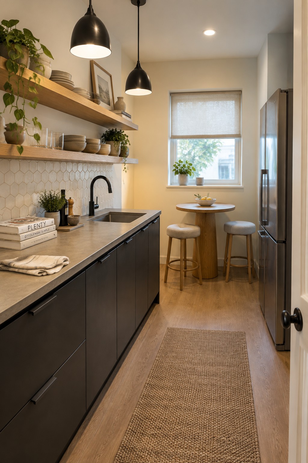
The walls read as a warm greige, a soft neutral that looks closest to Benjamin Moore Pale Oak, Sherwin-Williams Accessible Beige, or Behr Wheat Bread. It keeps this narrow kitchen from feeling stark while still giving the dark cabinets a clear contrast.
In a low-natural-light kitchen, this kind of neutral can feel warmer than a cooler gray. The wood floor and shelves suit it well, though it’s worth testing a sample on the wall first, since warm greige can look beige under artificial light.
Warm Greige Walls Beside White Tile
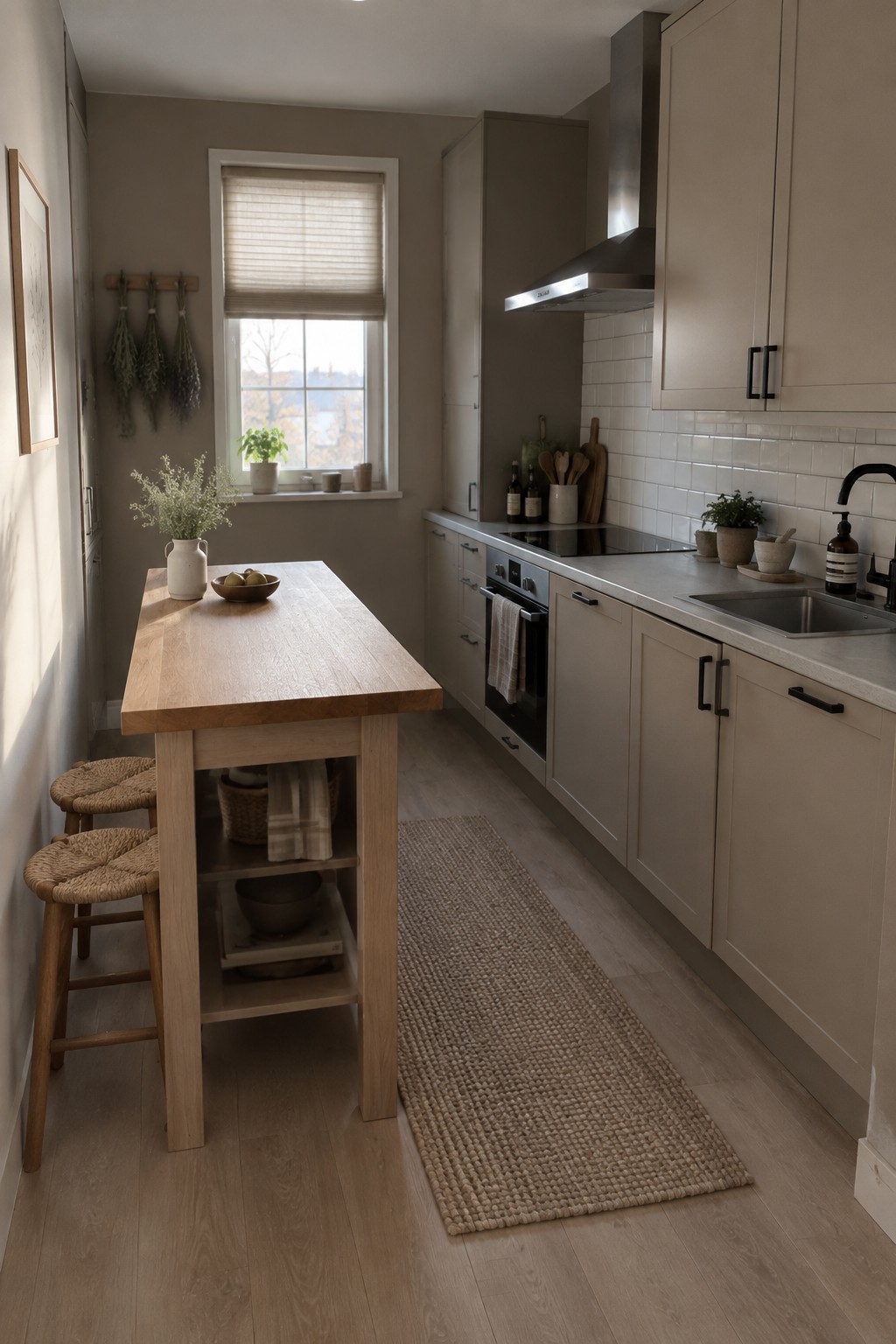
The walls look like a warm greige, a soft blend of beige and gray. For similar shades, consider Benjamin Moore Edgecomb Gray, Sherwin-Williams Accessible Beige, or Behr Wheat Bread. This muted color feels gentle rather than stark, which can help a low-light kitchen feel comfortable without making the walls too dark.
The white tile gives the greige a clearer, slightly warmer cast. Try samples on more than one wall, since a small window can make gray-beige paint look deeper; warm bulbs and light wood can help keep the overall effect from feeling chilly.
Muted Blue-Gray Walls Beside Warm Wood
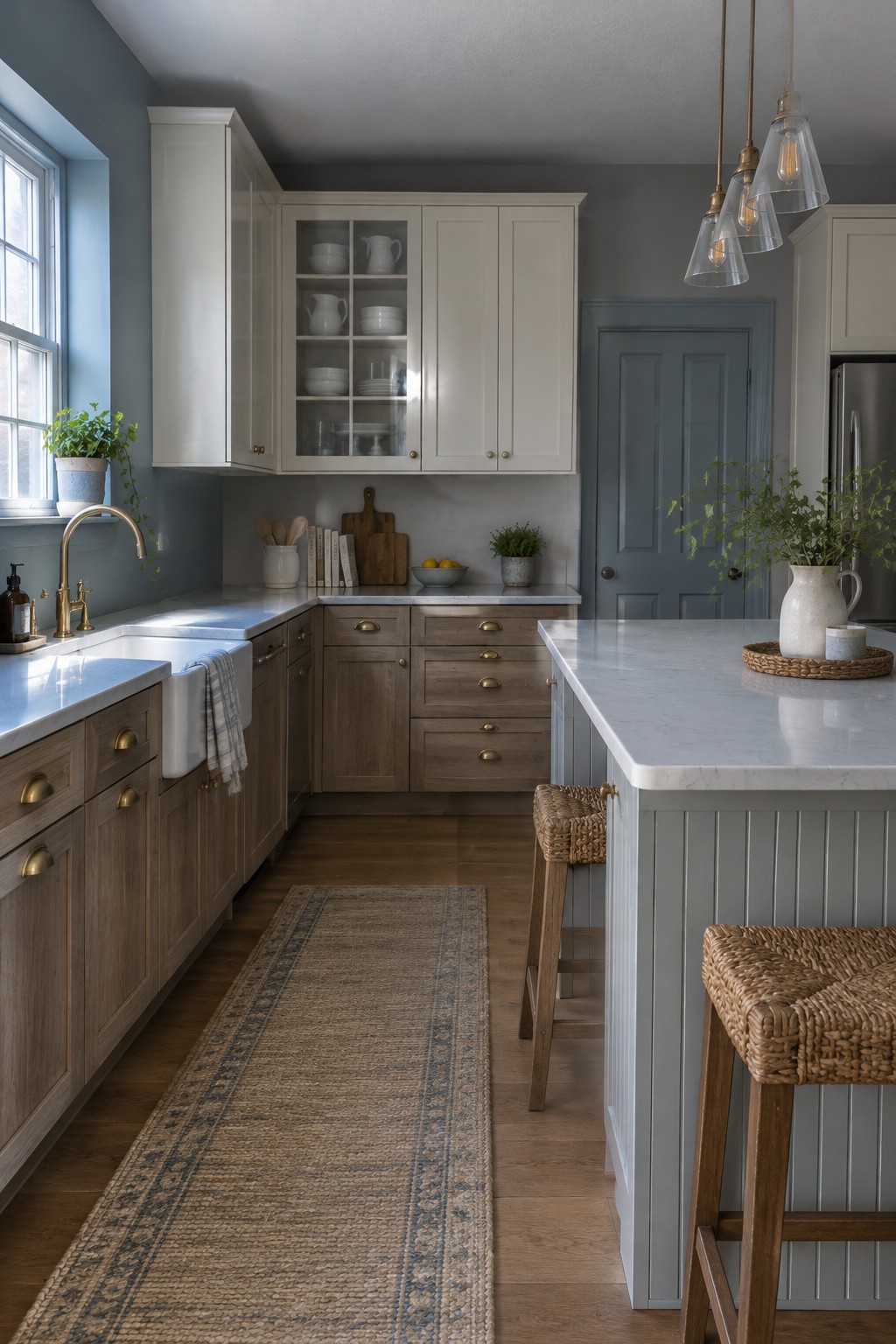
A muted blue-gray is the main wall color here. It looks closest to Benjamin Moore Boothbay Gray, Sherwin-Williams Smoky Blue, or Behr Light Drizzle, though the exact match is hard to pin down from a photo. This cool, softened color gives a low-light kitchen some color without making the walls feel too dark.
The warm wood cabinets and white counters help keep the blue-gray from reading too chilly. It can work well in a kitchen with limited daylight, especially if you use warm bulbs and test a sample on more than one wall first.
Muted Sage Walls With Cream Cabinets
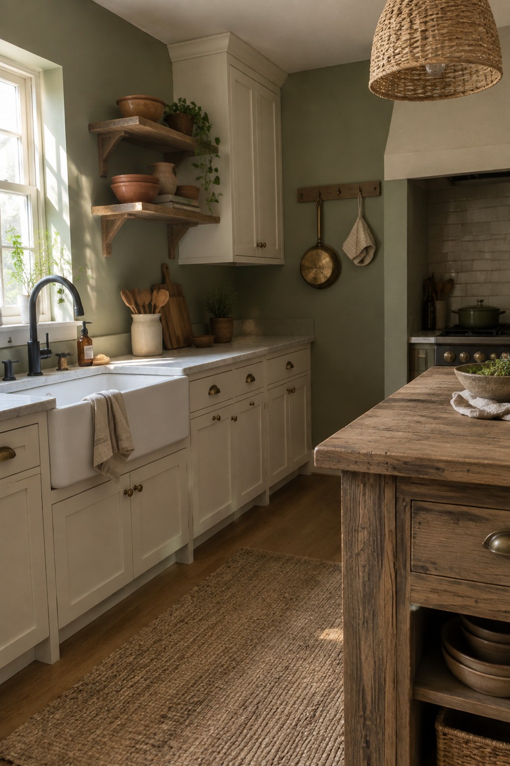
A muted sage green, perhaps close to Benjamin Moore Saybrook Sage, Sherwin-Williams Clary Sage, or Farrow & Ball Mizzle, suits a kitchen that gets limited natural light. It has a soft gray cast, so it feels gentle rather than bright or minty.
Here, the sage walls sit beside cream cabinets and a pale sink, which keep the green from feeling too dark. Pair it with warm wood for a comfortable, lived-in look, and test a sample on the shadiest wall first since the color may read deeper there.
Muted Blue-Gray Walls in a Low-Light Kitchen
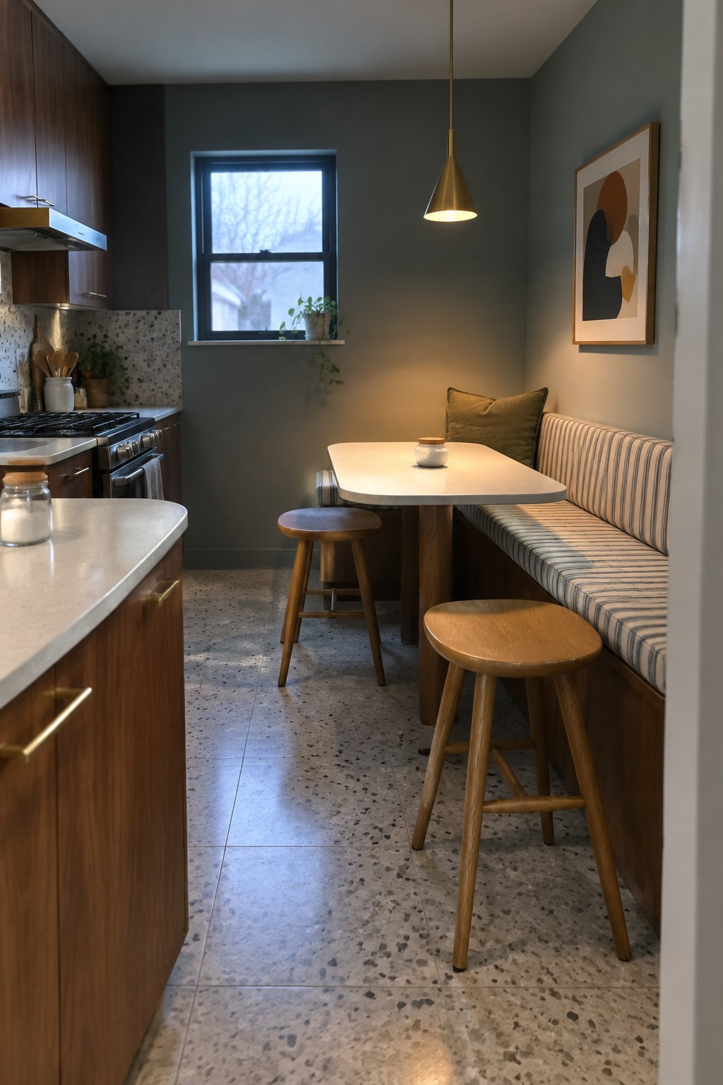
A muted blue-gray, close to Sherwin-Williams Silver Strand, Benjamin Moore Boothbay Gray, or Behr Light French Gray, gives this kitchen a subdued wall color without making it feel stark. It reads as a medium gray with a cool green-blue cast, a useful choice when white walls seem too bright but a dark shade would feel heavy.
In a low-natural-light room, this color can look deeper and cooler, so test a sample on more than one wall first. It pairs well with the warm wood cabinetry; a creamy white nearby can keep the overall look from feeling too chilly.
Warm Charcoal Walls Above White Subway Tile
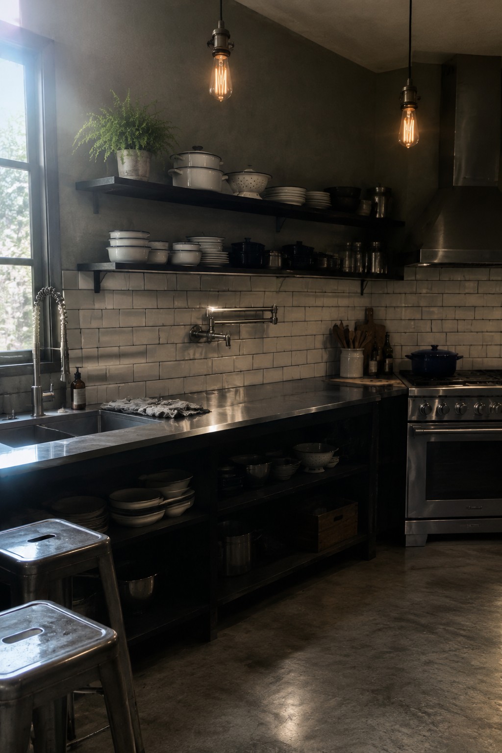
This kitchen’s walls look like a deep, warm charcoal gray, perhaps close to Benjamin Moore Kendall Charcoal or Sherwin-Williams Iron Ore. It’s a useful choice for a low-light room when you want a cozy, settled feel rather than a pale color that can look dull in dim corners.
The white subway tile keeps the darker paint from taking over, while the window gives it some changing natural light. Try this kind of charcoal with light tile or counters, and sample it on the wall first, since it can read nearly black in a room with very little daylight.
Warm Beige Walls With Dark Counters
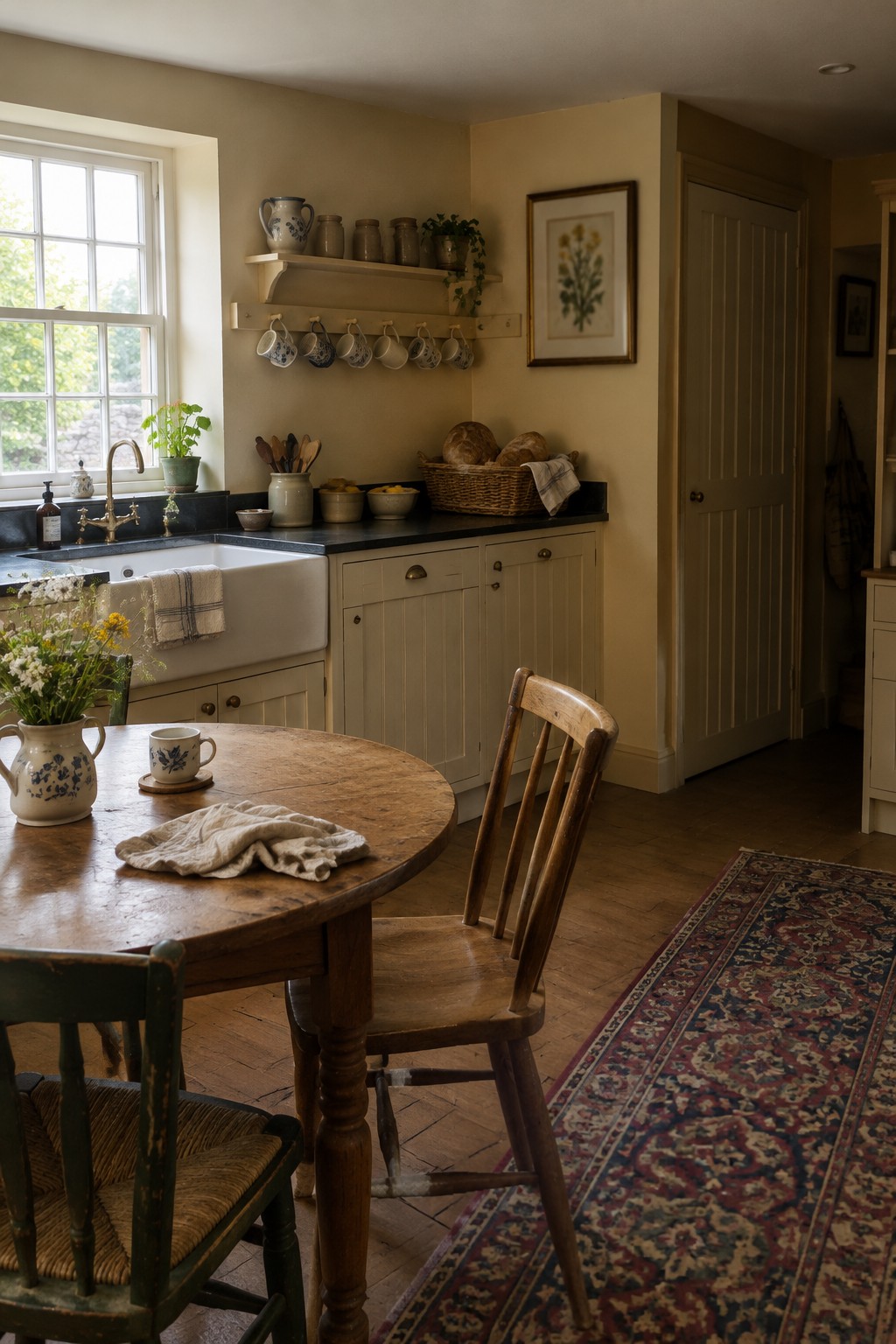
The walls look like a warm beige, close to Benjamin Moore Manchester Tan, Sherwin-Williams Accessible Beige, or Behr Almond Wisp. This kind of muted neutral feels comfortable in a traditional kitchen and gives you more color than plain white without making the room feel busy.
With little natural light, beige can turn quite golden, so test a sample on the wall before committing. The dark countertops provide a useful contrast; warm white trim can keep the overall look from feeling too brown.
Warm Taupe Walls With Dark Cabinetry
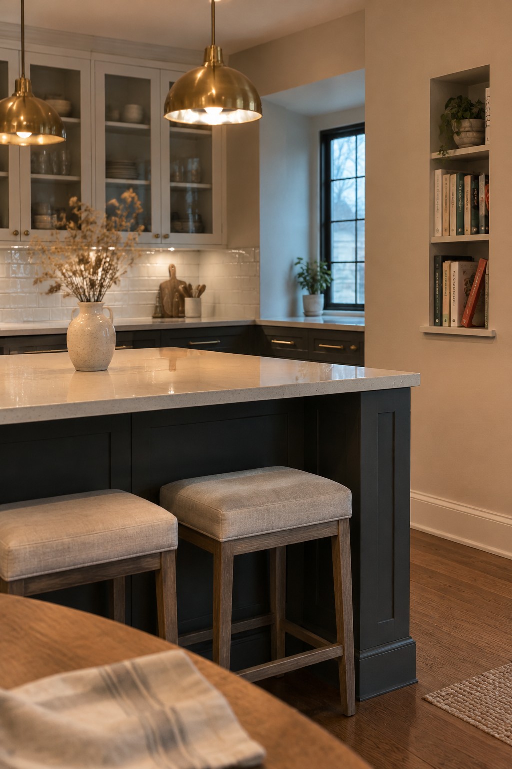
A warm taupe or soft mushroom wall color would suit this kitchen; it looks closest to Benjamin Moore Edgecomb Gray, Sherwin-Williams Accessible Beige, or Behr Wheat Bread. This muted neutral feels comfortable without making a low-light room look stark, and it sits naturally beside the dark cabinets.
The shade has a gentle beige undertone that can look a little deeper away from the window. Try a sample on the wall before choosing, and check it at different times of day. White tile and warm wood flooring are easy pairings.
Dusty Terracotta Walls With Open Shelving
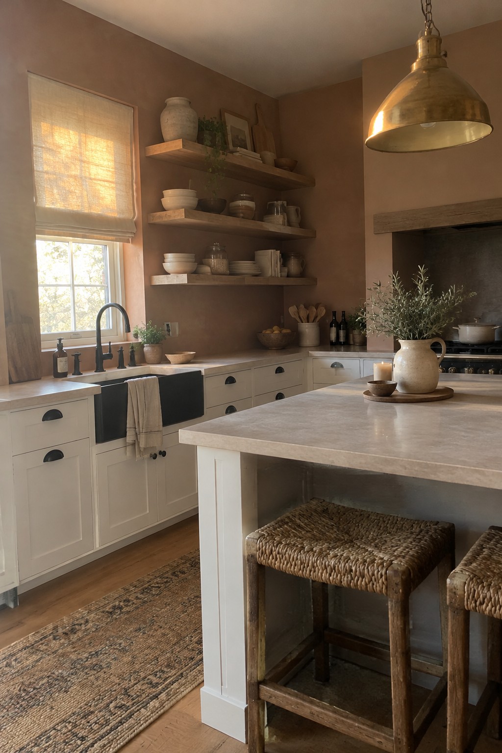
A muted terracotta, close to a warm clay or rosy brown, is a good choice when a low-light kitchen needs color without feeling too bright. This wall shade looks closest to Benjamin Moore Terra Cotta Tile or Sherwin-Williams Cavern Clay, though the exact match is hard to tell from a photo. It has more brown than orange, so it feels comfortable beside pale cabinets.
In a kitchen with limited daylight, test a sample first since terracotta can look darker once the sun goes down. The open wood shelves suit this warm shade, and cream cabinets help keep the room from feeling closed in.
Warm Taupe Walls With Dark Tile
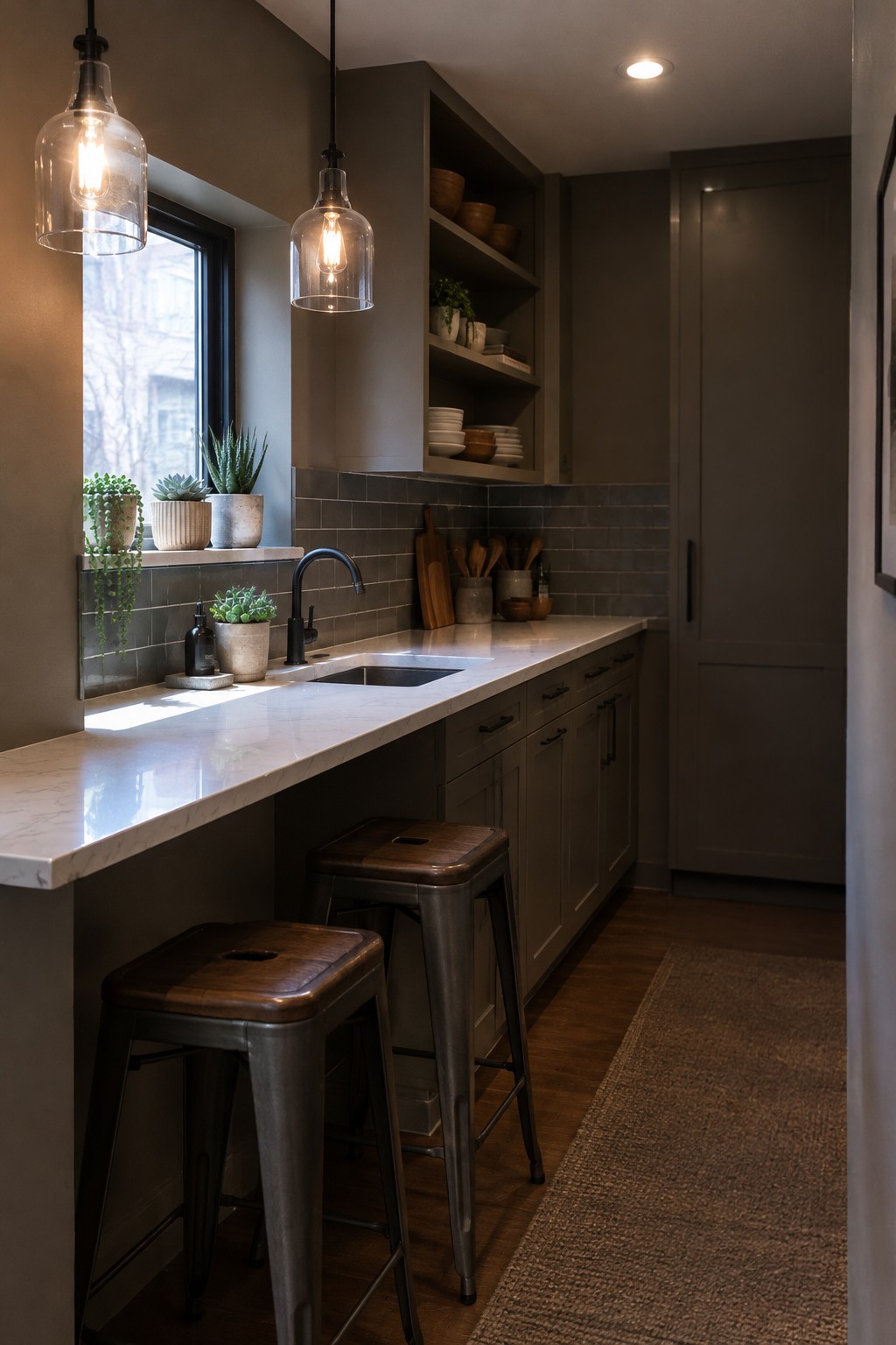
Warm taupe paint on the walls looks close to a deep, earthy greige, though the exact shade is hard to pin down from a photo. It works well in a low-light kitchen because it feels cozy without leaning too yellow, and it gives the pale countertop a clear contrast.
The dark backsplash and cabinetry make the wall color read a little richer, so test a sample in your own kitchen before painting. A taupe with a soft brown undertone is a good place to start; Sherwin-Williams Studio Clay, Benjamin Moore Pashmina, or Behr Perfect Taupe are possible matches.
Muted Sage Walls Above Blue-and-White Tile
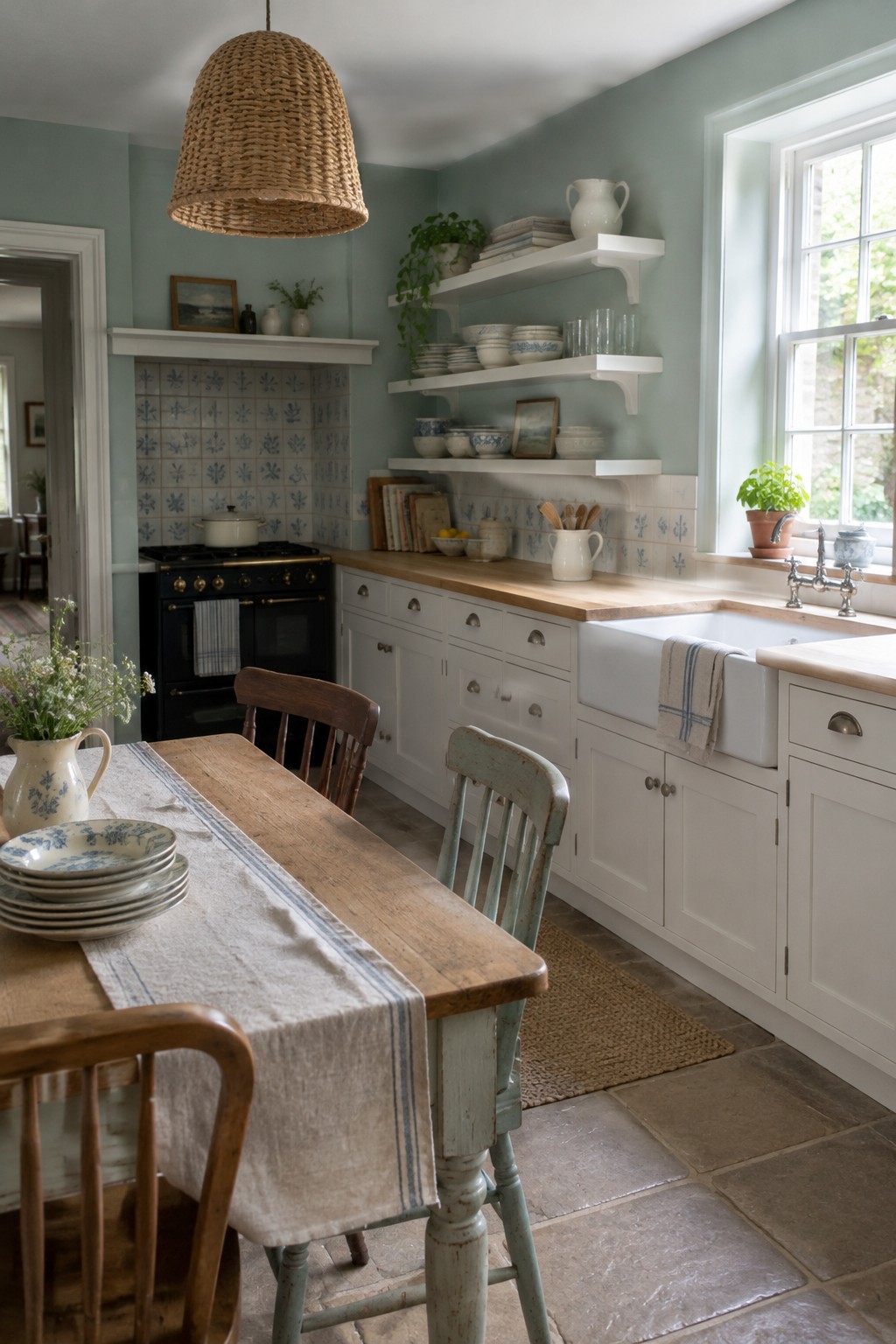
The walls look like a muted sage green, a soft, slightly gray color that can bring some life to a low-light kitchen without feeling too strong. It seems close to Sherwin-Williams Clary Sage, Benjamin Moore October Mist, or Farrow & Ball Mizzle, though the exact match is hard to tell from a photo.
The blue-and-white tile gives the green a cooler neighbor, so it may read more gray in a dim room. Pair it with warm wood counters or other natural wood to keep the kitchen from feeling chilly, and test a sample on the wall before committing.
Soft Gray Walls Beside White Subway Tile
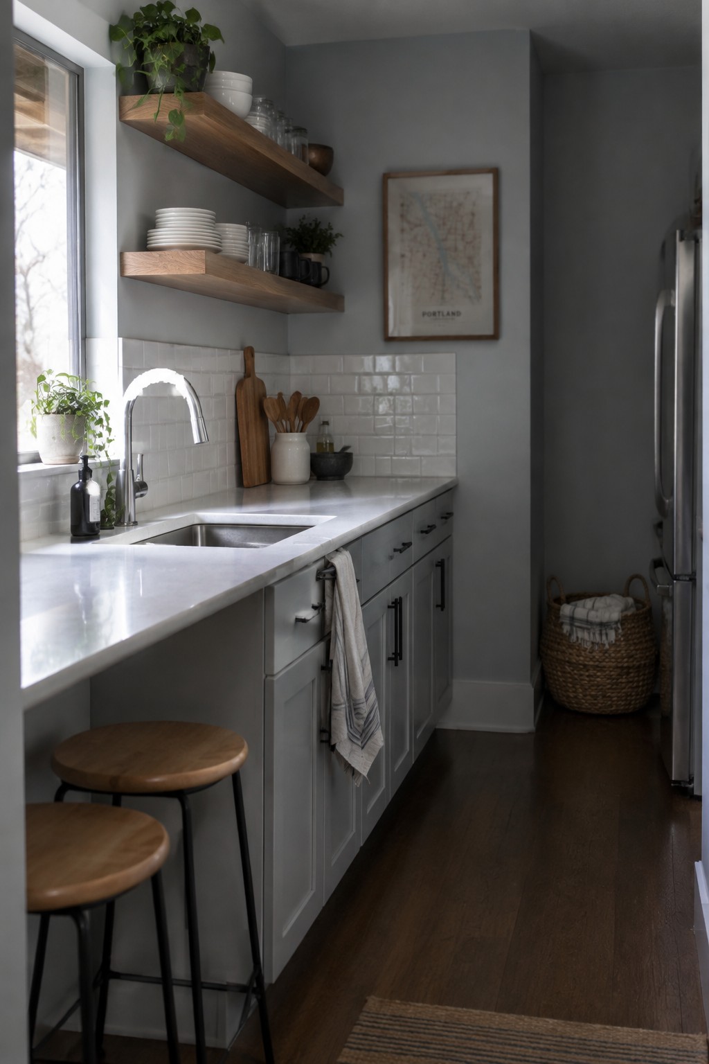
Soft gray walls would suit this kitchen well. The color reads as a muted, slightly cool gray, close to Benjamin Moore Gray Owl, Sherwin-Williams Passive, or Behr Silver Drop. It keeps the narrow kitchen from feeling too heavy while giving the white tile a little contrast.
In a room with limited natural light, test a sample on more than one wall since gray can look darker or bluer in dim corners. The white tile and pale counters help keep the combination feeling light; warm wood shelves are a useful counterpoint.
Warm Greige Walls With Pale Marble
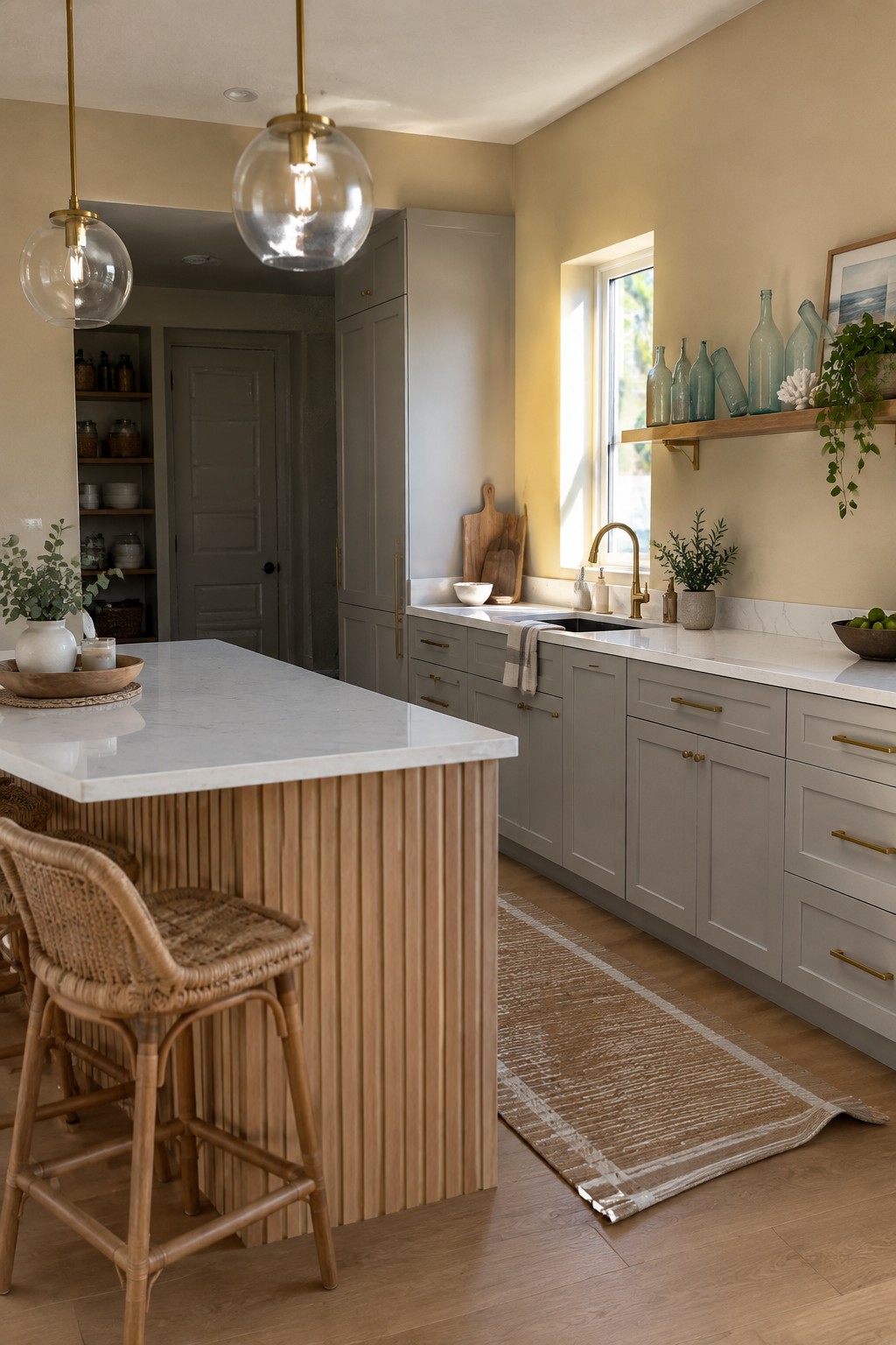
For a low-light kitchen, these walls read as a warm greige: a soft beige-gray that looks closest to Sherwin-Williams Accessible Beige, Benjamin Moore Pale Oak, or Behr Wheat Bread. It is a useful middle ground if cream feels too yellow and a cooler gray seems flat.
The warm undertone suits pale marble counters and warm wood flooring without making the room feel too stark. Try a sample on more than one wall, since greige can look noticeably grayer in a dim corner.
Warm Greige Walls With Pale Stone Counters
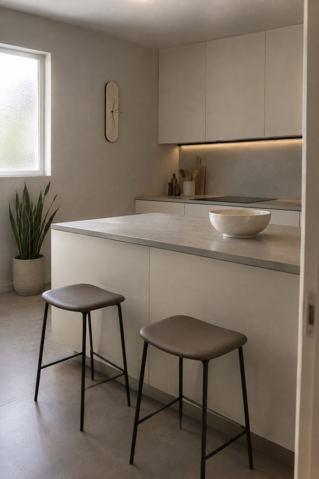
A warm greige is a useful choice for a kitchen with little natural light. This looks closest to a soft beige-gray, with likely matches including Benjamin Moore Pale Oak, Sherwin-Williams Accessible Beige, or Behr Almond Wisp. It feels neutral without turning stark or overly yellow.
The warm undertone suits the pale stone counters and keeps the room from feeling cold. Try a sample on more than one wall first, since low light can make greige look deeper; a slightly lighter shade may be the safer pick for a small kitchen.
Muted Olive Green Across Walls and Cabinetry
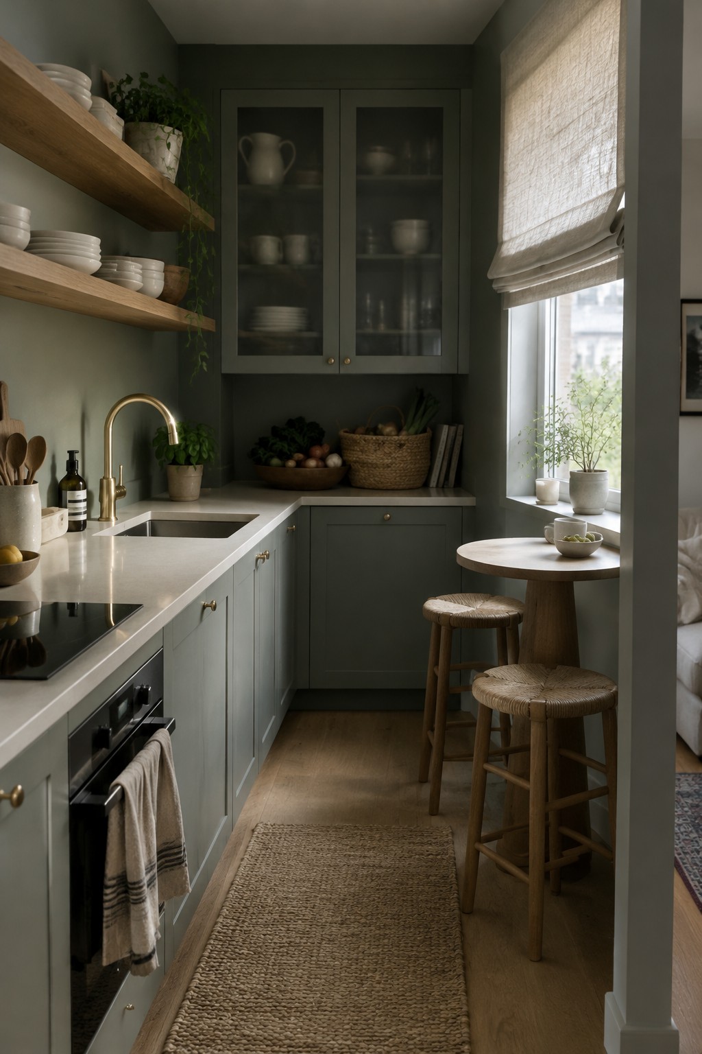
A muted olive green seems closest here, though the exact shade is hard to pin down from a photo. It is a deep, gray-leaning green that gives a small kitchen a settled feel without relying on bright white walls. Using it on both the walls and cabinets makes the color feel deliberate rather than scattered.
In a low-light kitchen, this shade will look darker, so it works best with a light countertop and some natural wood nearby. Try a sample on the wall and cabinet surface before committing; the same green can shift noticeably between them.
Warm Gray Walls With Stainless Steel
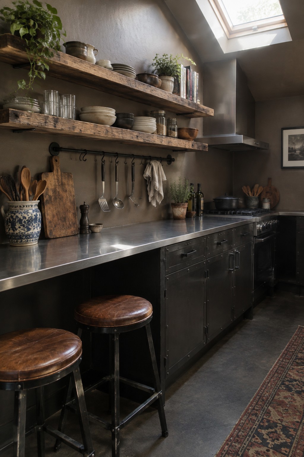
A warm gray wall color, close to Benjamin Moore’s Pashmina, Sherwin-Williams’ Agreeable Gray, or Behr’s Wheat Bread, suits a kitchen that gets limited daylight. It has enough brown in it to feel softer than a cool gray, without making the room look beige.
The stainless-steel counter gives this shade a cooler neighbor, so test a sample on the wall before committing. It should work well with dark cabinets and natural wood, but check it in the dimmest part of the kitchen too.
Muted Olive Walls With Dark Stone Counters
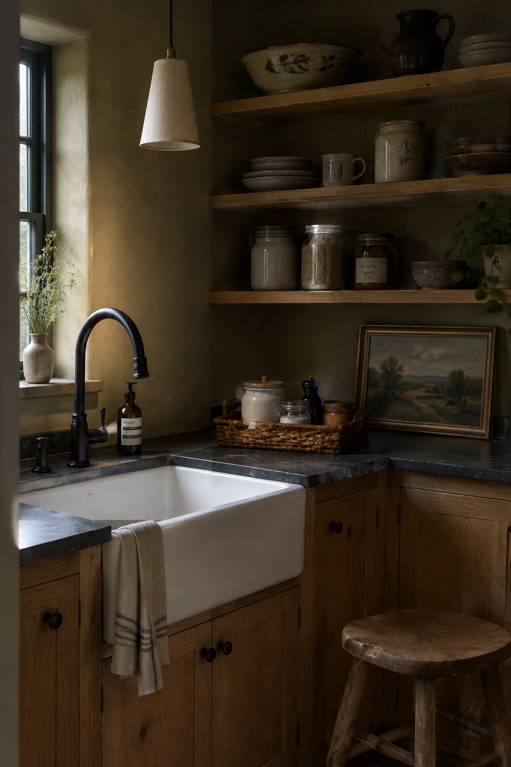
This looks like a muted olive green, with a brownish, earthy undertone. A close match might be Benjamin Moore Vintage Vogue, Sherwin-Williams Ripe Olive, or Farrow & Ball Olive. In a kitchen with little natural light, this deeper color can feel cozy rather than stark, especially when used with warm wood.
The dark stone counters make the green read moodier, so consider using it on one wall or in a kitchen with some lighter finishes nearby. Test a sample in your own light first, since olive can turn quite brown in a dim room.
Warm Cream Walls in a Wood-Furnished Kitchen
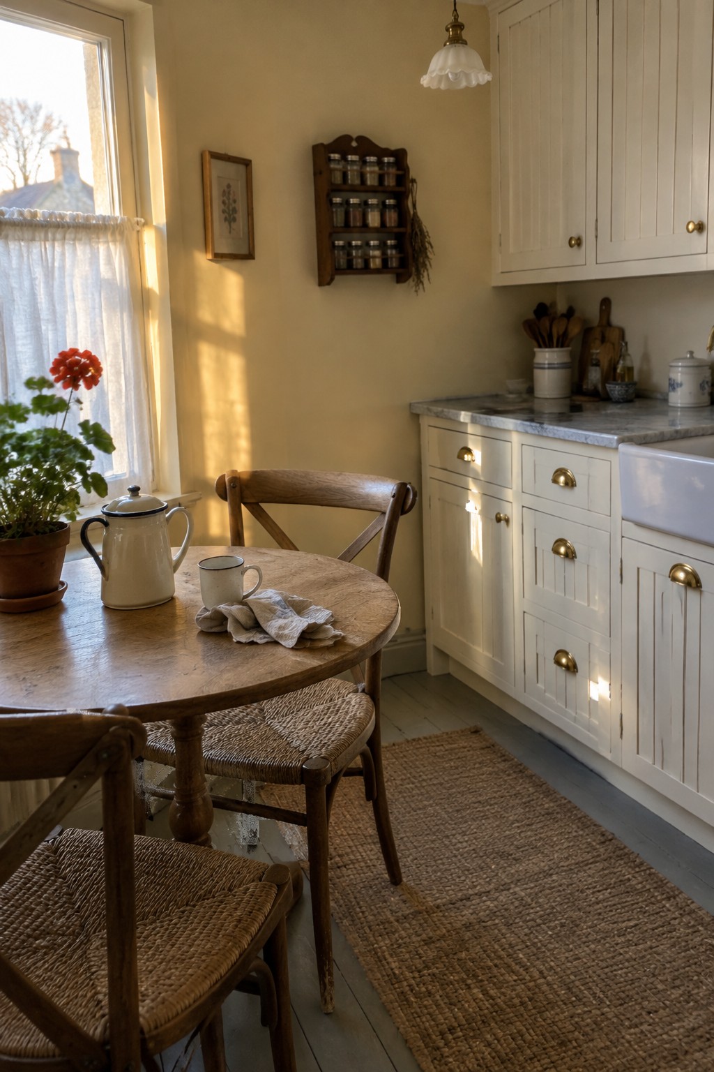
A warm cream wall color looks like a good fit for this low-light kitchen. It is a soft, yellow-based neutral rather than a stark white, and a close match might be Benjamin Moore Swiss Coffee, Sherwin-Williams Creamy, or Farrow & Ball Dimity. That warmth helps the room feel comfortable without making the walls look too dark.
In a kitchen with wood furniture and white cabinets, this kind of cream can keep the finishes from feeling chilly. Check a sample on the wall first, since yellow undertones can look stronger in a small room with limited daylight.
Blue-Gray Walls With Warm Wood Shelves
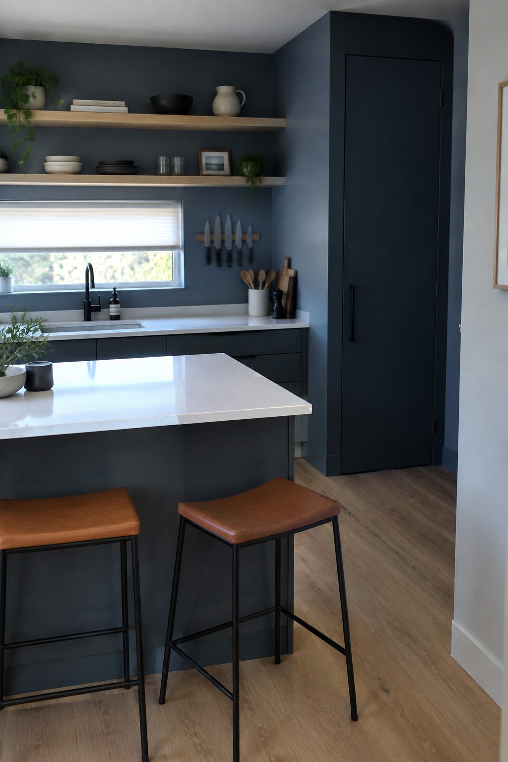
This muted blue-gray looks closest to a slate blue with a cool undertone. It gives the kitchen a deeper, settled color without making the walls feel stark, and the pale wood shelves keep it from reading too cold.
In a low-natural-light kitchen, this shade may look darker and grayer, so it’s worth testing a sample on more than one wall. White counters help keep the room feeling open, while warm wood is a good pairing for a little contrast.
Warm Greige Walls Beside Pale Green Tile
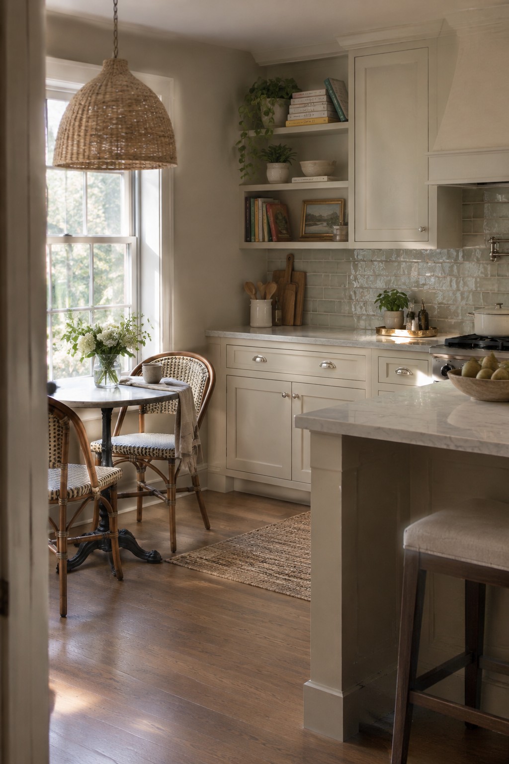
Warm greige is a good fit for a low-light kitchen like this one. It looks closest to a soft beige-gray, perhaps near Benjamin Moore Pale Oak, Sherwin-Williams Accessible Beige, or Behr Wheat Bread. The color stays light without feeling stark, which makes it a practical choice when a room does not get much sun.
The pale green tile gives the walls a gentle contrast, while the warm wood floor keeps the gray side of the greige from feeling chilly. Try a sample on the wall and check it at different times of day; in a dim corner, it may read more beige than gray.
Cool Gray Walls in Dim Window Light
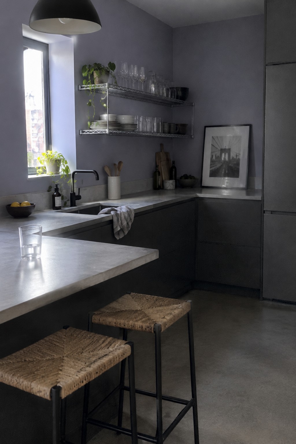
A cool gray with a slight blue-violet cast seems closest here. For similar shades, look at Benjamin Moore Stonington Gray, Sherwin-Williams Passive, or Behr Silver City. Gray can suit a low-light kitchen when you want a quiet alternative to white, though this cooler version feels more subdued than bright.
The pale counters help keep the gray from feeling too heavy, while the dark cabinetry makes the room moodier. Try a sample on more than one wall before painting, since limited daylight can make cool gray look darker or more purple than expected.
Warm Plaster Walls Beside Terracotta
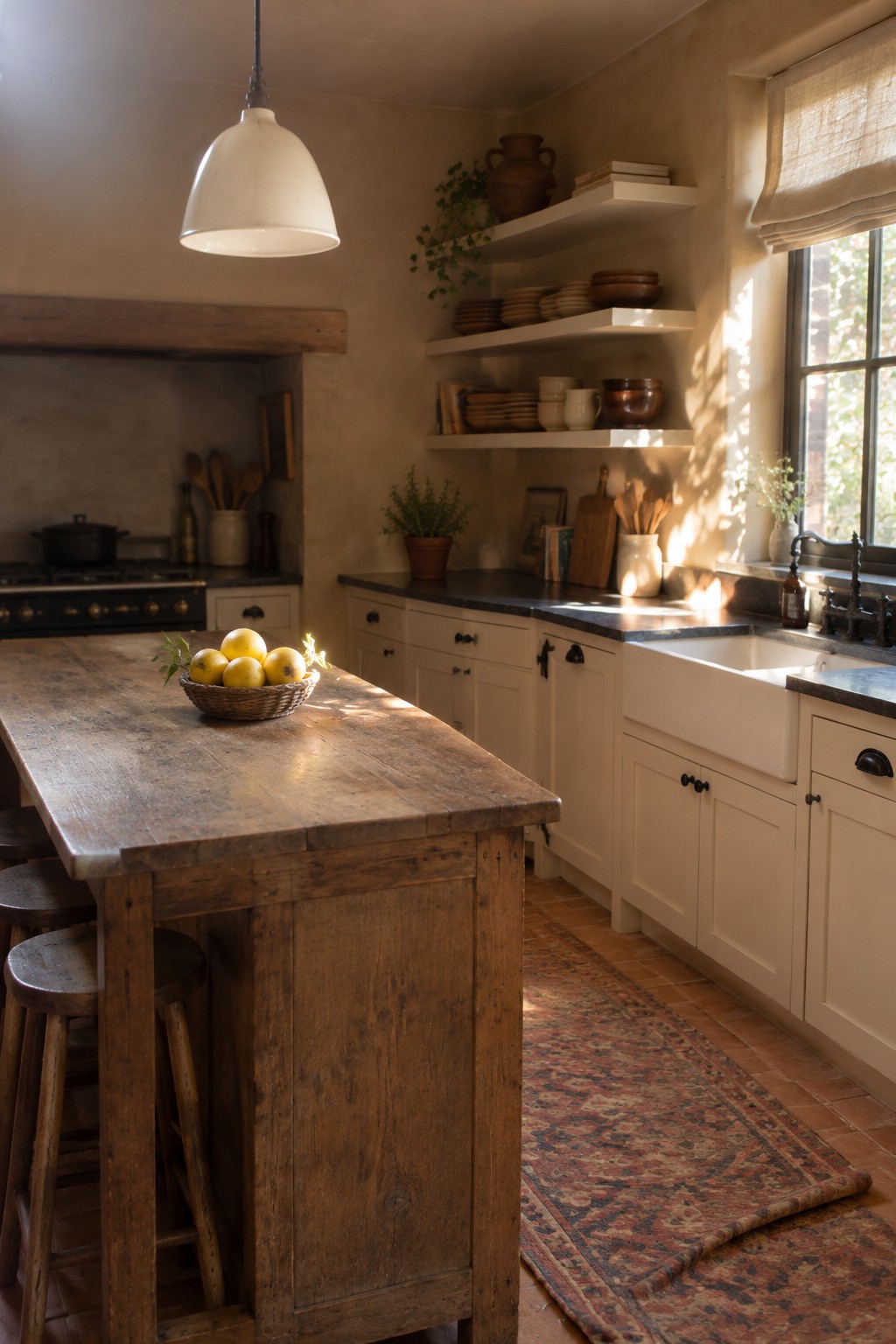
For this low-light kitchen, the walls read as a warm beige with a soft clay undertone. Similar shades might be Benjamin Moore Muslin, Sherwin-Williams Accessible Beige, or Farrow & Ball String, though the exact match is hard to pin down from a photo. This kind of muted neutral feels softer than a stark white and suits a kitchen with rustic finishes.
The warm wall color works naturally with the terracotta floor and aged wood, without making the room feel too dark. If your kitchen gets little daylight, sample a few shades first: beige can turn more yellow or muddy in dim corners.
Warm Taupe Walls Beside White Marble
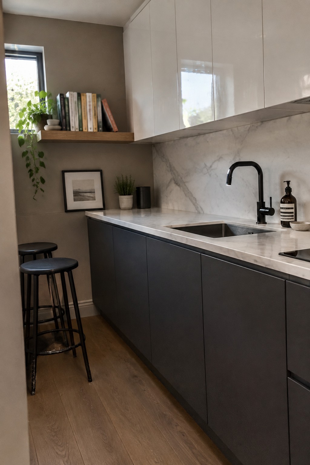
Warm taupe is a useful choice for a low-natural-light kitchen because it brings a soft, earthy neutral to the walls without looking stark. This shade reads close to Benjamin Moore Pashmina, Sherwin-Williams Taupe Tone, or Farrow & Ball Elephant’s Breath, though the exact match is hard to tell from a photo.
Beside white marble, taupe can make a small kitchen feel less cold while still letting the counters stay bright. Look for a muted shade with a gray-brown undertone, and test it on the wall first since limited daylight can make taupe appear darker.
Muted Olive Walls Around Warm Wood Cabinetry
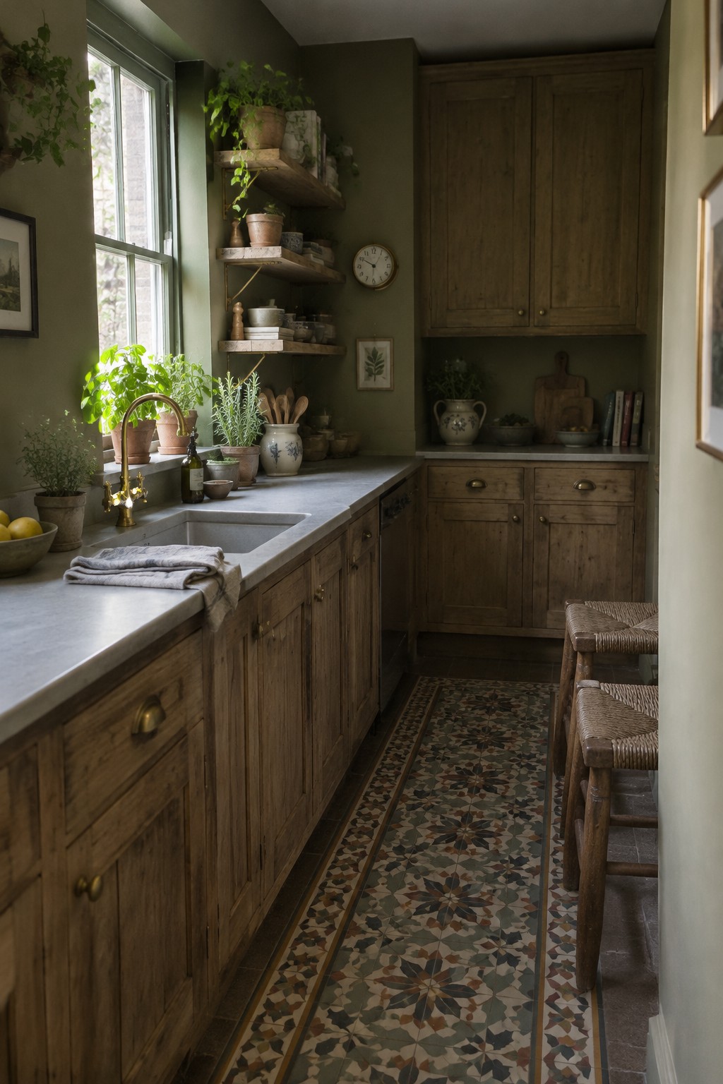
A muted olive green looks like the closest fit for these kitchen walls. It is a deep, earthy shade that gives a low-light room some color without feeling too bright or sharp. With the natural wood cabinetry, it feels settled and traditional.
In a kitchen with limited daylight, olive can read darker, so test a sample on more than one wall before committing. Look for a shade with a little gray in it, and pair it with a pale counter to keep the room from feeling too enclosed. Possible matches include Benjamin Moore Tate Olive, Sherwin-Williams Ripe Olive, or Farrow & Ball Bancha.
Frequently Asked Questions
Q: Will white walls make a low-light kitchen feel brighter?
A: They can, especially if you choose a warm white rather than a stark, cool one. Pair it with a light backsplash or cabinet finish so the room reflects what little daylight it gets.
Q: Can I use a dark color in a kitchen with very little natural light?
A: Yes, but it will make the room feel moodier rather than brighter. Try it on one wall or below a chair rail, and use good task lighting to keep work areas easy to see.
Q: How can I tell if a paint color will look right in my kitchen?
A: Paint a sample on a few different walls and check it in the morning, afternoon, and evening. Kitchen lighting can shift a color more than you’d expect.
Q: Should I choose a warm or cool wall color for a north-facing kitchen?
A: Warm shades often balance the cooler light in a north-facing room. Soft cream, muted peach, or a gentle yellow can add warmth without feeling too bold.