


Navy cabinets can make a kitchen feel grounded, but the wall color around them changes whether the room reads cozy, crisp, or too dark.
I find that warm whites and muted greens often soften navy, while cooler shades can bring out its sharper blue undertones.
The same paint can shift from calm to slightly dull as daylight moves across the room, so I’d test samples beside the cabinets, trim, and countertops before settling on a color.
Small differences in undertone matter here, especially when the floor or backsplash already adds warmth.
Some shades are worth seeing on the wall through a full day before you decide.
Terracotta Walls Above White Tile
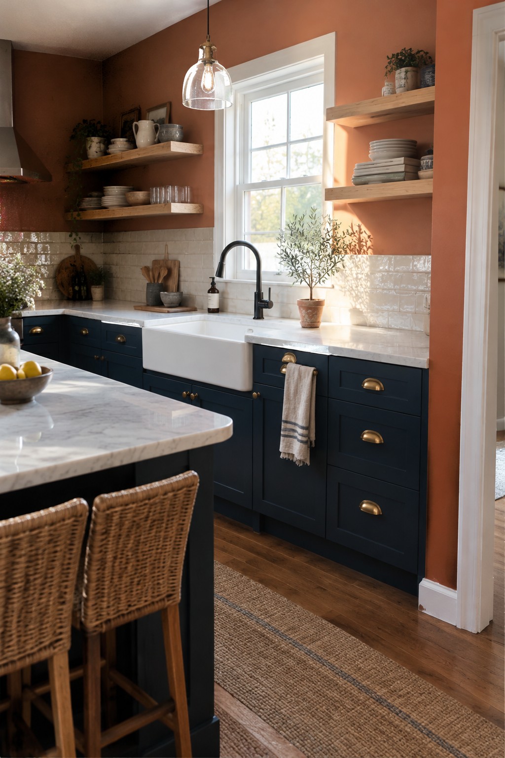
The walls look like a muted terracotta, a warm, earthy orange that suits a kitchen with navy cabinets. This shade feels richer than a pale peach but still works as a backdrop for everyday cooking. A close match might be Benjamin Moore Potters Clay, Sherwin-Williams Cavern Clay, or Behr Canyon Dusk.
The white tile keeps the color from feeling too heavy, while the natural light near the sink brings out its softer, dusty side. Try a sample on more than one wall before committing, since terracotta can look much stronger in a dim corner.

This warm ochre yellow looks closest to Benjamin Moore’s Golden Straw, Sherwin-Williams’ Golden Fleece, or Farrow & Ball’s India Yellow. It is a rich, earthy wall color that gives navy cabinets a warmer, less formal feel than white walls would.
The yellow has a golden, slightly muted cast, which suits the wood floor and dark cabinetry. It works best where there’s enough daylight to keep the color from feeling too heavy; test a sample first, since it may read browner in a dim kitchen.
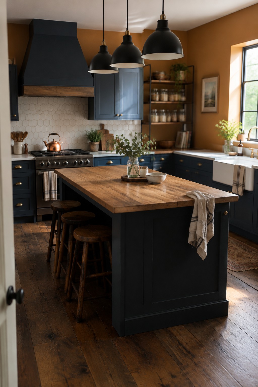
The wall color looks like a rich ochre or burnt orange, a warm choice that sits comfortably beside navy cabinetry. Similar shades include Benjamin Moore’s Potters Clay, Sherwin-Williams’ Cavern Clay, and Behr’s Canyon Dusk. The color gives a navy kitchen a warmer feel without making the cabinets seem less striking.
In this kitchen, the wood island top helps connect the orange walls to the navy cabinets. This kind of earthy color can work well in a room with plenty of natural light; in a darker kitchen, test a sample first, since it may read quite deep.
Deep Green Walls With White Tile
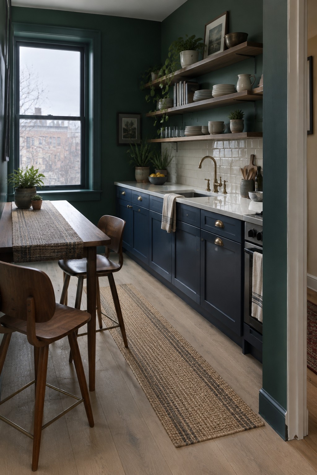
This looks like a deep, blue-leaning forest green, close to Benjamin Moore Essex Green, Sherwin-Williams Jasper, or Farrow & Ball Green Smoke. It gives a narrow kitchen a rich color without making the navy cabinets feel like the only dark feature.
The green reads cooler in the window light, while the white tile keeps the wall area from feeling too heavy. It would suit a kitchen with good natural light; warm wood shelves or brass hardware can help keep the overall palette from feeling chilly.

Navy is a deep blue that can look almost charcoal in a dim kitchen. It seems closest to Hale Navy by Benjamin Moore, though the photo alone can’t confirm an exact match. Using it on both the perimeter cabinets and island gives the room a steady, traditional look without needing a bright wall color.
Here, the dark stone counters sit comfortably against the blue-black paint, while the wood floor keeps the palette from feeling too cool. Navy works well in kitchens with good window light; in a darker room, test a sample first, since it can read nearly black.

The cabinets look like a deep, slightly muted navy, close to Hale Navy by Benjamin Moore. It’s a rich blue that gives a small kitchen a clear point of color without making every surface feel dark. The white tile and countertop keep the navy from taking over.
In a kitchen like this, navy works well with warm wood floors and simple white surfaces. It can read nearly charcoal in a dim room, so test a sample in your own light before painting all the cabinets.
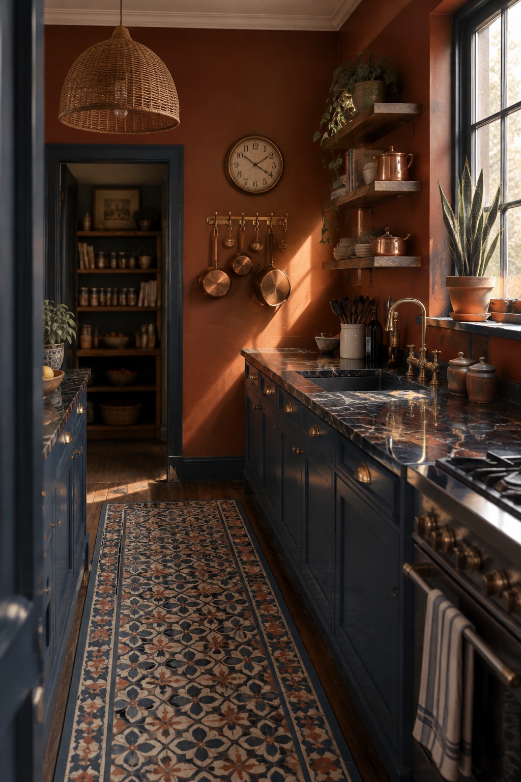
This warm, earthy rust color looks close to terracotta, with a muted red-brown undertone. For similar shades, consider Benjamin Moore Terra Cotta Tile, Sherwin-Williams Cavern Clay, or Farrow & Ball Red Earth. It gives navy cabinets a rich contrast without making the kitchen feel too cool.
The warm wall color works well beside dark marble and brass, but it can look stronger in a small kitchen, so test a sample in your own light first. Cream trim or natural wood can make the combination feel a little softer.
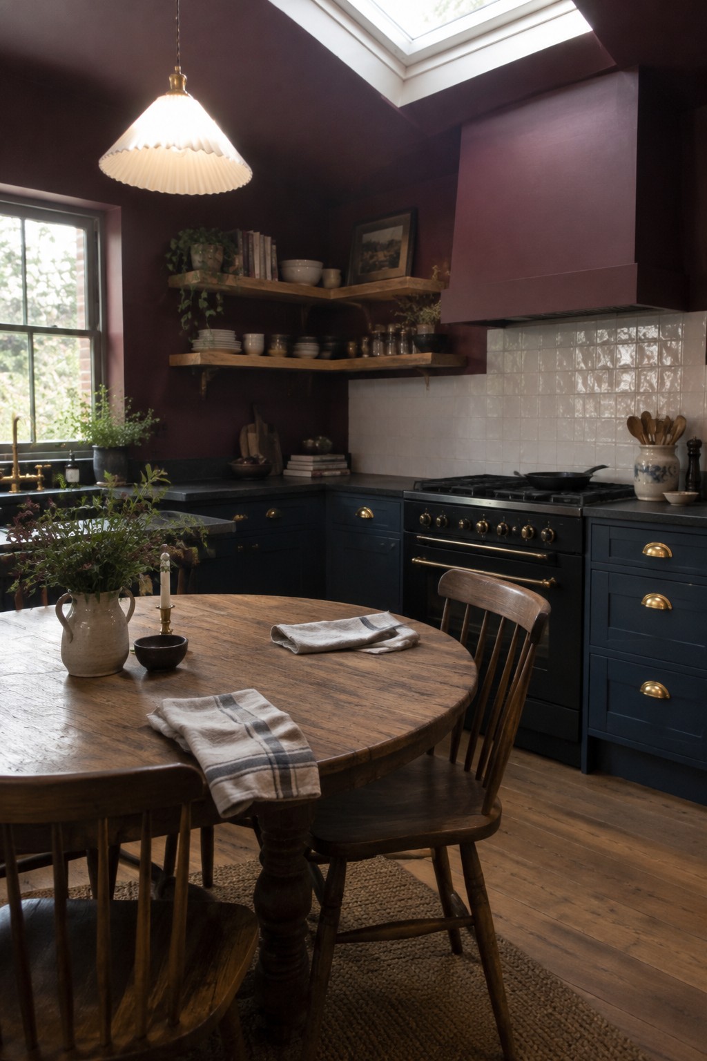
A deep plum or aubergine looks like the main wall color here, though the exact shade is hard to pin down. It is a rich, red-violet color that gives navy cabinets a softer, less expected partner than plain white walls.
The plum can look nearly brown in dim corners and more purple in stronger daylight, so it suits a kitchen with good natural light. White tile keeps the darker colors from taking over; warm wood is another easy pairing.
Dusty Mauve Walls With Pale Green Tile
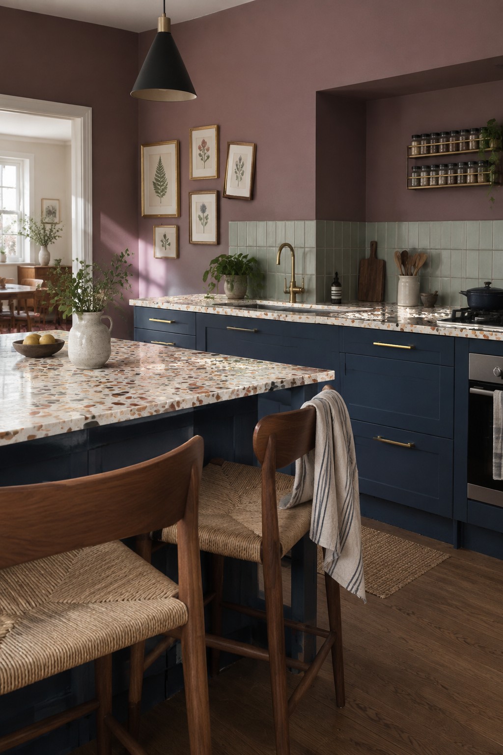
A dusty mauve or muted plum wall color would suit a kitchen with navy cabinets like this one. It looks closest to Farrow & Ball’s Sulking Room Pink, Benjamin Moore’s Mauve Desert, or Sherwin-Williams’ Mauve Finery, though the exact shade is hard to pin down from a photo. The color feels richer than a plain neutral but still lets the navy cabinetry stand out.
The mauve has a soft, slightly brown undertone that pairs well with the pale green tile and speckled stone counters. It may look deeper in a dim kitchen, so test a sample on the wall before committing.
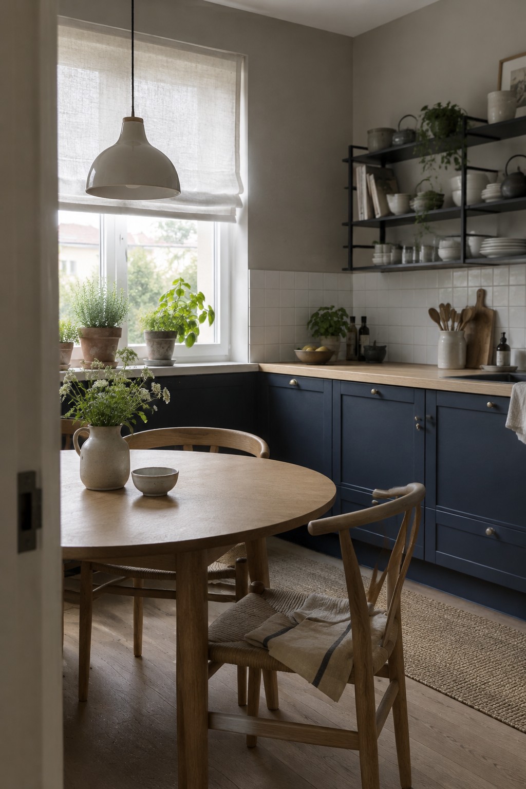
The cabinets read as a deep, slightly muted navy, close to Benjamin Moore Hale Navy or Sherwin-Williams Naval. It’s a rich color for a kitchen, but the warm wood counters keep the navy from feeling too stark.
White tile nearby gives the dark cabinets a clear contrast, while the wood adds a softer note. This shade works well when you want color on the cabinetry without making every surface dark. Check it in your own kitchen first, since navy can look nearly black in a room with limited natural light.
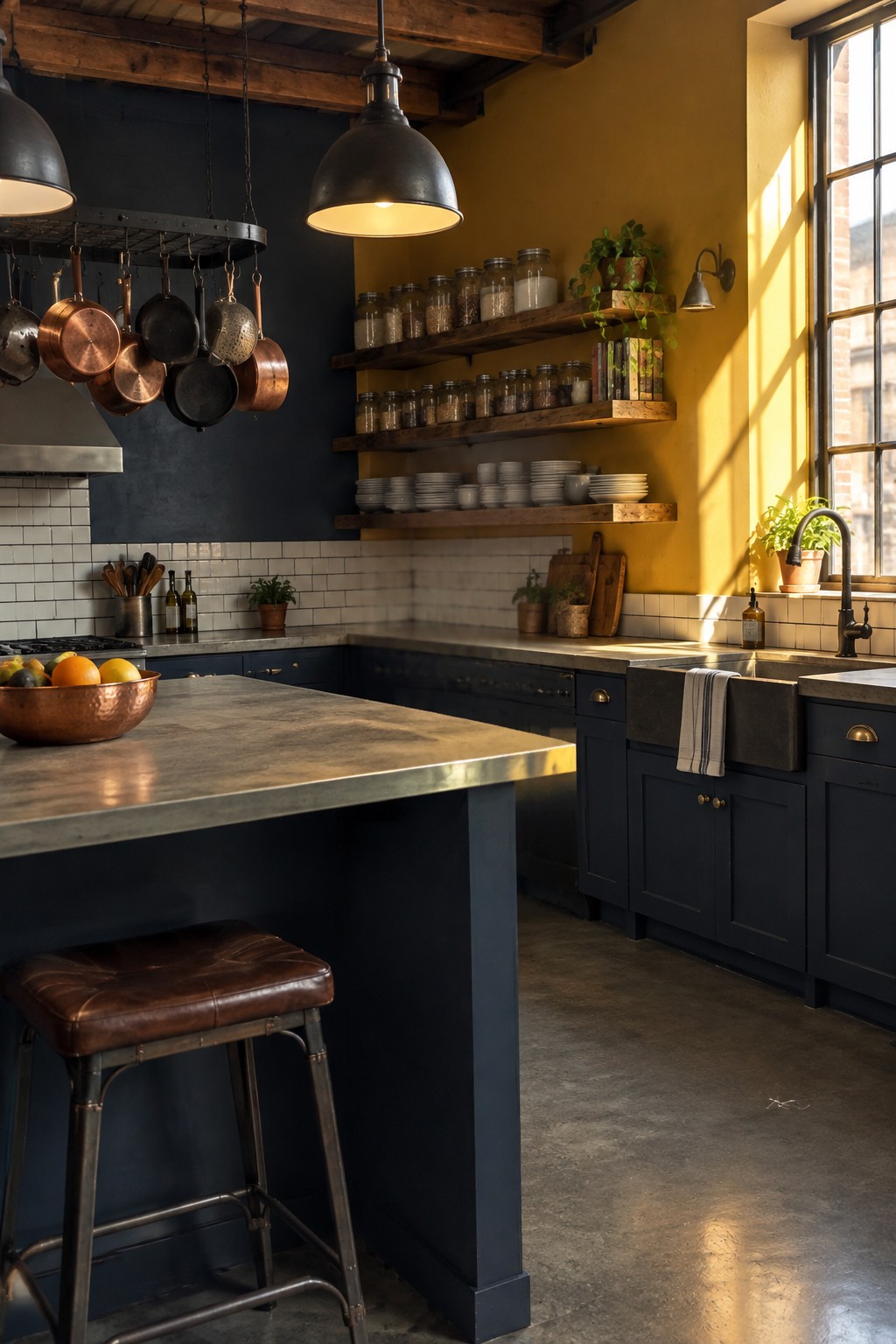
This wall color looks like a rich golden ochre, close to Benjamin Moore Golden Retriever or Sherwin-Williams Ceremonial Gold. It brings a warmer, more colorful feel to navy cabinets without making the kitchen look overly formal.
The yellow undertone suits the dark cabinetry, and white tile helps keep the combination from feeling too heavy. It’s a good option for a kitchen with limited natural light, though I’d test a sample first since ochre can look quite strong across a large wall.
Rust-Red Walls With a White Farmhouse Sink
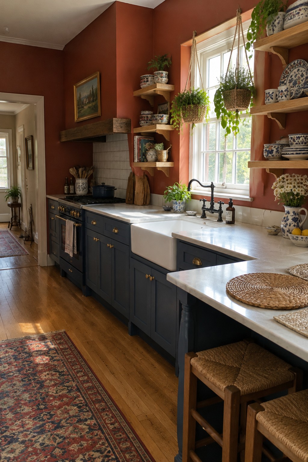
The wall color reads as a rich rust red, a warm, earthy choice that keeps navy cabinets from feeling too cool. It looks closest to terracotta or burnt sienna; likely matches include Benjamin Moore Terra Cotta Tile, Sherwin-Williams Cavern Clay, or Farrow & Ball Red Earth. The white sink and tile give the deep color a bit of contrast without making it feel stark.
This kind of red can look stronger in a small kitchen, so test a sample on more than one wall before committing. It suits traditional rooms especially well, and warm wood floors help the color feel at home.

A deep teal-blue is the main color idea here, though it comes from the glossy wall tile rather than paint. For a similar painted shade, I’d look at blue-green colors like Benjamin Moore Aegean Teal, Sherwin-Williams Cascades, or Farrow & Ball Inchyra Blue. This kind of rich color gives a navy kitchen a little variation without moving far from its cool, moody palette.
The tile’s blue-green cast reads brighter where the window light reaches it, while the navy cabinetry stays more subdued. If you use a similar color on kitchen walls, pale marble can keep the room from feeling too dark. Test a sample in your own light, since deep teal can look much greener or bluer from one kitchen to another.
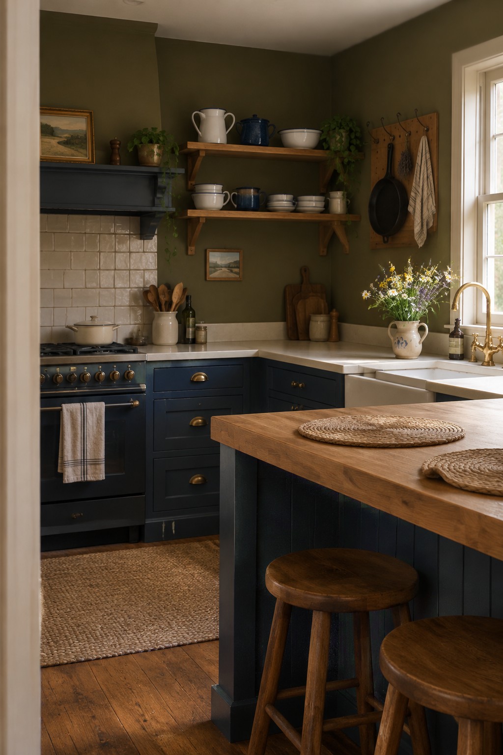
The walls look like a deep olive green, close to Benjamin Moore Backwoods, Sherwin-Williams Rookwood Dark Green, or Farrow & Ball Bancha. It’s a muted, earthy color that gives navy cabinets a little contrast without making the kitchen feel stark.
This shade can look nearly brown in dimmer corners, so it works best with some natural light. Warm wood shelves and a pale countertop help keep it from feeling too dark; test a sample on the wall before committing.
Burnt Sienna Walls Beside Dark Shelving
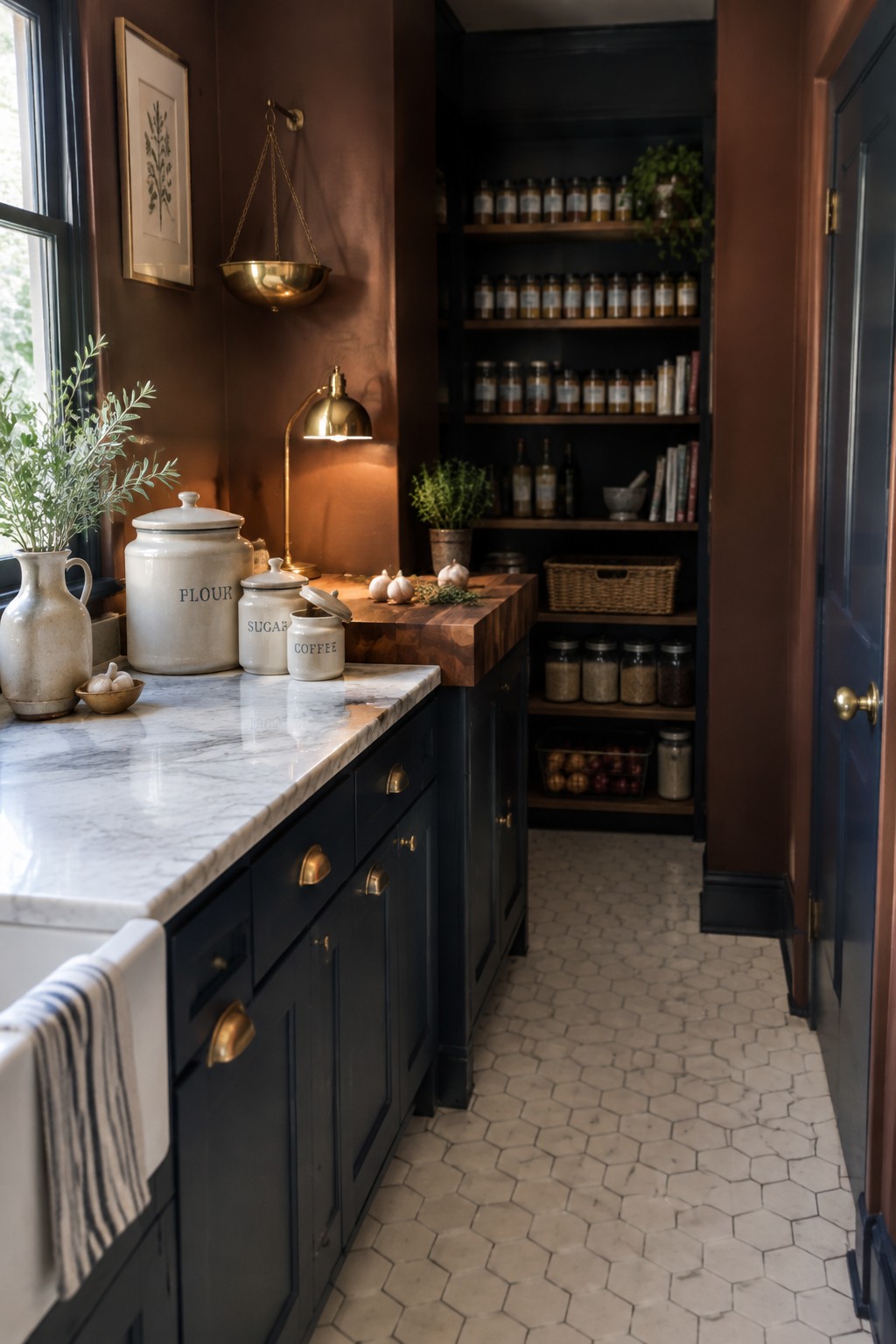
This warm, reddish brown wall color looks close to burnt sienna, though the exact shade is hard to pin down from a photo. Similar options include Benjamin Moore Potters Clay, Sherwin-Williams Cavern Clay, or Farrow & Ball Red Earth. It gives a navy kitchen a warmer, more old-fashioned feel without making the walls pale or plain.
The color works especially well with dark navy cabinetry and white marble, as the contrast keeps the narrow kitchen from feeling too dark. In a room with limited natural light, test a sample first; a red-brown shade can look much deeper once the sun goes down.

The walls look like a dusty rose pink, a muted, warm color that keeps navy cabinets from feeling too stark. A close unbranded match might be Benjamin Moore First Light, Farrow & Ball Setting Plaster, or Sherwin-Williams Malted Milk, though the photo can’t confirm an exact shade.
This pairing suits a kitchen with white tile and pale counters, which give the rosy walls a little breathing room. Check a sample in both daylight and evening light, since pink can look stronger or more peachy once the room is dimmer.

A muted blue-gray is a natural wall color for a kitchen with navy cabinets. It reads cool and a little smoky, so it keeps the room feeling cohesive without making every surface the same shade. Similar colors include Sherwin-Williams Smoky Blue, Benjamin Moore Boothbay Gray, or Farrow & Ball De Nimes.
The blue-gray works especially well with the dark stone counter, though it may look deeper in areas away from the window. Try a sample on the wall first, and check it in both daylight and evening light before choosing a finish.
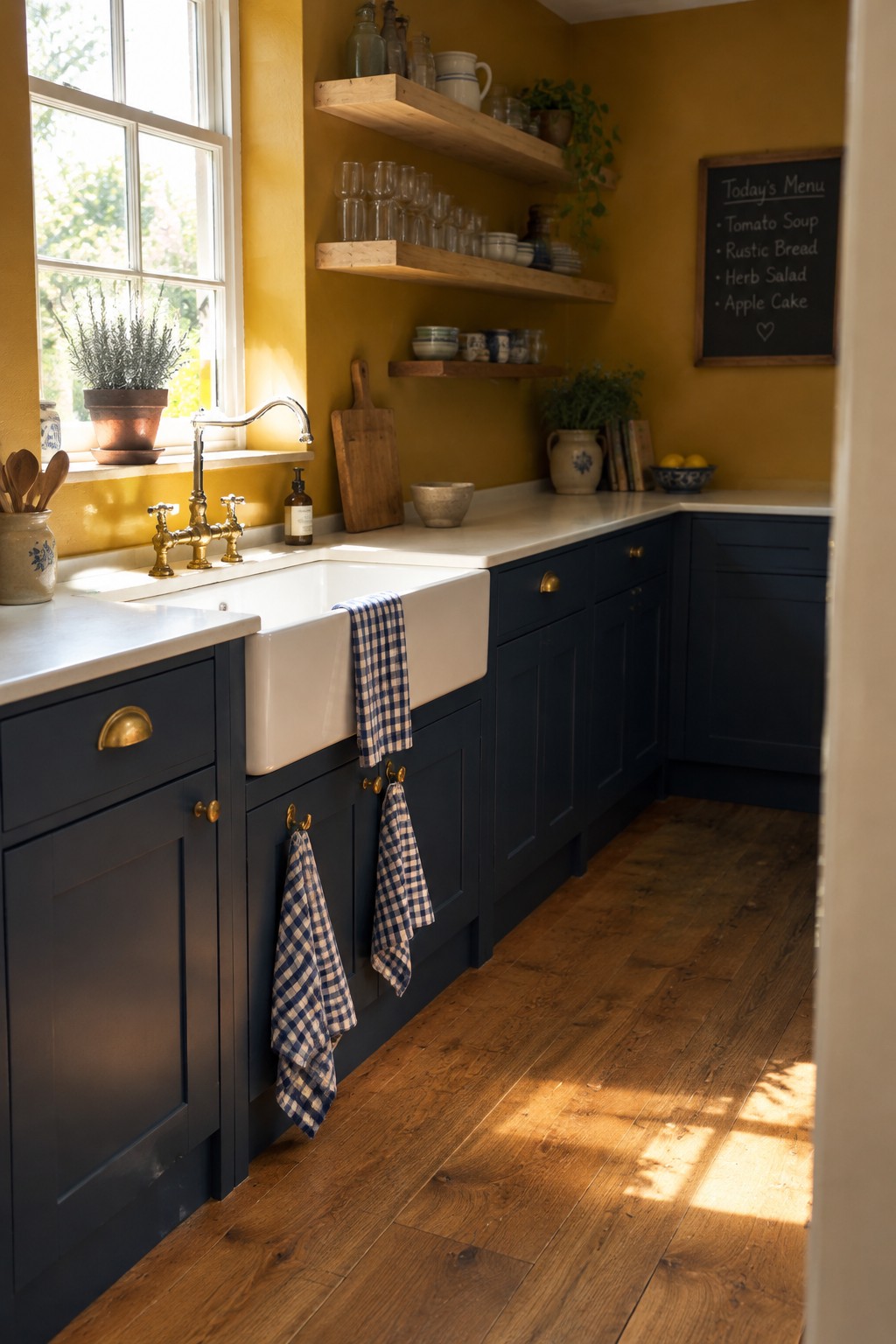
A golden ochre wall color like this looks closest to Sherwin-Williams Goldenrod, Benjamin Moore Stuart Gold, or Farrow & Ball India Yellow. It is a warm, earthy yellow that gives navy cabinets a stronger contrast than a pale cream would, without feeling quite as sharp.
In a kitchen with limited daylight, this much yellow can read quite deep, so test a sample on the wall before painting the whole room. It pairs naturally with brass hardware and warm wood, while white counters help keep the combination from feeling too heavy.
Frequently Asked Questions
Q: What wall color makes navy cabinets feel warm instead of dark?
A: Try a soft creamy white, warm beige, or muted terracotta. These shades bring out the richness of navy without making the kitchen feel heavy.
Q: Can I use a dark wall color with navy cabinets?
A: Yes, especially if your kitchen gets plenty of natural light. Deep green or charcoal can look striking, but balance the dark walls and cabinets with light countertops, warm wood, or bright hardware.
Q: Will cool gray walls work with navy cabinets?
A: They can, but choose a gray with a little warmth so the room doesn’t feel cold. Test a paint sample beside the cabinets at different times of day, since gray can shift noticeably in changing light.