

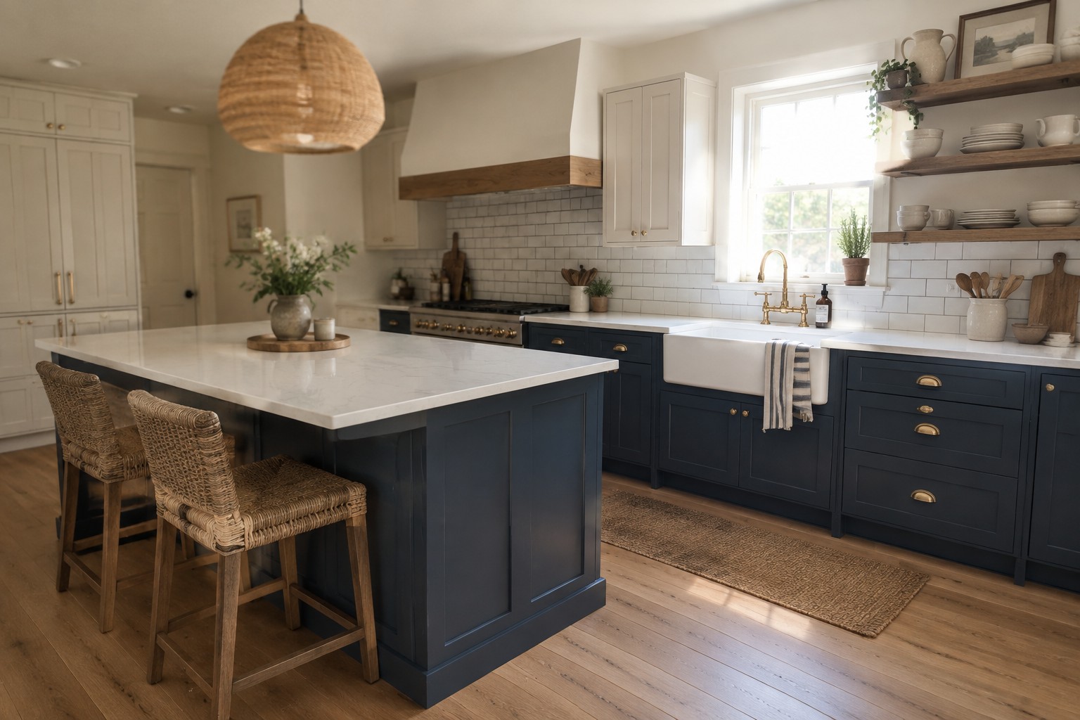
Two-tone cabinets can make a kitchen feel more considered, but the wall color has to work with both finishes rather than compete with either one.
I find that undertones matter most when the cabinets, counters, and flooring sit close together, since a color that looks neutral on a sample can turn pink, green, or muddy in the room.
Changing daylight and warm bulbs can shift the walls again, so I’d test a few shades beside the cabinets and near the trim before settling on one.
Some colors make contrasting cabinets feel connected, while others sharpen the split in a way that can feel busy.
The best options are worth seeing on your own walls at different times of day.
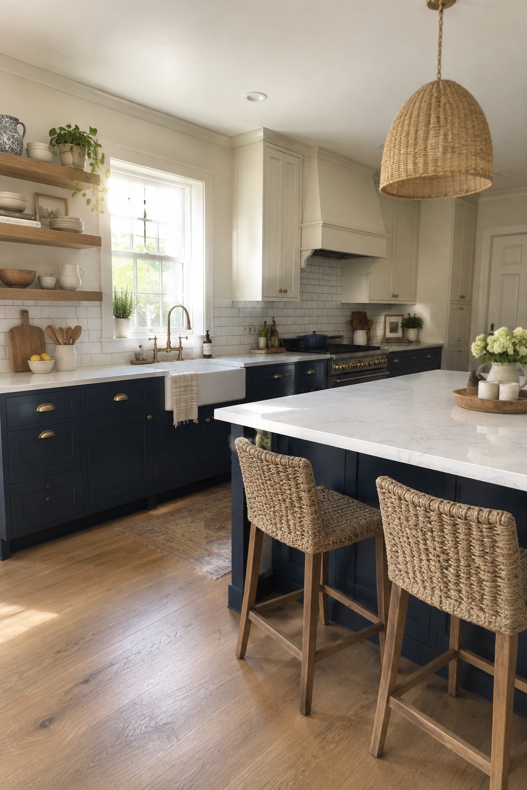
This kitchen’s deep navy cabinetry looks closest to a muted, slightly warm navy rather than a bright blue. For similar colors, consider Benjamin Moore Hale Navy, Sherwin-Williams Naval, or Behr Nocturne Blue. The dark lower cabinets give the room a clear two-tone look while keeping the upper area light.
Navy can read almost charcoal in dim corners, so it works best with good natural light or pale surfaces nearby. White marble and warm wood are useful partners here; test a sample first to make sure the blue doesn’t look too cold in your kitchen.
Blue-Gray Walls Beside White Tile
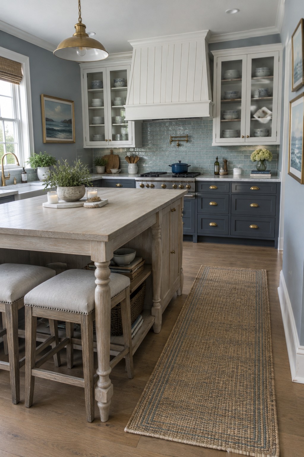
The kitchen walls look like a muted blue-gray, close to Benjamin Moore Smoke, Sherwin-Williams Krypton, or Farrow & Ball Parma Gray. It’s a gentle color for a kitchen with two-tone cabinets, since it gives the white upper cabinets and darker lower cabinets a little separation without competing with either.
The shade leans cool, so it works especially well beside the pale blue-green backsplash tile. If you try it at home, check a sample in your own light first; blue-gray paint can look more gray or more blue from one room to another.
Muted Sage Cabinets With Warm Wood Counters
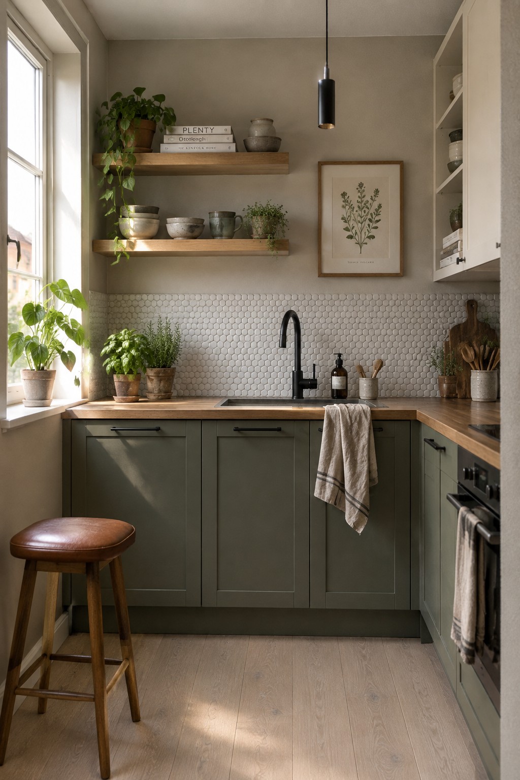
This kitchen uses a muted sage green that looks closest to Benjamin Moore October Mist, Sherwin-Williams Clary Sage, or Farrow & Ball Mizzle. It is a soft, earthy green rather than a bright one, and it gives the lower cabinets a little color without making the small kitchen feel too dark.
The warm wood counters bring out the green’s gentle warmth, while the white tile keeps the combination from feeling too heavy. This kind of sage is worth testing in your own kitchen first, since it can look grayer in cooler light and more olive in a sunny room.
Warm Greige Walls Beside Dark Cabinets
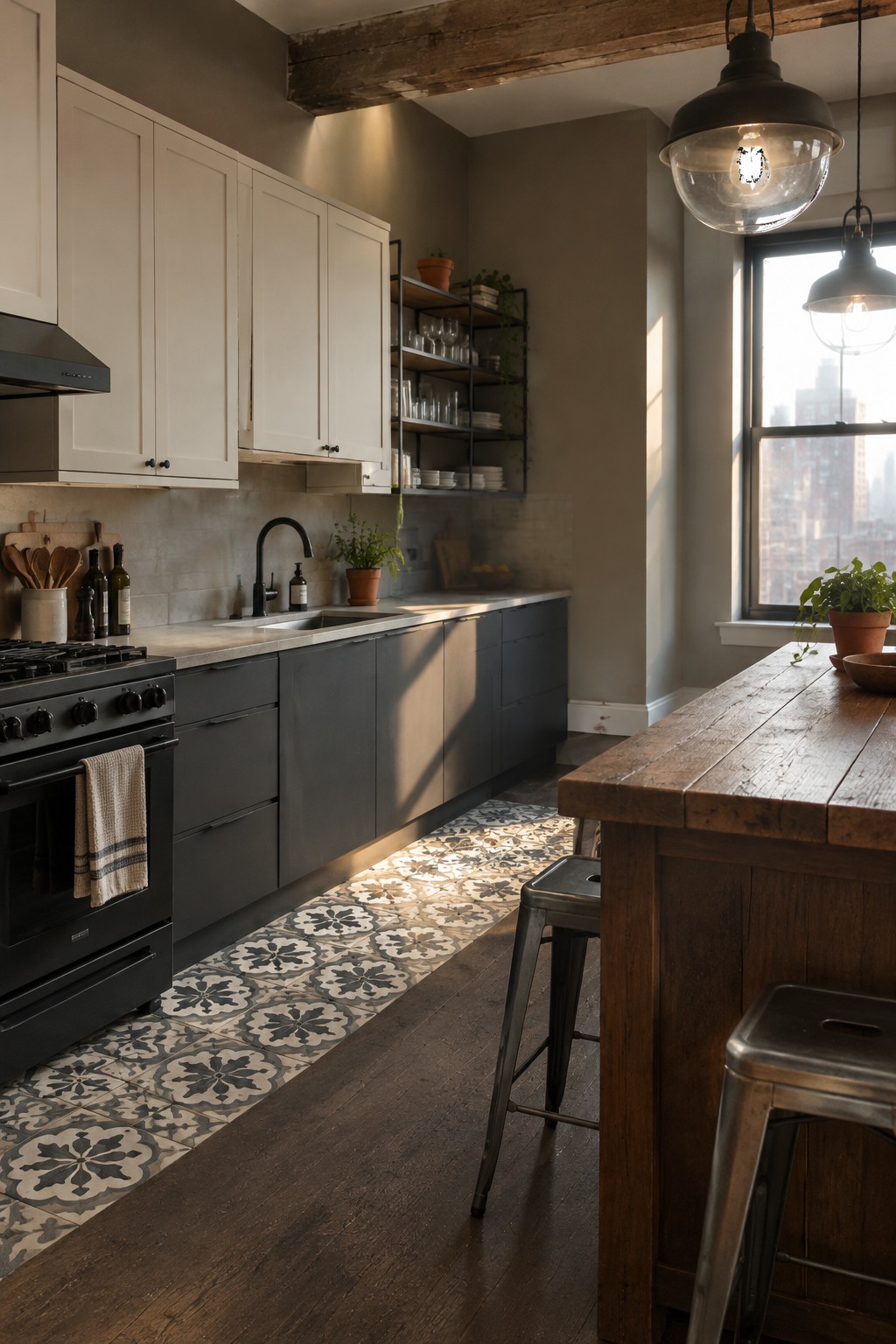
The walls look like a warm greige, a soft neutral between beige and gray. For an unbranded match, I’d consider Benjamin Moore Edgecomb Gray or Sherwin-Williams Accessible Beige, though the exact shade is hard to confirm from a photo. It’s a useful choice for a two-tone kitchen because it keeps the wall color quiet beside darker lower cabinets.
The warm undertone suits the wood floor and patterned tile, while still reading neutral in natural light. Try samples beside your cabinets and check them at different times of day, since greige can lean more beige or gray depending on the light.
Muted Green Walls With Dark Wood Cabinets
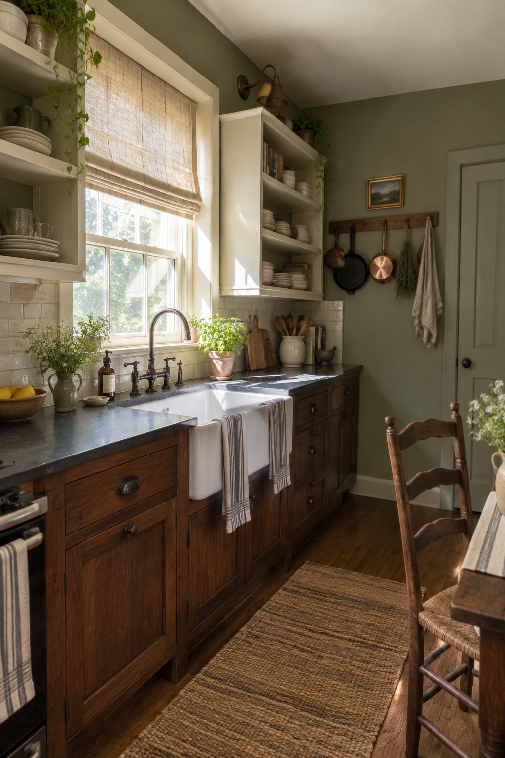
The walls look like a muted sage green, close to Sherwin-Williams Clary Sage, Benjamin Moore October Mist, or Farrow & Ball Mizzle. This soft, earthy color gives a traditional kitchen a quieter feel without making the walls seem stark or overly bright.
Its gray undertone works well beside the dark wood cabinets and white tile. In a kitchen with less daylight, test a sample first, since muted green can look deeper and grayer on the wall.
Warm Greige Walls Beside Walnut Cabinets
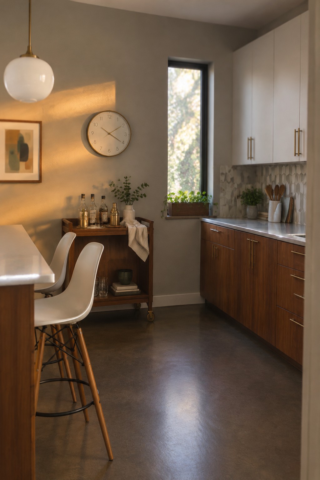
This wall color reads as a warm greige, somewhere between soft beige and muted gray. It looks closest to Sherwin-Williams Accessible Beige, Benjamin Moore Edgecomb Gray, or Behr Wheat Bread. That kind of neutral works well in a two-tone kitchen because it lets darker cabinetry stand out without making the room feel stark.
The walnut cabinets bring out the color’s beige side, while cooler daylight may make it look a little grayer. Try samples on more than one wall before choosing, since the light can shift the balance. It’s a useful choice for a kitchen with dark wood or charcoal accents.
Deep Green Cabinets Beside Dark Stone
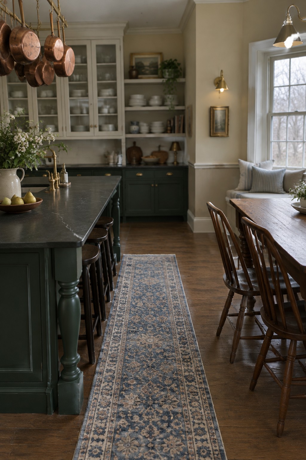
This kitchen’s cabinets look closest to a deep, muted green, with a slightly gray cast. For similar shades, consider Benjamin Moore Essex Green, Sherwin-Williams Rookwood Shutter Green, or Farrow & Ball Studio Green. The color gives traditional cabinetry a little more character without making the room feel too bright or trendy.
The dark stone countertop suits this shade, while the wood floor keeps the overall palette from feeling cold. Green can look nearly black in a dim kitchen, so sample it in your own light before committing. It works especially well on lower cabinets or an island if you want less of it.
Cool Gray Cabinets With Pale Blue Walls
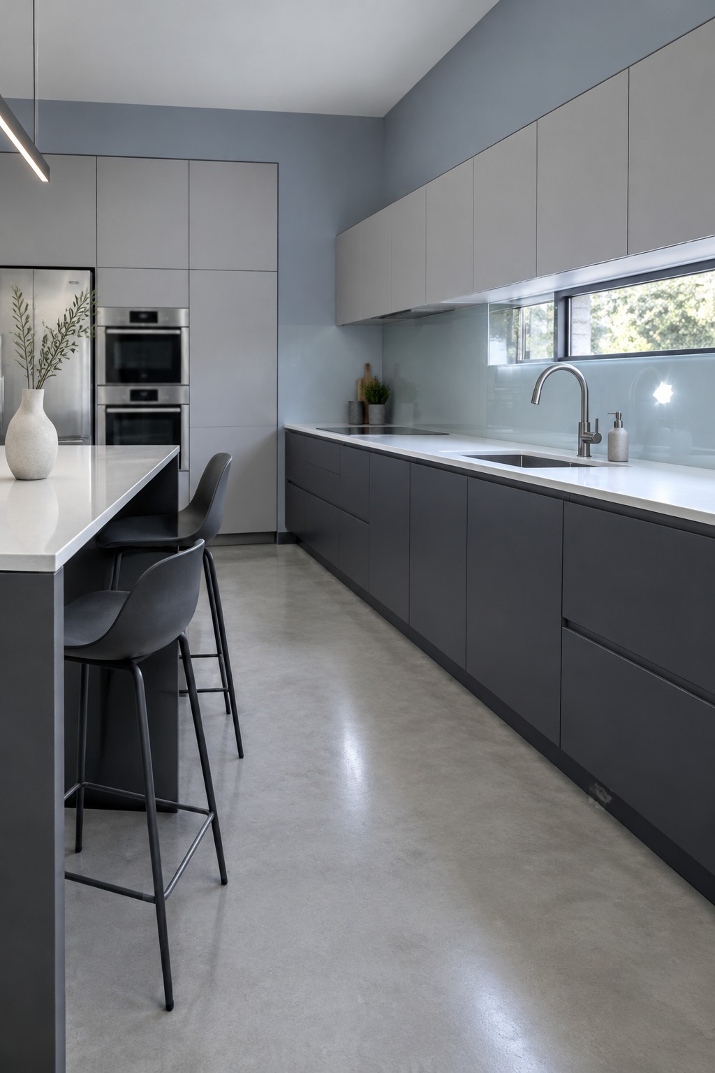
The wall color reads as a pale, cool blue-gray, while the cabinets are a deeper charcoal gray. For a close match, look at Benjamin Moore Smoke, Sherwin-Williams Misty, or Behr Light French Gray. This pairing gives the kitchen contrast without relying on a bright accent color.
The cool wall color suits the concrete floor and white counters, but it may feel chilly in a room with little natural light. If you use a similar shade, test it on the wall first and check it at different times of day.
Warm Gray Cabinets With Copper and Wood
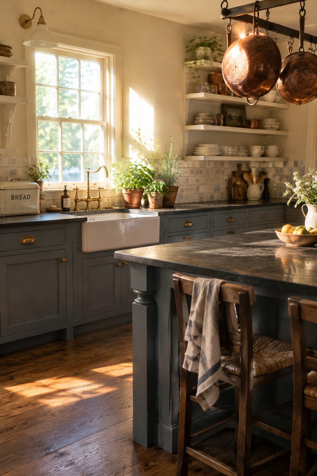
For a two-tone kitchen, the painted cabinets read as a warm charcoal gray, close to matches like Sherwin-Williams Gauntlet Gray or Benjamin Moore Chelsea Gray. It’s a deeper neutral than a typical light kitchen gray, but it still feels easy to live with and gives the room a little more character.
The warm cast works well with the wood floor and copper pans, while the white sink and tile keep the darker cabinetry from feeling too heavy. This color suits a kitchen with plenty of natural light; in a dim room, test a sample first, since it may look much darker.
Muted Greige Walls Above Charcoal Cabinets
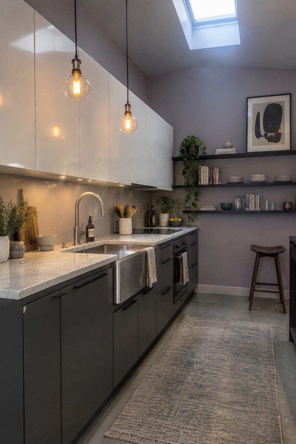
The walls read as a muted greige, a soft gray with a slight warm-violet cast. For close matches, consider Sherwin-Williams Repose Gray, Benjamin Moore Balboa Mist, or Behr Silver Drop. This kind of restrained wall color lets charcoal cabinets feel less stark without competing with the white marble counters.
The skylight may make the paint look cooler, so test a sample at different times before painting the whole kitchen. It works well with dark two-tone cabinetry and pale stone, but a warmer greige may suit a room with less natural light.
Dusty Green Cabinetry Across Walls and Built-Ins
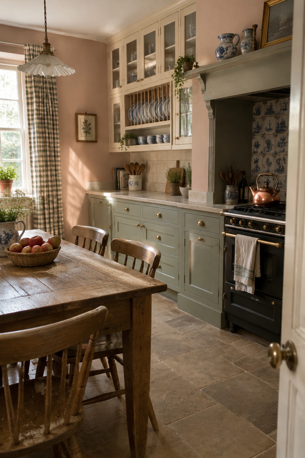
A muted sage green, likely close to Benjamin Moore Saybrook Sage or Sherwin-Williams Clary Sage, suits this traditional kitchen. The color runs across the lower cabinets and built-ins, so the two-tone look feels connected rather than choppy.
Its earthy undertone works well with the warm wood table and brass hardware. In a kitchen with less natural light, sample it first, since this mid-tone green may read deeper than expected.
Muted Green Island With Light Wood Cabinets
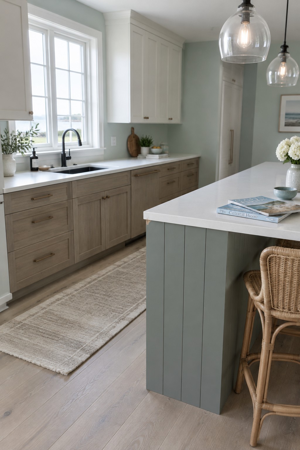
A muted blue-green, somewhere between sage and sea glass, is the main paint idea here. It looks closest to Sherwin-Williams Sea Salt, Benjamin Moore Palladian Blue, or Farrow & Ball Pigeon, though the exact match is hard to pin down. Using it on the island keeps the color noticeable without painting every cabinet.
The gray undertone helps the island sit comfortably beside the pale wood cabinets and white counters. This kind of color works well in a bright kitchen; in a darker room, it may read grayer and less green, so test a sample first.
Muted Green Cabinets Beside Terracotta Tile
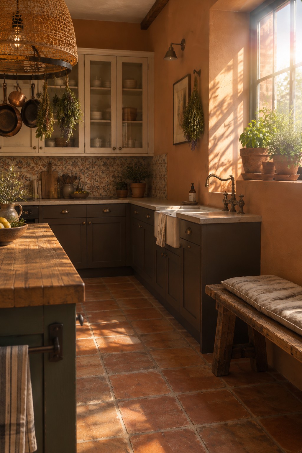
The walls look like a muted terracotta or clay shade, closest to colors such as Benjamin Moore Terra Cotta Tile or Sherwin-Williams Cavern Clay. It is a warm, earthy choice for a kitchen, especially when you want color without a bright, saturated look.
Here, the clay walls work with dark cabinetry and terracotta floor tiles. In a kitchen with less natural light, sample the paint first, since this warm shade can look heavier in a small space. It pairs well with creamy counters and natural wood.
Butter Yellow Walls With Warm Wood Floors
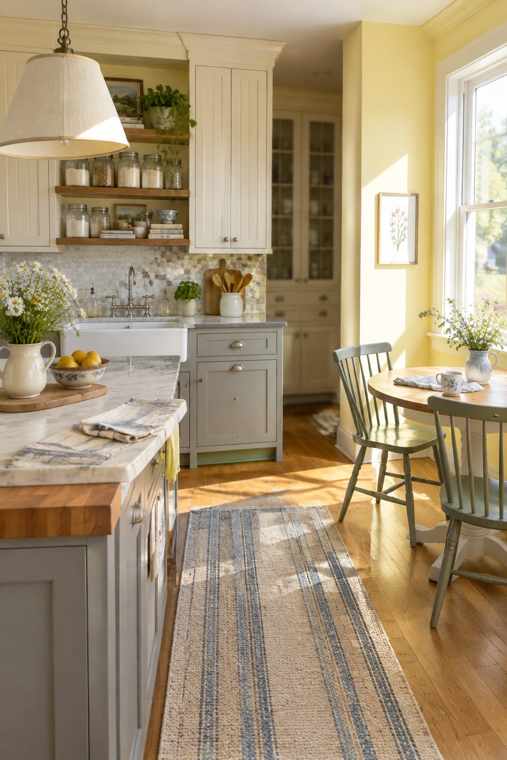
Butter yellow walls look closest to a soft, warm yellow, similar to Benjamin Moore Hawthorne Yellow or Sherwin-Williams Friendly Yellow. This shade keeps a traditional kitchen feeling cheerful without making the color the only thing you notice.
The warm wood floor suits the yellow undertone, while the pale cabinets give it a lighter contrast. In a sunny kitchen, test a sample first, since strong daylight can make yellow look brighter than expected.
Warm Greige Walls With Dark Cabinetry
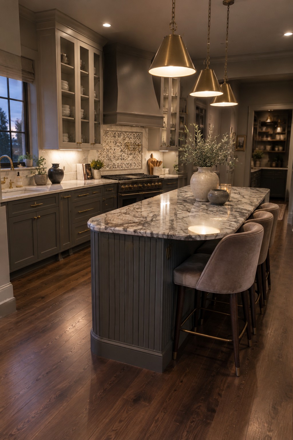
A warm greige is a good wall color to consider with two-tone kitchen cabinets. It looks closest to Benjamin Moore Edgecomb Gray, though Sherwin-Williams Accessible Beige is another possibility. This soft neutral keeps the room from feeling too stark beside the charcoal-gray lower cabinets.
The warmth in greige works well with the dark wood floor and brass cabinet hardware. In a kitchen with less natural light, test a sample first, since some greiges can look noticeably darker or more beige indoors.
Blue-Gray Walls With Walnut Cabinets
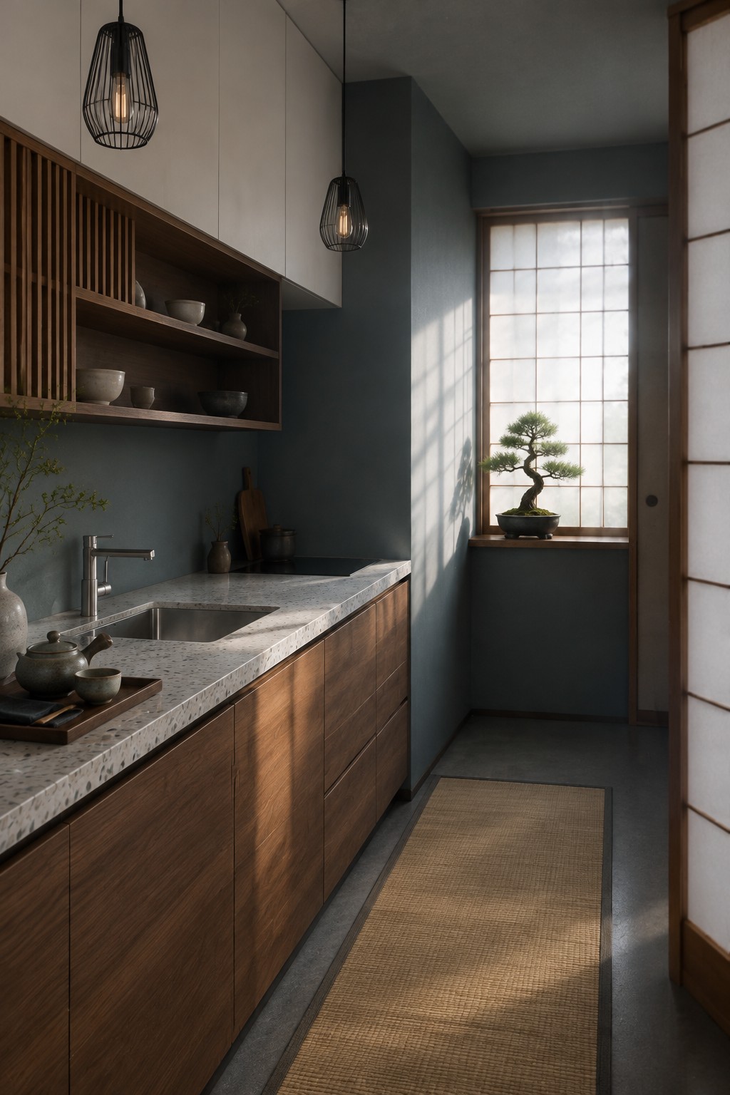
This kitchen’s wall color looks like a muted blue-gray, close to Sherwin-Williams Smoky Blue, Benjamin Moore Boothbay Gray, or Farrow & Ball De Nimes. It is cool without feeling icy, and it gives a narrow kitchen a calm backdrop without competing with the cabinets.
The walnut brings out the color’s softer, slightly green-gray side. Try it with warm wood and light counters, and sample it in your own kitchen first, since limited daylight can make blue-gray paint look darker.
Muted Blue-Green Cabinets With Pale Stone
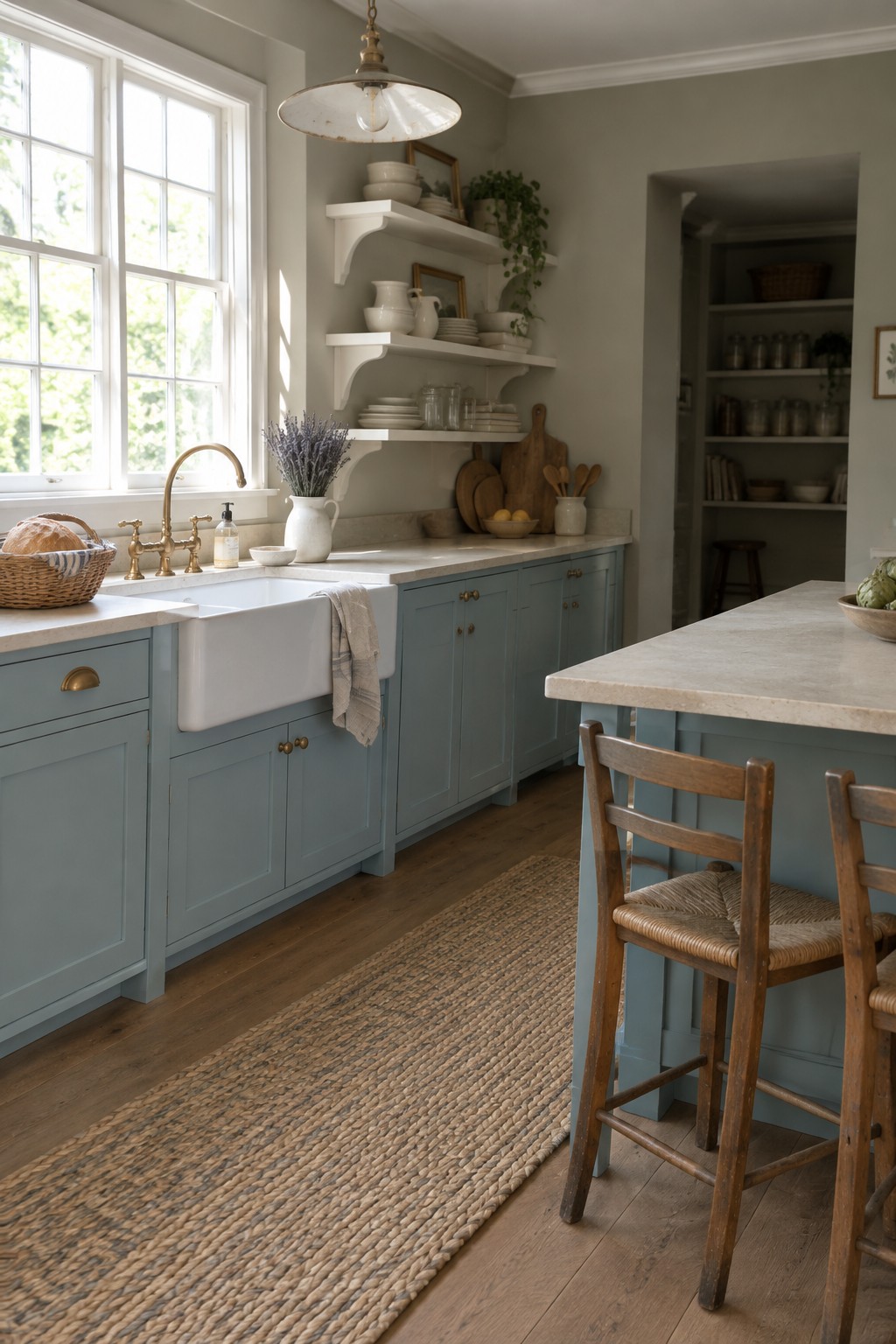
For this two-tone kitchen, the cabinets look like a muted blue-green, somewhere between soft sage and gray. In an unbranded palette, likely matches include Benjamin Moore Saybrook Sage, Sherwin-Williams Sea Salt, or Farrow & Ball Green Blue. The color feels gentle rather than bright, so it gives the cabinetry character without taking over the room.
Pale stone counters help keep the blue-green from reading too dark, while the wood floor brings in a warmer note. This shade is a good fit for a kitchen with plenty of natural light; in a dim room, test a sample first, since the gray undertone may look cooler.
Muted Blue-Gray Walls With Two-Tone Cabinets
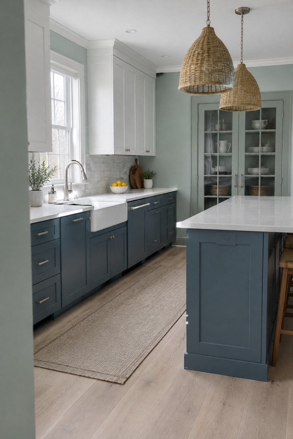
A muted blue-gray is a good choice when you want color in the kitchen without making the walls feel too strong. It reads softly cool here, and would suit a room with darker lower cabinets and white upper cabinets. For similar shades, look at Benjamin Moore Boothbay Gray, Sherwin-Williams Smoky Blue, or Behr Adirondack Blue.
The white marble backsplash and counters help keep the blue-gray feeling light, while the blue cabinet color gives the room more contrast. This kind of pairing works well in a bright kitchen; in a dimmer room, test a sample first, since the walls may look grayer.
Frequently Asked Questions
Q: Should the wall color match one of my cabinet colors?
A: It doesn’t have to. A soft neutral can tie the two cabinet colors together without making the kitchen feel too matchy. If you want a bolder wall color, pick up a subtle undertone from one of the cabinets.
Q: What wall color works with white upper cabinets and dark lower cabinets?
A: Warm white, pale greige, and muted sage all pair nicely with that contrast. Check your cabinet samples beside the wall color in daylight and at night, since lighting can shift how both shades look.
Q: Can I use a dark wall color with two-tone cabinets?
A: Yes, especially if the kitchen gets good natural light or has light countertops. Try the color on one wall first, because a dark shade can feel heavier across a whole small kitchen.
Q: How do I choose a wall color if my cabinets have different undertones?
A: Look at the colors together and find a wall shade that feels comfortable beside both, rather than matching either one exactly. A muted neutral is often an easy bridge.