

Kitchen wall color can shift more than expected once morning light, evening shadows, and warm wood cabinets enter the picture.
I find that soft whites and muted greens work best when their undertones sit comfortably beside the counters, flooring, and trim rather than competing with them.
A shade that looks clean on a sample card may feel cool or dull across a whole wall, so it helps to test a few options in the room.
Scandinavian kitchens often rely on simple finishes, which makes even a subtle wall color noticeable next to pale cabinetry, natural wood, and tile.
I’d start with colors that still feel calm under both daylight and the warmer light used after dark.
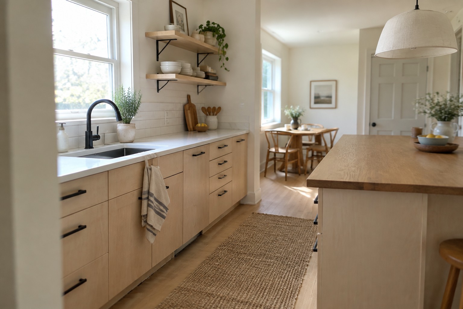
Warm White Walls Beside Pale Wood

The kitchen walls look like a soft warm white, close to Benjamin Moore White Dove, Sherwin-Williams Alabaster, or Behr Swiss Coffee. This gentle neutral keeps a Scandinavian kitchen feeling bright without the starkness of a cooler white.
It works well with pale wood cabinets and flooring, which can look washed out beside a sharper white. Check a sample in your own kitchen first, since warm daylight can make creamy whites look more yellow.
Muted Sage Cabinets With White Marble
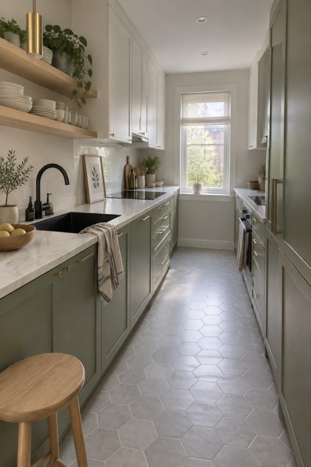
The cabinets look closest to a muted sage green, a soft gray-green that feels calm without looking too pale. Similar shades include Benjamin Moore October Mist, Sherwin-Williams Clary Sage, and Farrow & Ball Mizzle. This color works well in a kitchen because it gives the cabinetry some color while keeping the room light.
The white marble helps the green read a little cooler, especially near the window. Pair sage cabinets with warm wood or simple brass hardware if you want a touch more warmth, and test a sample in your own kitchen before painting since the color can shift with the light.
Warm Greige Walls With Oak Flooring
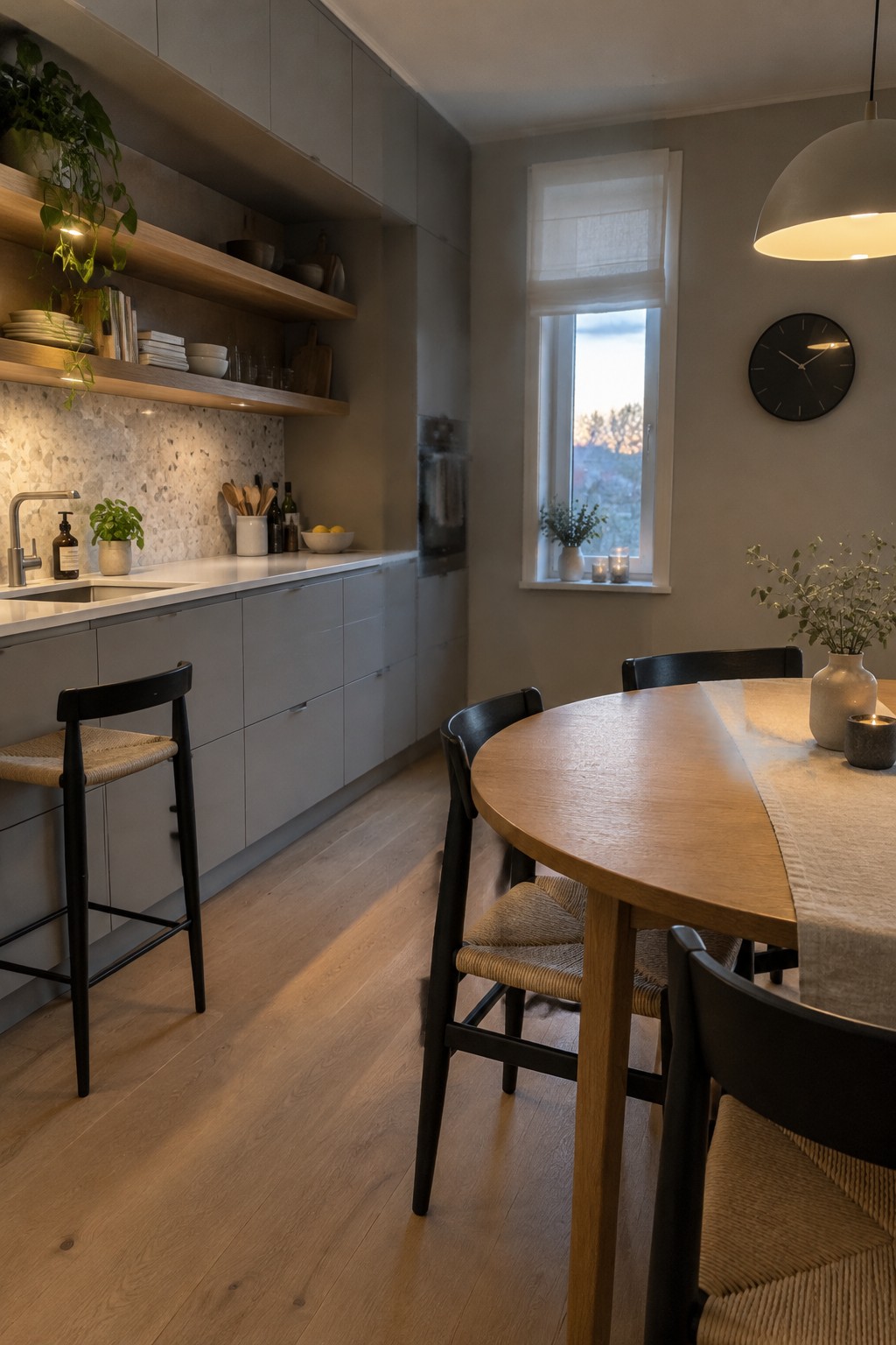
This kitchen’s walls look like a warm greige, a soft gray-beige that keeps a Scandinavian kitchen from feeling stark. Close matches might include Benjamin Moore Pale Oak, Sherwin-Williams Drift of Mist, or Behr Blank Canvas; the exact shade is hard to tell from a photo.
The muted color works well with the light oak floor and gray cabinetry. Try a sample on the wall first, since cooler daylight can make greige look grayer than it does in the evening.
Soft Warm White Across the Kitchen
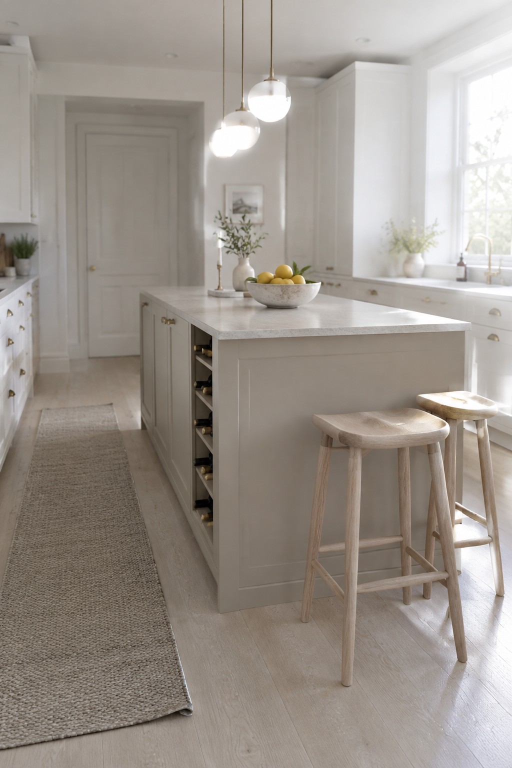
This kitchen’s painted cabinetry looks like a soft warm white, close to Benjamin Moore White Dove, Sherwin-Williams Alabaster, or Farrow & Ball School House White. It’s a gentle neutral rather than a bright, cool white, which suits a Scandinavian kitchen without making the cabinets feel stark.
The pale wood floor and light stone countertop help keep the color feeling natural. In a kitchen with less daylight, test a sample first, since warm whites can look creamier in dim light.
Cool Blue-Gray Walls Above White Tile
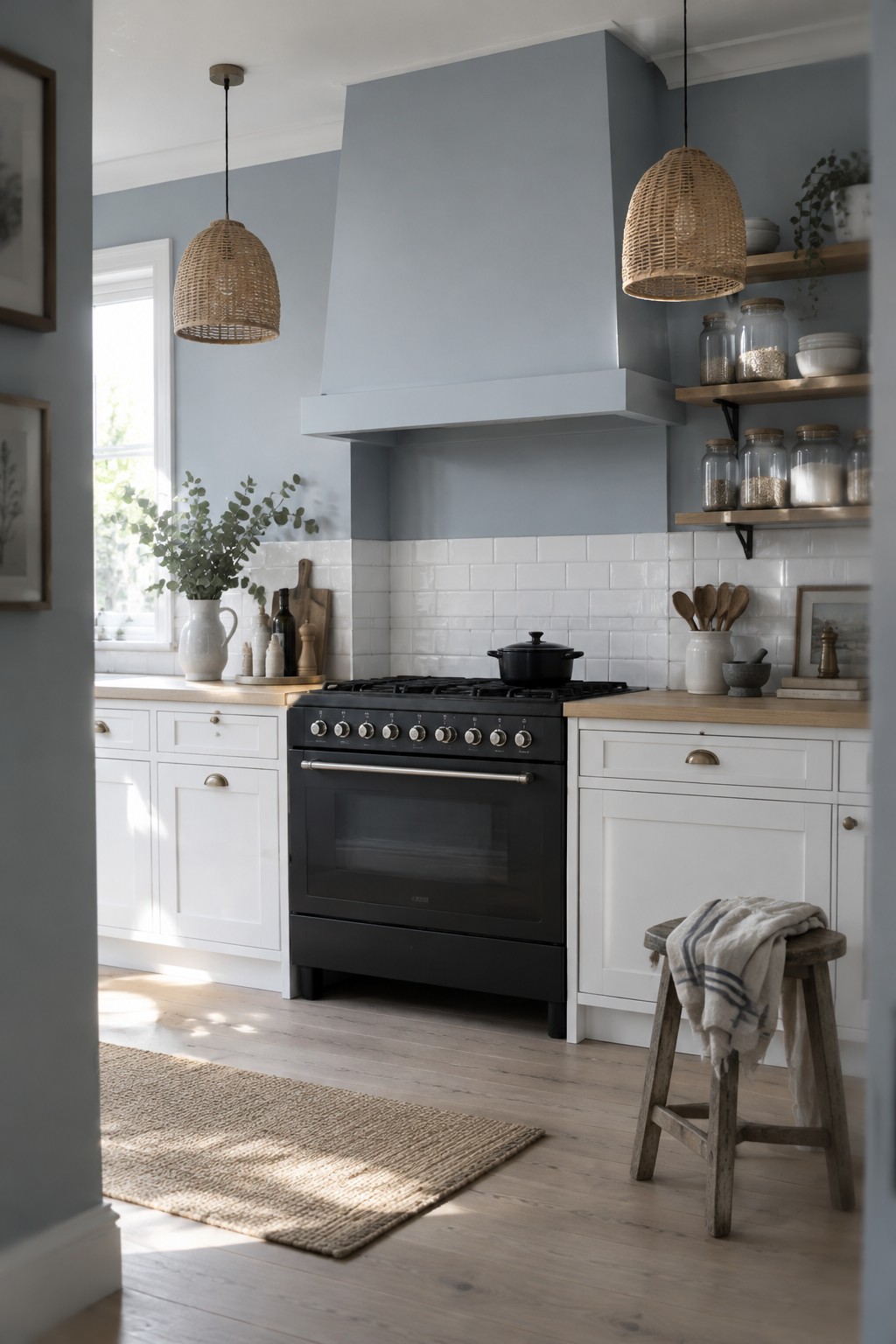
This muted blue-gray looks closest to Benjamin Moore’s Silver Gray, though the match is only an estimate. It has a soft, cool cast that feels fresh without looking stark, and it gives a white kitchen a little more color while keeping the room light.
The shade works especially well above white tile and next to pale wood counters. In a dim kitchen, it may read grayer, so test a sample on the wall before painting the whole room.
Dusty Rose Banquette Beneath Warm White Paneling
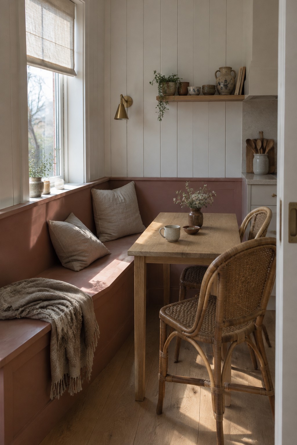
A muted dusty rose on the built-in banquette gives this kitchen nook a gentle, earthy color. It looks closest to Benjamin Moore’s Canyon Dusk, though the exact match is hard to pin down. Painting the seat and lower wall together makes the color feel like a useful part of the room, rather than a small accent.
The shade leans warm, so it pairs easily with natural wood and cream-colored walls. It would suit a breakfast nook or a kitchen that needs some color without going bright. Check a sample in your own light first, since dusty pink can look browner in a dim room.
Warm Greige Cabinets Beside White Marble
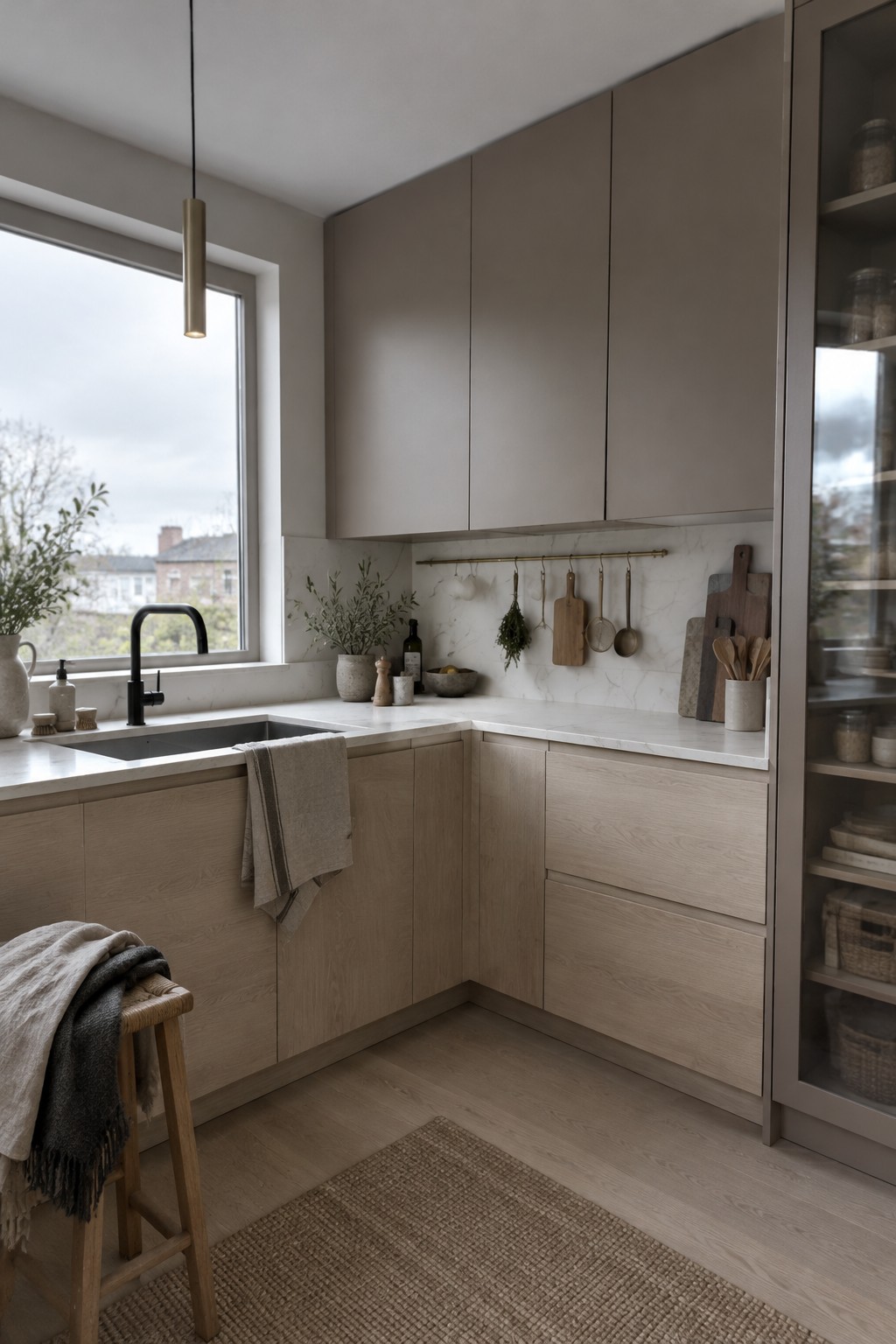
This looks like a warm greige, a quiet mix of gray and beige that suits a clean Scandinavian kitchen. Close matches might include Benjamin Moore Pale Oak, Sherwin-Williams Agreeable Gray, or Farrow & Ball Skimming Stone. The muted color feels softer than white cabinetry but still keeps the room light.
Beside white marble, warm greige can look a little cooler, so sample it in your own kitchen before committing. Pale oak flooring and lower cabinets are a natural fit; choose a shade with enough warmth to avoid a flat, chilly look.
Deep Olive Paint Beside Warm Wood
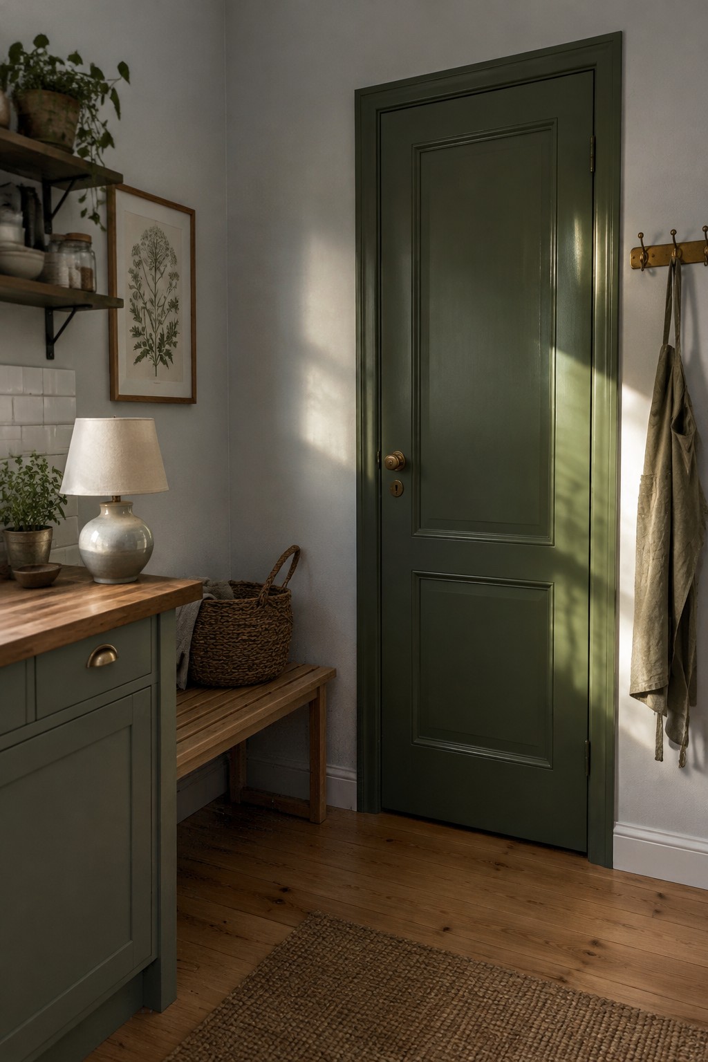
This deep olive green looks closest to Benjamin Moore Essex Green, though the image alone can’t confirm an exact match. It reads almost like a dark green-black, with a muted warmth that keeps it from feeling too sharp. Used on kitchen walls or cabinetry, it can suit a Scandinavian kitchen that has plenty of natural light and warm wood.
The wood floor and counter are good partners for this color. In a dim kitchen, though, the deep shade may feel heavy, so test a sample at different times of day before committing. White tile or a pale countertop can help keep the overall palette feeling clean.
Pale Gray-Green Walls With Warm Wood Shelves

A muted gray-green is a good fit for a Scandinavian kitchen, and this shade looks close to Benjamin Moore October Mist or Sherwin-Williams Sea Salt. It is light enough to keep the room feeling open, but has more color than plain white.
The gray undertone helps it sit comfortably beside the pale wood shelves and island. In a kitchen with less daylight, test a sample first, since the green may read cooler on the wall.
Soft Warm White Across Walls and Cabinetry
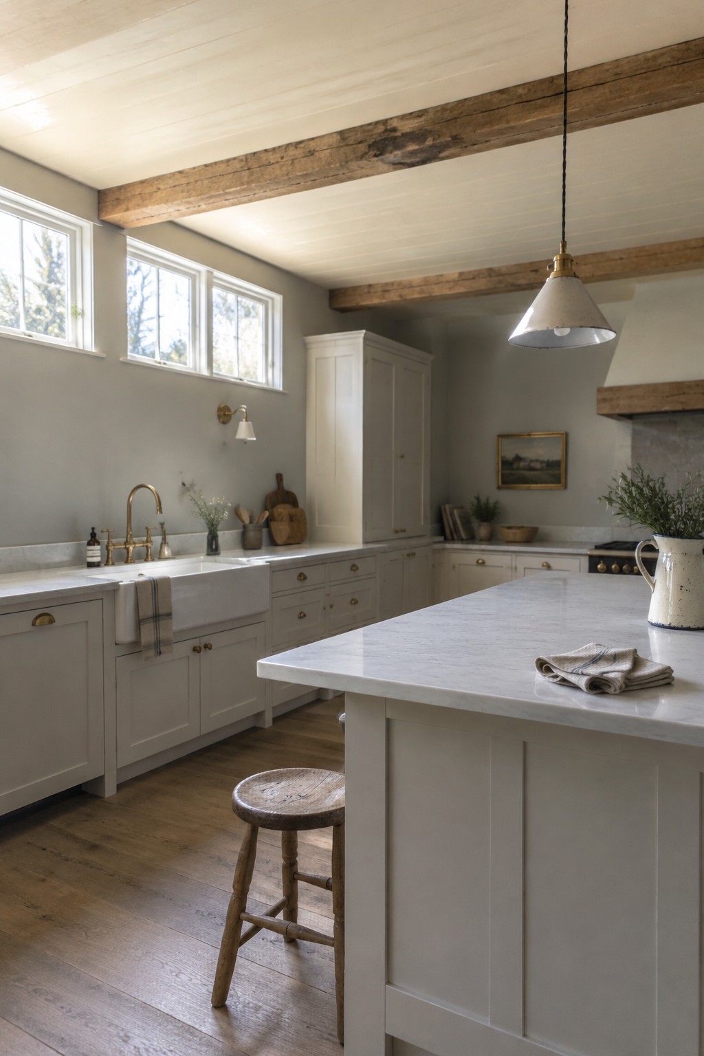
This kitchen’s paint reads as a soft warm white, though the exact shade is hard to confirm from a photo. Similar colors include Benjamin Moore White Dove, Sherwin-Williams Alabaster, and Farrow & Ball School House White. Using a light color on both the walls and cabinets keeps the room feeling open without making it look stark.
The warm wood beams and floors help bring out the paint’s gentle creaminess. Sample a few shades in your own kitchen, since daylight can make warm white look cooler or more yellow than expected.
Blue-Gray Cabinets With a Pale Stone Counter
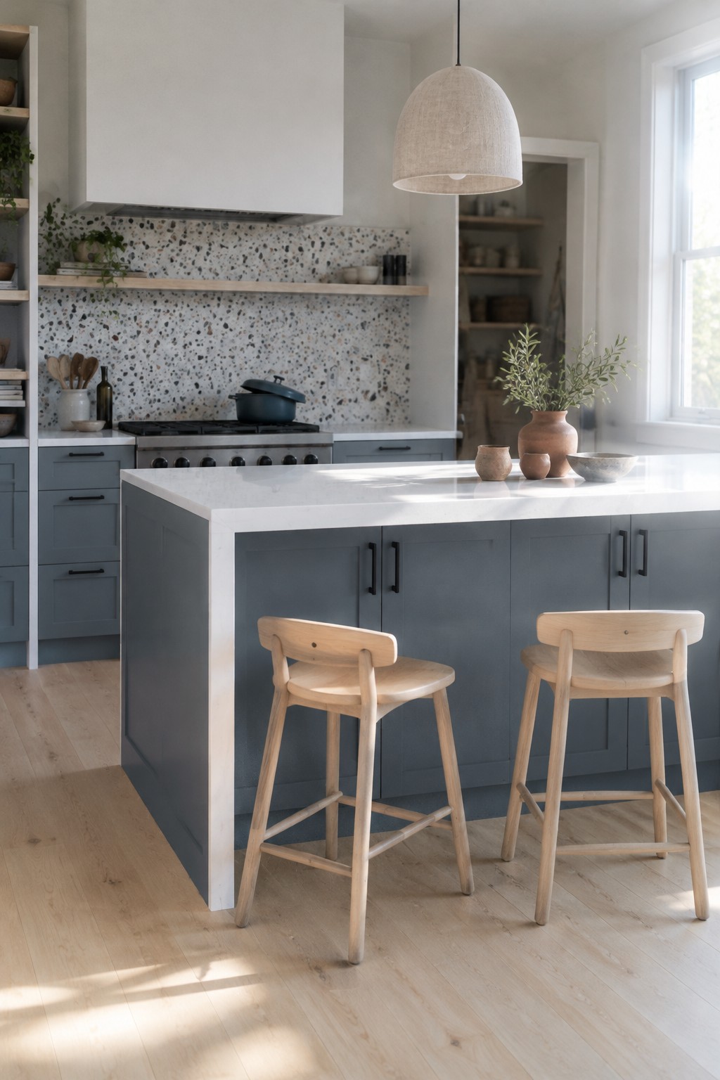
A muted blue-gray is the main paint idea here. It looks closest to Benjamin Moore Boothbay Gray, though the exact shade is hard to confirm from a photo. This mid-tone color is a useful alternative to white cabinets when you want a little more color without making a kitchen feel dark.
The pale countertop keeps the blue-gray from reading too heavy, while the light wood floor suits its cool undertone. Try a sample in both morning and evening light, since some blue-grays can look more gray indoors.
Warm Greige Cabinets Beside Marble
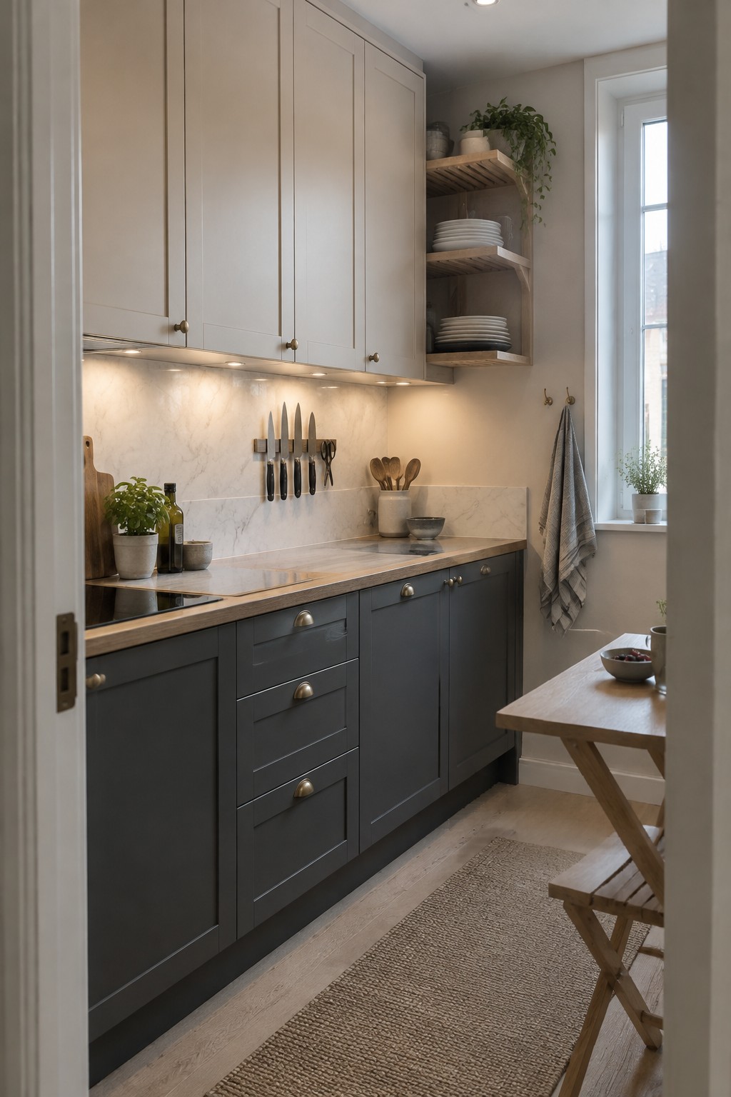
A warm greige is a good choice for kitchen walls when you want a neutral that feels softer than plain white. This shade looks closest to a pale taupe-gray, with a warm undertone. It suits a Scandinavian kitchen without making the room feel stark.
The marble backsplash helps keep the color from feeling too beige, while the dark gray lower cabinets give it contrast. Try a sample on the wall first, since warm light can make greige look creamier than expected.
Muted Blue-Gray Walls With Light Oak
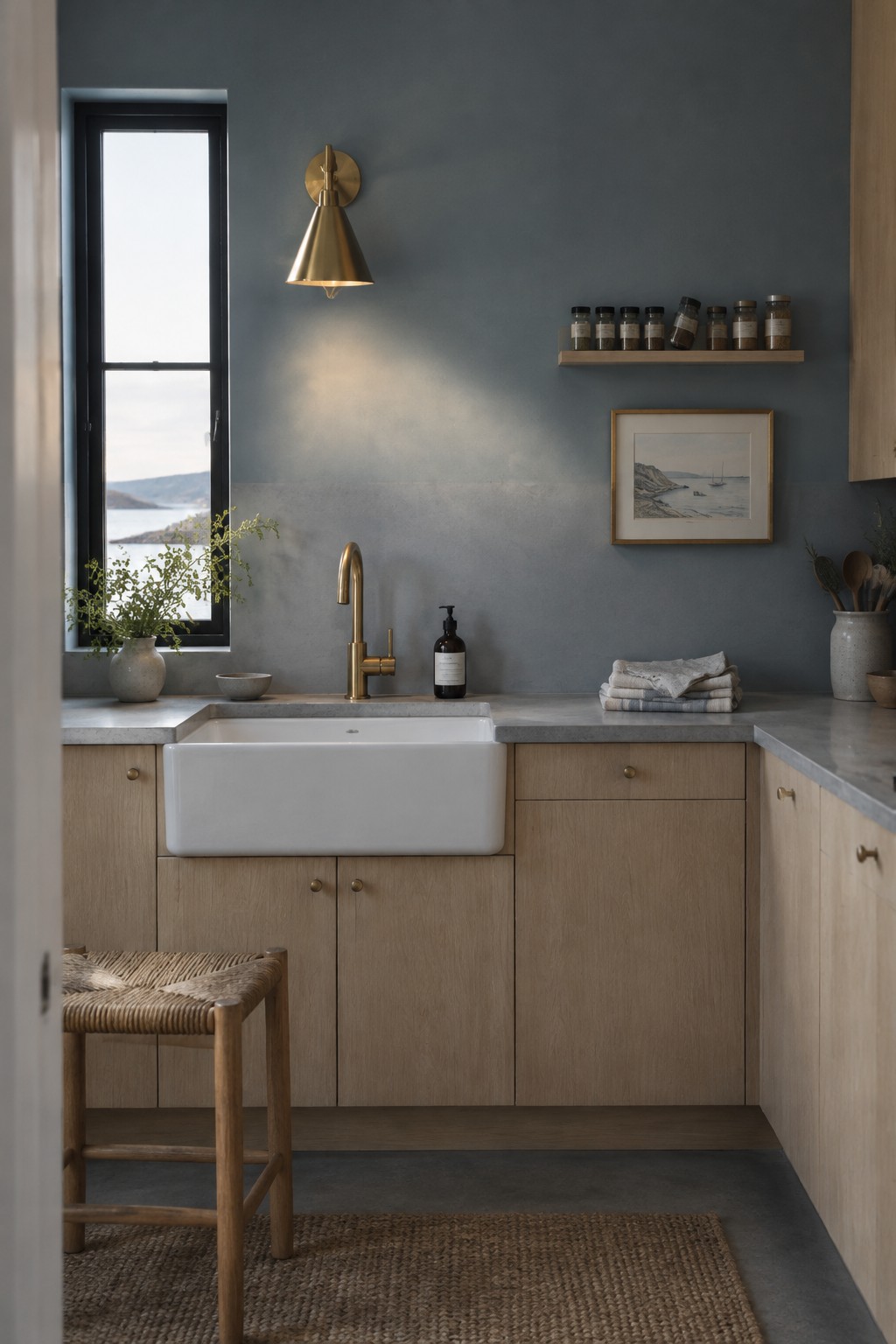
A muted blue-gray is the main paint idea here. It reads cool but not stark, and looks closest to colors like Benjamin Moore Boothbay Gray, Sherwin-Williams Smoky Blue, or Farrow & Ball De Nimes. The shade gives a kitchen a little color while still being easy to live with.
Light from the window keeps the blue-gray from feeling too dark, while the light oak gives it a natural contrast. It would suit a Scandinavian kitchen with simple wood cabinets and pale stone counters. Test a sample in your own room, since this color can look grayer in dim light.
Muted Olive Walls With Oak Shelves
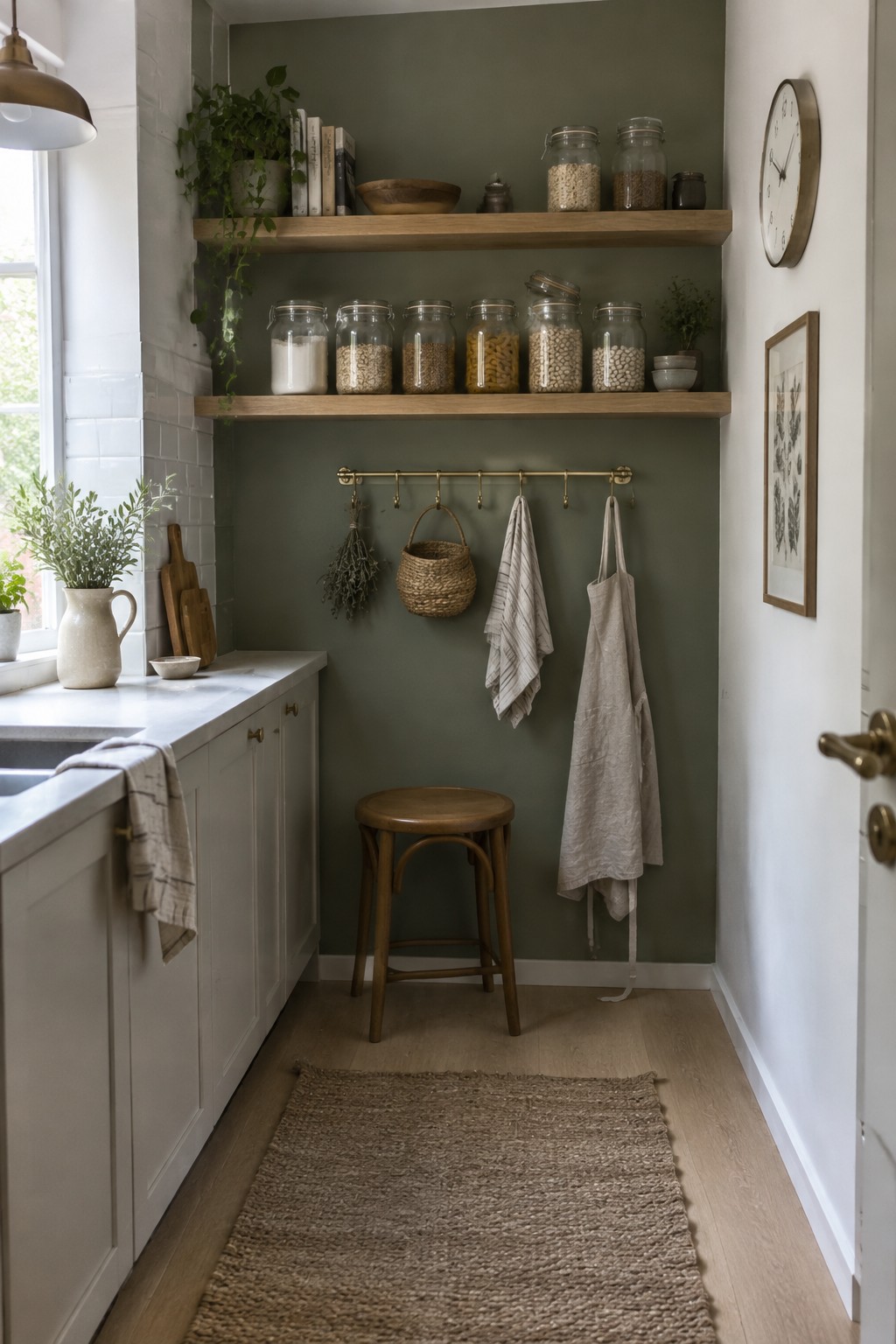
This muted olive green looks closest to a soft, gray-based sage, with likely matches in Benjamin Moore October Mist or Sherwin-Williams Clary Sage. It’s a mid-tone color that gives a small kitchen a cozy feel without making the walls look too dark. The oak shelves bring out its earthy side.
In changing window light, the green may read grayer or more olive, so test a sample on the wall first. It works well with warm wood and simple white surfaces, especially in a narrow kitchen where a little color can make the walls feel less plain.
Soft Warm White With a Light Wood Counter
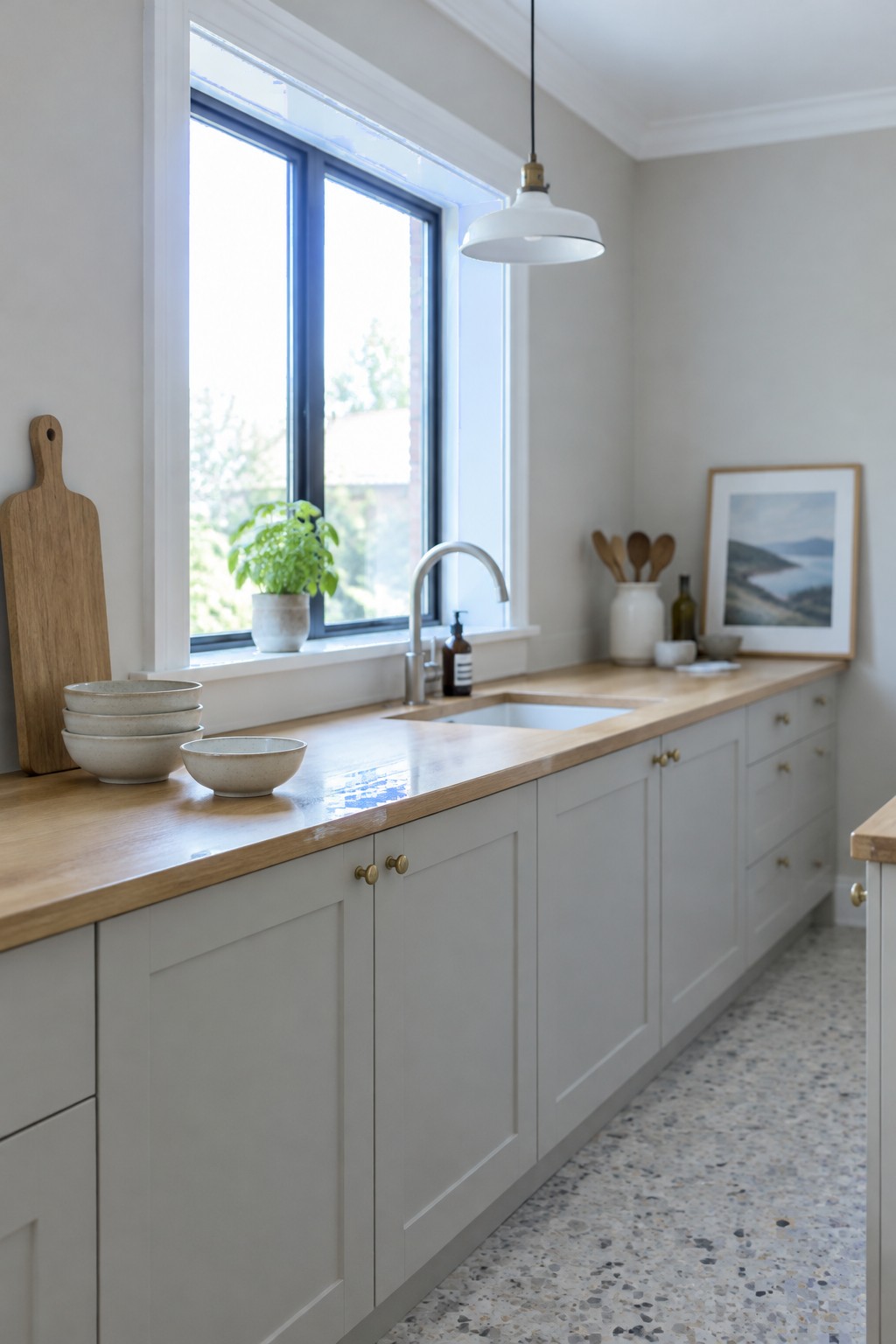
The walls read as a soft, warm white, close to Benjamin Moore White Dove, Sherwin-Williams Alabaster, or Farrow & Ball School House White. It keeps a Scandinavian kitchen feeling bright without looking stark, and the pale wood counter gives the white a gentle warmth.
In a kitchen with strong window light, this shade should stay airy. Pair it with white trim and light wood, and test a sample first since cooler light can make warm whites look grayer.
Warm Greige Pantry Doors Beside Light Wood
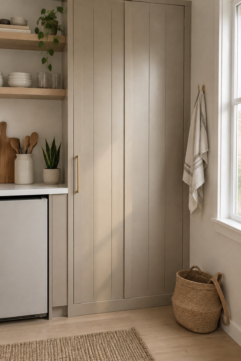
This looks like a warm greige, a soft neutral with a beige cast rather than a cool gray. Similar shades include Sherwin-Williams Accessible Beige, Benjamin Moore Pale Oak, and Behr Wheat Bread. On tall pantry doors, it gives a Scandinavian kitchen a little more color than white without making the storage feel heavy.
The light wood shelves and floor suit this shade, while natural window light helps keep it from looking too muddy. Try a sample on the pantry doors first, since greige can shift toward beige or gray depending on the room.
Muted Terracotta on the Kitchen Island
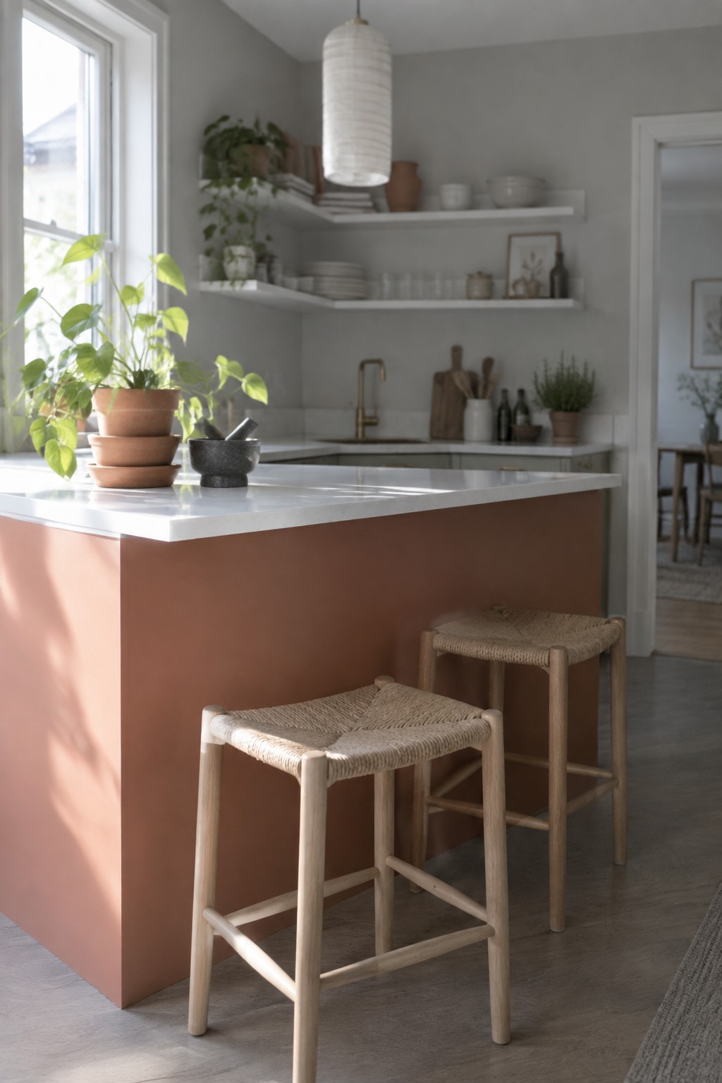
Terracotta pink looks closest to this island color, with a muted, earthy quality rather than a bright orange tone. It’s a useful way to bring color into a Scandinavian kitchen without painting every cabinet or wall.
The shade pairs naturally with the white marble countertop and pale wood stools. In strong window light it may look lighter and pinker, so test a sample in your kitchen before choosing a final paint color.
Warm Greige Walls Above White Tile
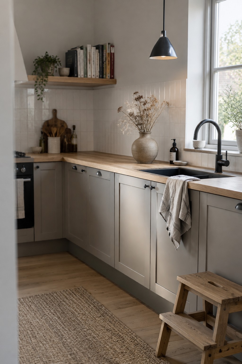
A warm greige is a good fit for a Scandinavian kitchen when you want something softer than plain white. This shade looks closest to Benjamin Moore Pale Oak, Sherwin-Williams Agreeable Gray, or Farrow & Ball Skimming Stone, though the exact match is uncertain. Its quiet, neutral feel works well on walls without making the room seem stark.
Here, the color sits above white tile and near pale wood, which helps keep it from reading too cool. Try it in a kitchen with limited natural light, but test a sample first: some greiges can look noticeably beige in warmer light.
Warm Greige Walls Beside Natural Oak
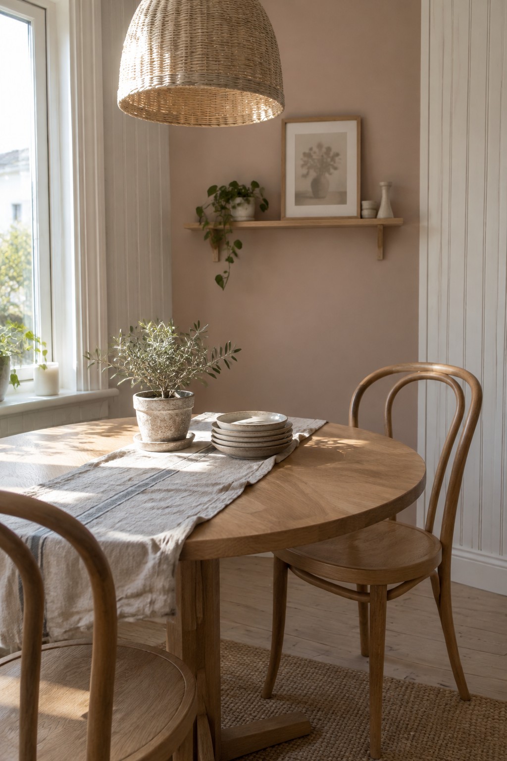
The walls read as a warm greige, a soft neutral with a faint pink-beige cast. A close match might be Benjamin Moore Pale Oak, Sherwin-Williams Egret White, or Farrow & Ball Skimming Stone. It’s a gentle choice for a Scandinavian kitchen when plain white feels a little stark.
The natural oak table and pale wood floor suit this color well. In strong window light, the walls may look lighter and more beige, so test a sample in the room before painting.
Charcoal Cabinets With White Marble
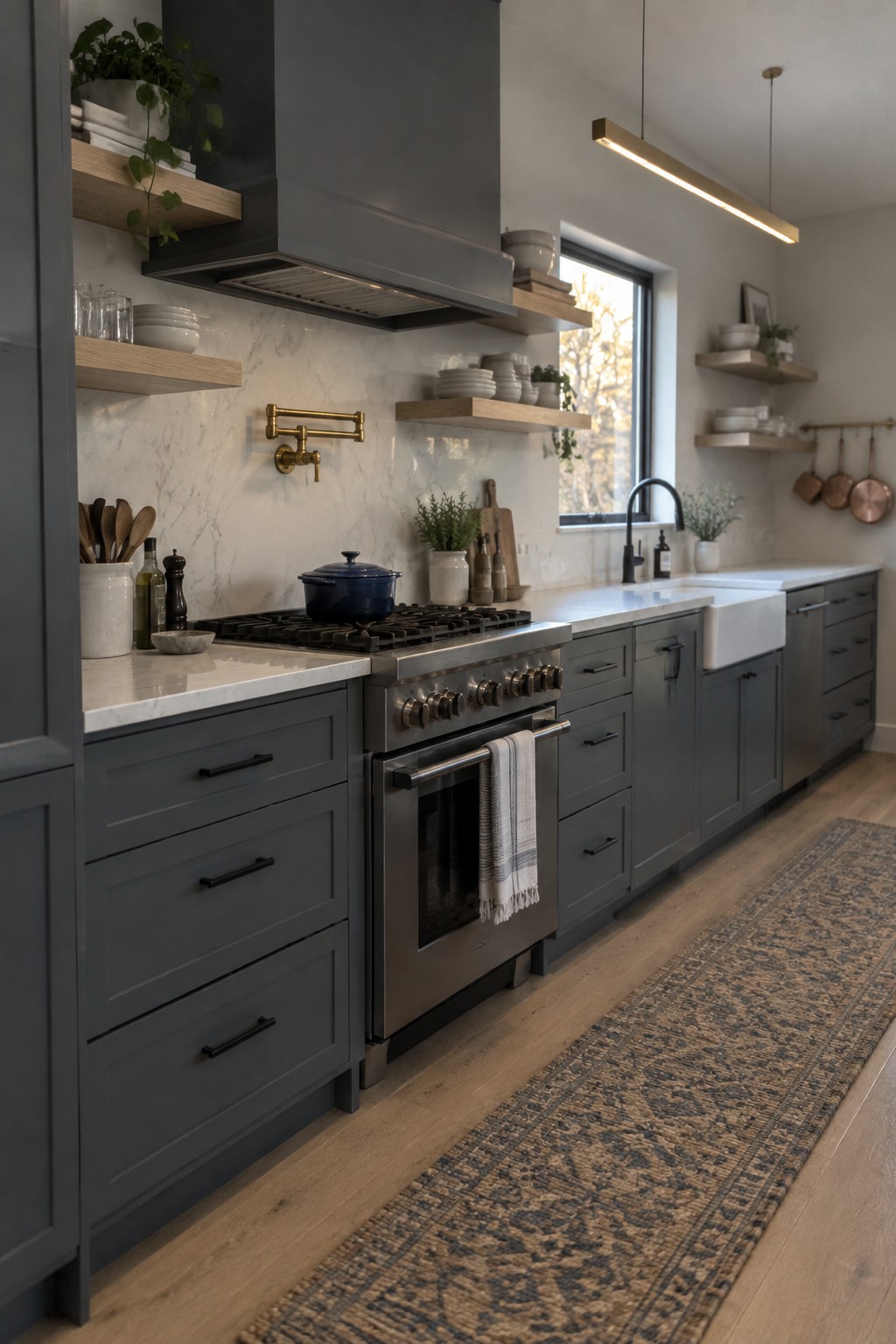
A deep charcoal gray is the main paint idea here, likely close to Benjamin Moore Kendall Charcoal or Sherwin-Williams Peppercorn. It gives kitchen cabinets a clear, darker color without the starkness of pure black. The pale marble countertop and backsplash keep the combination from feeling too heavy.
This shade works well in a kitchen with good natural light and warm wood nearby. If the room gets little daylight, test a sample first, since charcoal can read nearly black in a dim corner.
Frequently Asked Questions
Q: What wall color works best in a small Scandinavian kitchen?
A: Soft white or pale warm gray can help a small kitchen feel open without looking stark. If the room gets little daylight, choose a warmer shade so the walls don’t feel cold.
Q: Can I use a darker color in a Scandinavian kitchen?
A: Yes. A muted forest green or deep blue can look great on one wall, especially with light wood cabinets and simple decor. Keep the other walls light to balance it.
Q: How do I choose between warm white and cool white paint?
A: Check the paint beside your cabinets and countertops at different times of day. Warm white tends to suit oak and other honey-toned woods, while cool white pairs neatly with gray finishes.
Q: What finish should I use on kitchen walls?
A: Eggshell or satin is usually a practical choice because it’s easier to wipe clean than a flat finish. Keep the sheen subtle so the walls still feel soft and calm.