

Small kitchens can handle bright wall colors well, but the shade needs to work with the room’s light and finishes.
I’ve found that a yellow or green can look fresh on a paint chip, then feel much stronger beside white cabinets or warm wood once it covers a full wall.
Soft, clear tones often keep a compact kitchen feeling open, while muddy undertones can make it seem dimmer than expected.
Trim, counters, and flooring also affect how a wall color reads, so I’d test a few samples near those surfaces and check them in morning and evening light.
The right color can bring energy to a small kitchen without making it feel crowded.
Sunny Yellow Walls With Warm Wood

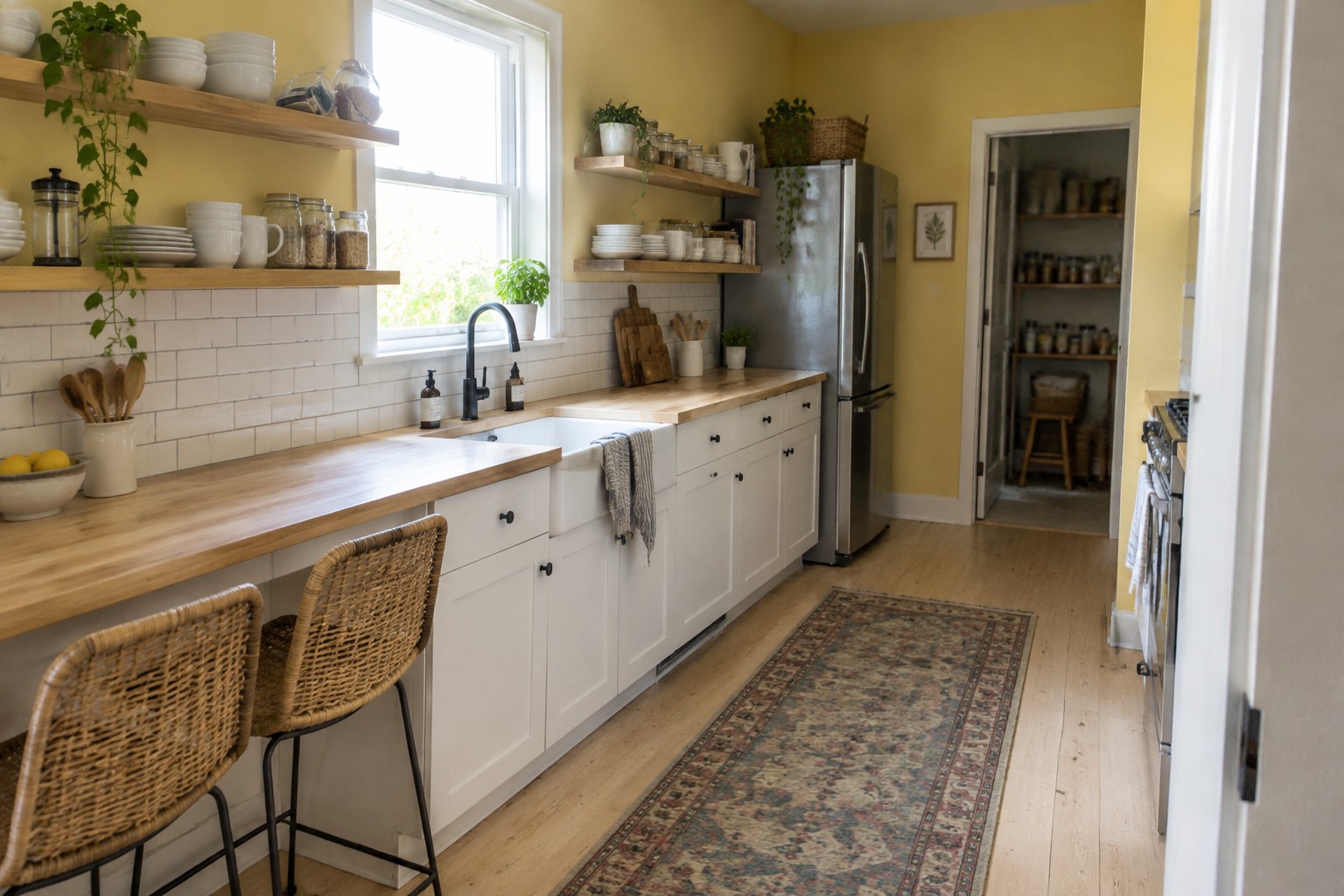
A soft, warm yellow looks like the main wall color here. It reads as a cheerful but gentle shade, rather than a sharp lemon yellow, and it can help a small kitchen feel brighter without making the walls seem stark. A close match might be Benjamin Moore Hawthorne Yellow, Sherwin-Williams Friendly Yellow, or Behr Corn Stalk; the exact shade is hard to pin down from a photo.
The yellow works especially well with the honey-toned wood counters. In a kitchen with less daylight, test a sample first, since warm yellow can look deeper under softer light. White tile and cabinets are easy pairings if you want to keep the room feeling open.
Pale Blue-Green Walls Beside White Marble

The walls look like a pale blue-green, somewhere between soft aqua and muted sea glass. For a small kitchen, this kind of light color can keep the room feeling open without resorting to plain white. Close matches might include Benjamin Moore Palladian Blue, Sherwin-Williams Sea Salt, or Behr Light Blue.
The color reads cool beside the white marble, but it still has enough green to feel gentle rather than icy. It should work well with white cabinets and warm wood floors; test a sample first, since cooler daylight can make it look bluer.
Bright Orange Walls Above White Tile
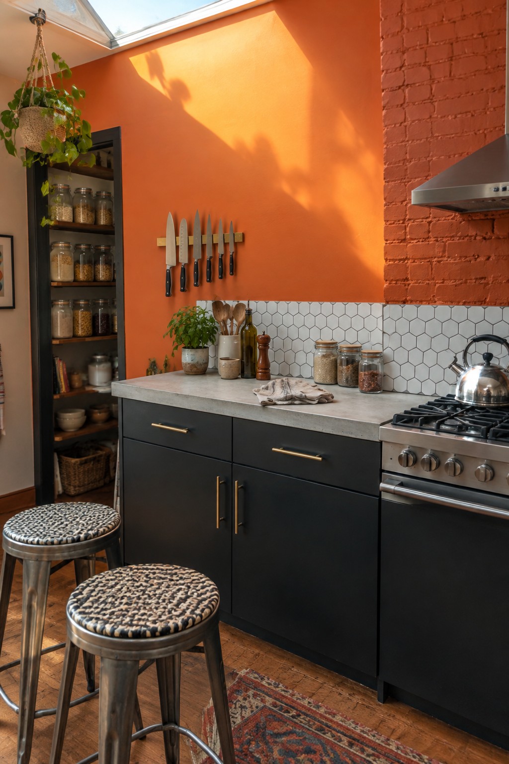
This looks like a saturated, warm orange, close to Benjamin Moore’s Tangerine Dream, Sherwin-Williams Carnival, or Behr’s Orange Zest. In a small kitchen, orange brings color to the walls without taking up counter or cabinet space, and the white hex tile helps keep the strong shade from feeling too crowded.
The color leans red-orange, so it can look especially vivid in a sunny kitchen. Pair it with charcoal cabinets or natural wood, and test a sample first: in a dimmer room, this much orange may feel heavier than expected.
Warm Yellow Walls in a Narrow Kitchen

This looks like a soft, warm yellow, close to Benjamin Moore Hawthorne Yellow, Sherwin-Williams Friendly Yellow, or Farrow & Ball Dayroom Yellow. It gives a small kitchen a sunny feel without relying on a strong, saturated shade. The color works especially well with white cabinets and natural wood.
Yellow can look brighter in direct window light, so test a sample on more than one wall before painting the whole room. A muted, buttery shade is usually easier to live with than a sharp lemon yellow, especially in a narrow kitchen.
Mint Green Walls With Teal Tile
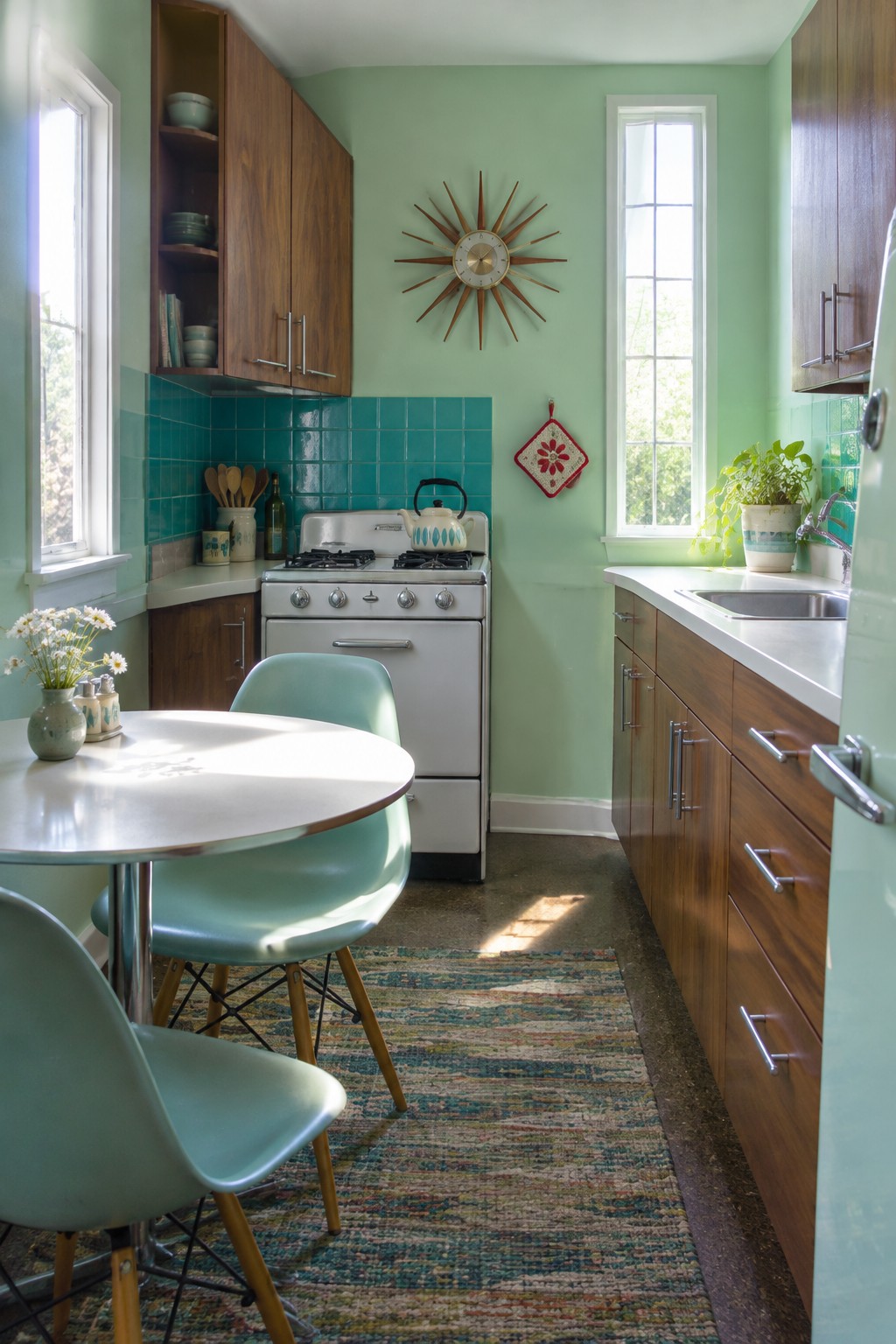
This looks like a pale mint green, close to Benjamin Moore Soft Fern, Sherwin-Williams Window Pane, or Behr Green Aqua. It is a bright, cool-leaning choice for a small kitchen, and the lighter walls help the narrow room feel open without relying on plain white.
The teal tile gives the green a stronger, bluer neighbor, while the wood cabinets keep the palette from feeling too cool. Try samples on more than one wall, since daylight can make a pale green shift noticeably.
Coral Walls With Patterned Blue Tile
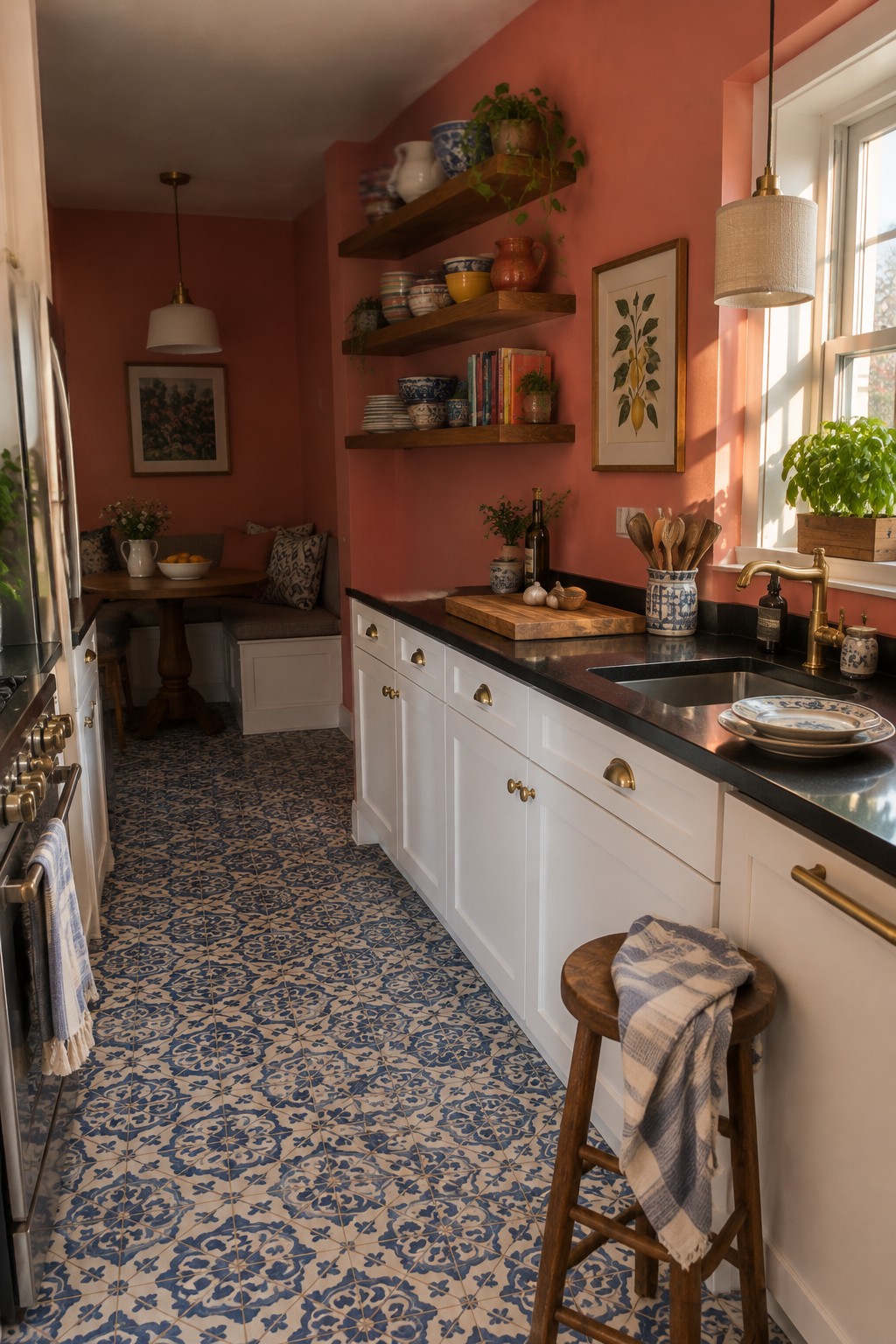
The walls look like a warm coral pink, close to Benjamin Moore Coral Gables, Sherwin-Williams Lei Flower, or Behr Coral Fountain. It is a lively choice for a small kitchen, but the earthy red undertone keeps it from feeling too sugary. The color gives the narrow room a brighter, more personal feel without relying on white walls.
Here, the blue-and-cream floor tile gives the coral a clear contrast. In a kitchen with less daylight, test a sample first, since this warm shade may read stronger on the walls than expected.
Pale Blue Walls Beside Warm Wood

This soft blue paint looks closest to Benjamin Moore Smoke, though the exact match is uncertain. It has a cool, slightly gray cast that feels light without looking stark, a useful choice for a small kitchen where white can feel too plain.
The warm wood table and chairs keep the blue from reading too chilly. In a kitchen with limited daylight, test a sample first, since this shade may look grayer in cooler light.
Soft Blue-Lavender Walls Above White Paneling
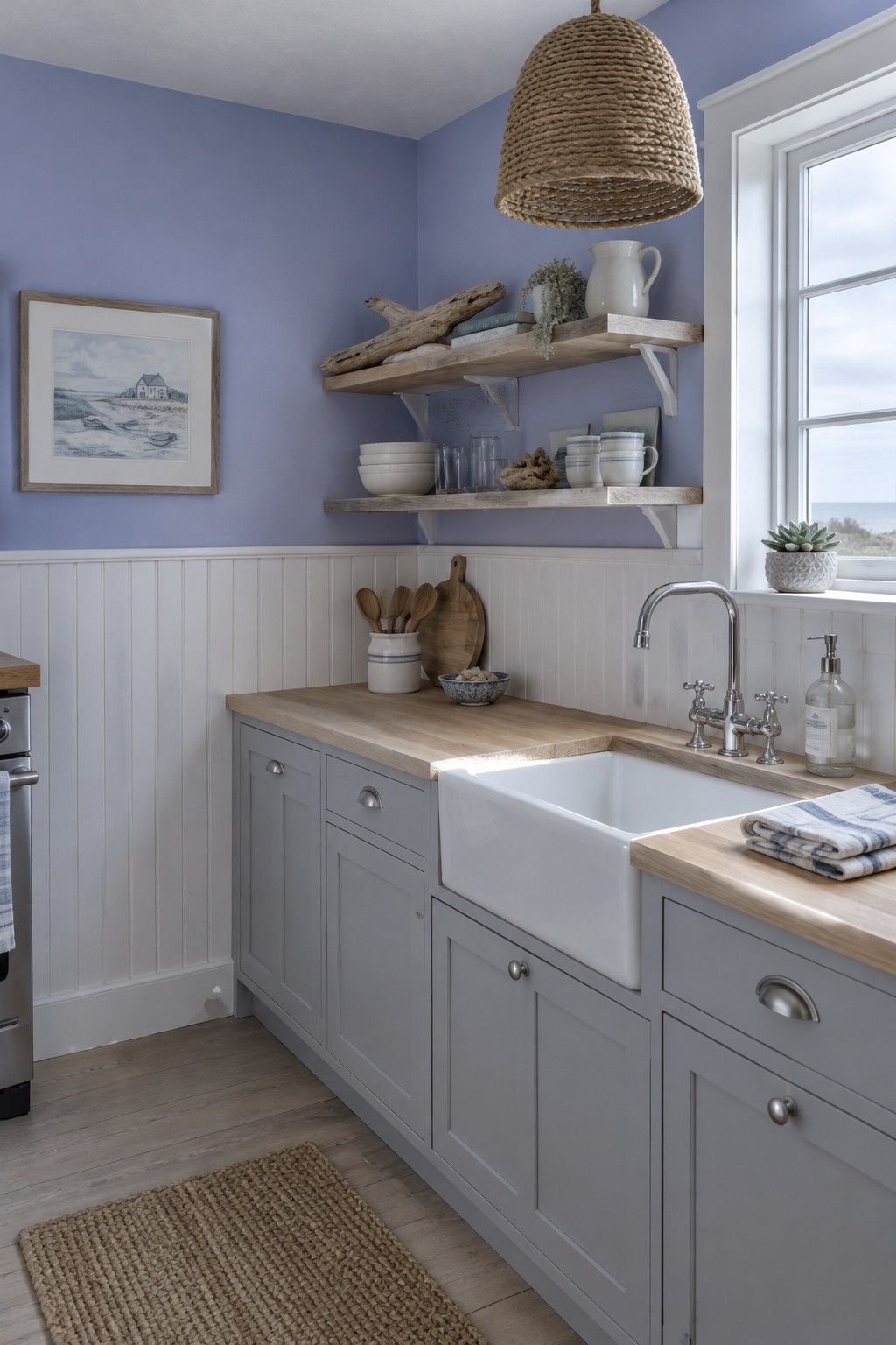
This looks like a soft blue-lavender, a cool, muted shade that feels lighter than a typical purple. For a close match, I’d look at Benjamin Moore Quiet Moments, Sherwin-Williams Silvermist, or Behr Light French Gray, though the exact color is hard to pin down from a photo. It can brighten a small kitchen without the sharpness of a stronger blue.
The white paneling keeps the lower half of the room feeling crisp, while the wall color gives the space a little more character. Try a sample near the window first, since cool daylight can make blue-lavender paint look grayer.
Warm White Cabinets With Dark Wood

For a small kitchen, a warm white is a bright choice that still feels comfortable rather than stark. It looks close to Benjamin Moore White Dove, Sherwin-Williams Alabaster, or Behr Swiss Coffee, though the exact match is hard to tell from a photo. Used on upper cabinets, this kind of white can help a compact kitchen feel more open.
The creamy undertone sits easily beside dark wood cabinets and flooring. It works best with warm finishes; a cooler white could look a little out of place next to the wood.
Olive Yellow Walls With Terracotta Tile

The walls look like a muted, olive-leaning yellow, close to Benjamin Moore’s Tate Olive, Sherwin-Williams’s Goldenrod, or Behr’s Saffron Strands. It’s a bright choice for a small kitchen, but the earthy cast keeps it from feeling too sharp or lemony.
The terracotta floor suits this yellow-green mix, while the daylight helps the wall color stay lively. Try it with warm wood or simple cream accents, and test a sample first since yellow can shift noticeably in different light.
Sunny Yellow Walls Around a Small Breakfast Nook

The walls look like a clear, sunny yellow, close to Benjamin Moore Hawthorne Yellow, Sherwin-Williams Decisive Yellow, or Behr Sunny Side Up. It is a cheerful choice for a small kitchen, especially when the same color continues around a compact eating nook and makes the wall color feel like one simple backdrop.
The yellow leans warm, so it pairs naturally with the green cabinetry and checkered floor. In a kitchen with less daylight, test a sample first; a strong yellow can look more intense on a large wall than it does on a paint chip.
Bright Yellow Walls Beside White Cabinets

A bright, warm yellow like this looks close to Benjamin Moore Hawthorne Yellow, Sherwin-Williams Friendly Yellow, or Behr Sunflower. It gives a small kitchen a cheerful wall color without taking up counter or cabinet space, and the white cabinetry keeps the yellow from feeling too heavy.
The shade leans golden, so it pairs naturally with the butcher-block counters. In a narrow kitchen, try it on one wall first and check it in both daylight and evening light; a strong yellow can feel more intense in a small room.
Teal Walls With Dark Wood Shelves

This looks like a saturated teal, a blue-leaning color that can make a small kitchen feel lively without taking up any floor space. Possible matches include Benjamin Moore Aegean Teal, Sherwin-Williams Oceanside, or Behr Ocean Abyss, though the exact shade is hard to pin down from a photo.
The dark wood shelves give the teal a clear contrast, while daylight helps the strong color stay bright rather than gloomy. Try it on one wall in a compact kitchen, and test a sample first since teal can look bluer or greener as the light changes.
Bright Orange Walls With Cream Cabinets

This kitchen’s warm orange paint looks closest to a saturated apricot or soft tangerine. It gives a small room plenty of color without needing a bold pattern or extra decoration. The creamy cabinets keep the bright walls from taking over.
The orange leans warm, so it works well with the checkerboard floor’s muted green and tan. In a small kitchen, try it on the walls with lighter cabinetry, and test a sample first since the shade can feel stronger in direct daylight.
Coral Walls Above White Hex Tile
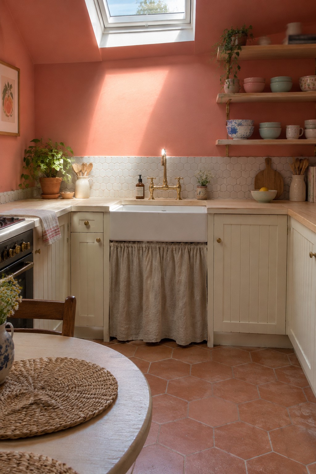
A muted coral pink is the closest color family here, with a warm, peachy cast. It reads close to Benjamin Moore Coral Gables, Farrow & Ball Nancy’s Blushes, or Sherwin-Williams Abalone Shell, though the exact match is hard to tell from a photo. On kitchen walls, this soft warm shade feels brighter than a neutral without being as sharp as a clear red or orange.
The white hex tile gives the color a clean stopping point, which can be helpful in a small kitchen. Try it with creamy cabinets and warm wood; very cool whites may make the coral look more orange.
Muted Sage Walls Beside Warm Wood

This wall color looks like a muted sage green, close to Benjamin Moore October Mist, Sherwin-Williams Clary Sage, or Behr Jojoba. It is a soft, mid-light green that brings color to a small kitchen without making the walls feel too strong.
The green has a slightly earthy cast, which suits the warm wood counters and floor. In a kitchen with limited daylight, test a sample first, since sage can look duller in shade; white cabinets and tile help keep the overall look bright.
Lime Green Walls With White Cabinets
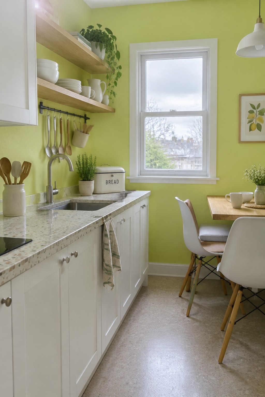
This looks like a bright yellow-green, somewhere between chartreuse and lime. For likely matches, I’d look at Benjamin Moore Citron, Sherwin-Williams Electric Lime, or Behr Sour Lime. It brings noticeable color to a small kitchen without needing a dark or heavily saturated shade.
The white cabinets help keep the strong wall color from taking over, while the pale countertop keeps the overall look light. This kind of green can shift more yellow in warm light, so test a sample on the wall before committing.
Mustard Yellow Walls Beside White Tile

This warm mustard yellow looks closest to a sunny golden yellow, with likely matches such as Benjamin Moore Buttercup, Sherwin-Williams Daisy, or Behr Sunflower. It gives a small kitchen a cheerful feel without needing color on every cabinet.
The shade leans warm, so it works naturally with the wood floor and white backsplash. In a kitchen with less daylight, test a sample first; a strong yellow can look deeper on the wall than expected.
Bright Teal Walls Beside White Kitchen Cabinets
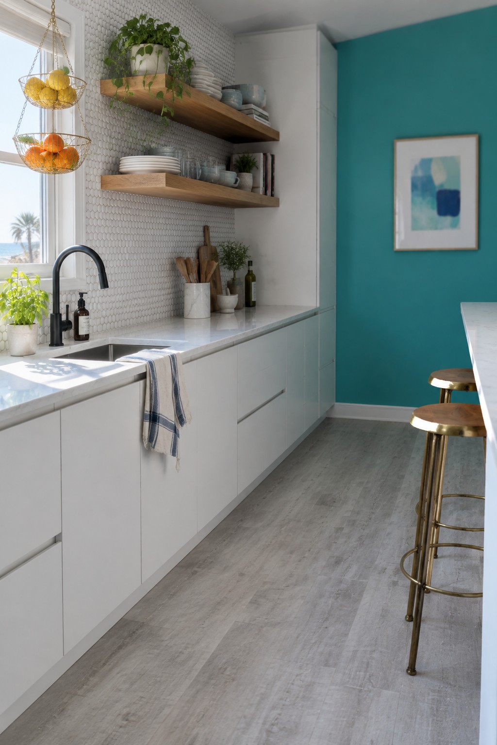
A bright teal wall color can bring a small kitchen to life without making the whole room feel dark. This one looks closest to a clear blue-green, though the exact shade is hard to pin down from a photo. Similar colors include Benjamin Moore Aegean Teal, Sherwin-Williams Oceanside, and Behr Ocean Abyss.
The white cabinets and pale backsplash give the saturated color room to stand out, while natural wood shelves keep the kitchen from feeling too cool. In a smaller space, try teal on one wall and test a sample in both daylight and evening light before painting.
Burnt Orange Walls Around a Small Breakfast Table
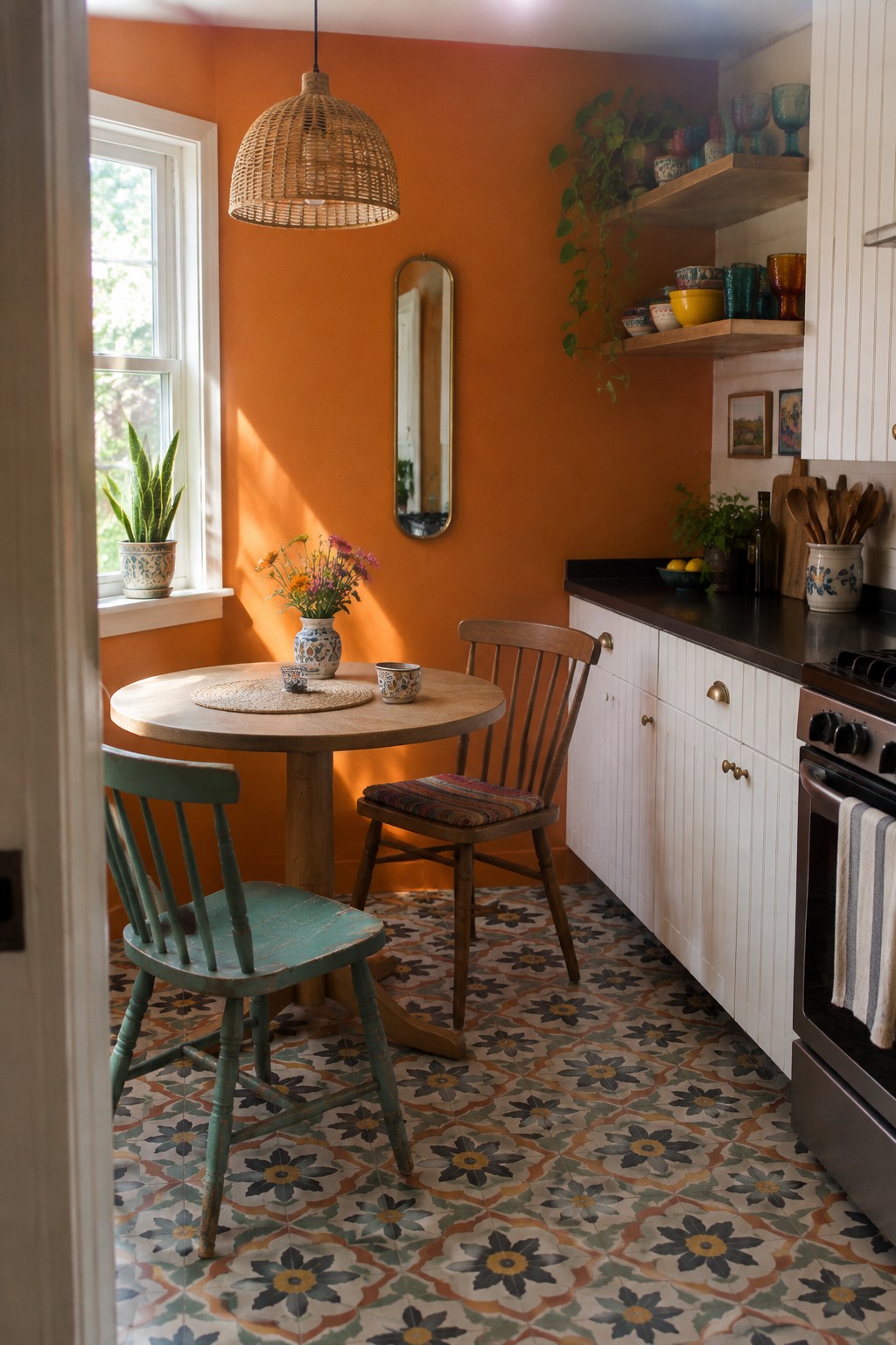
The walls look like a warm, saturated orange, close to burnt orange or terracotta. Similar shades include Sherwin-Williams Cavern Clay, Benjamin Moore Terra Cotta Tile, and Behr Orange Flambe. It’s a bold choice for a small kitchen, but using it on the walls gives the breakfast nook a clear color idea without needing colorful cabinets.
This orange has a red, earthy undertone, so it works well with the patterned floor and warm wood table. In a dim kitchen it may read quite strong, so test a sample on more than one wall before painting the whole room.
Blue-Gray Walls Above White Tile
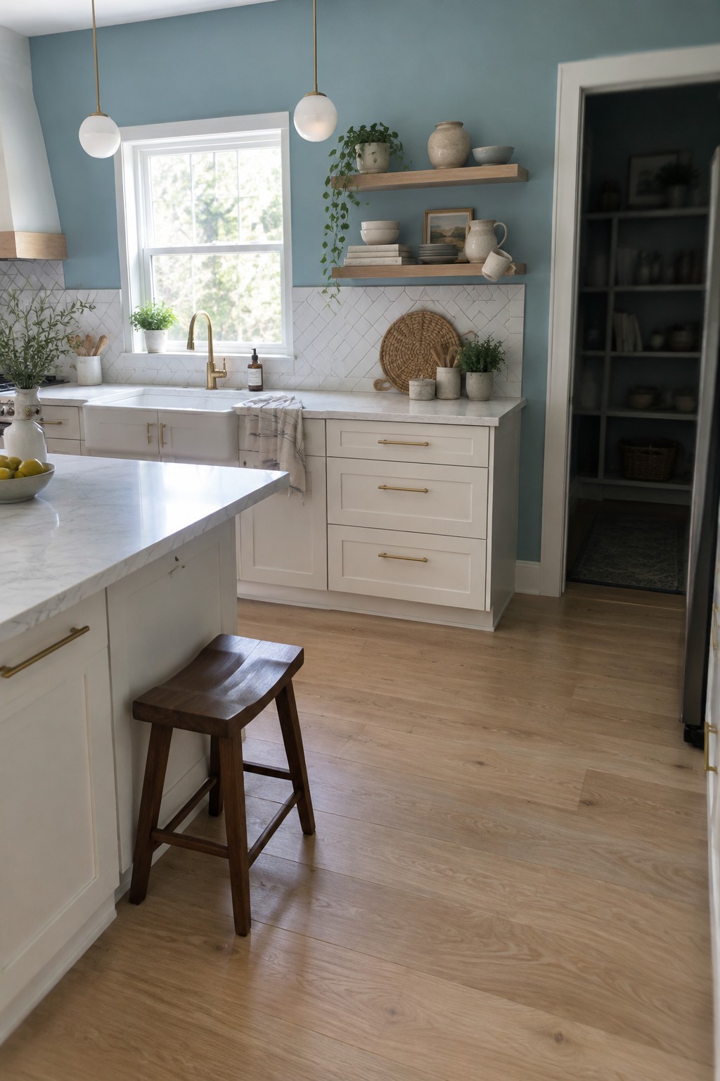
This kitchen’s wall color looks like a muted blue-gray, with a cool, slightly smoky cast. Similar shades include Benjamin Moore Smoke, Sherwin-Williams Silvermist, or Behr Light Drizzle. It gives a small kitchen color without making the walls feel too busy.
The white tile backsplash keeps the blue-gray from feeling dark, while the wood floor adds a warmer note. In a kitchen with limited daylight, test a sample first, since cooler light can make this shade look grayer.
Golden Yellow Walls With Cream Cabinets

A golden yellow is the main paint idea here, close to Benjamin Moore Hawthorne Yellow, Sherwin-Williams Golden Plumeria, or Behr Corn Stalk. It is a warm, fairly bright color that can make a small kitchen feel cheerful without relying on white walls.
The cream cabinets and wood counters suit its yellow undertone. In a kitchen with less daylight, test a sample first, since this shade may read stronger and more orange than expected.
Frequently Asked Questions
Q: Will a dark wall color make my small kitchen feel even smaller?
A: Not necessarily. A deep color on one wall can add depth and make the room feel more inviting, especially with light cabinets and good lighting. If the kitchen gets little natural light, try the shade on a small area first.
Q: Which wall should I paint if I want the kitchen to feel bigger?
A: Paint the wall you see first when you enter, or the one behind an open shelf or dining nook. A soft, light shade there can draw the eye through the room without making every surface feel too bright.
Q: How can I use a bright color without making the kitchen feel busy?
A: Keep the cabinets and larger surfaces simple, then let one wall carry the color. A sunny yellow or fresh green feels cheerful without competing with patterned tile or lots of colorful accessories.
Q: What finish works best for kitchen walls?
A: Choose a washable paint with a satin or eggshell finish, since kitchen walls need to handle splashes and regular wiping. Flat paint can be harder to clean, especially near the stove and sink.