


Choosing paint is the decision people put off the longest, because a chip in the store never looks the same on your wall. These eight bloggers shared how they actually chose: the samples they tested, the colors they rejected and what they would do differently.
Five are about whole-house palettes and three are about exterior colors. Each photo belongs to the blogger credited under it. If you are working on a kitchen, my guides to wall colors for navy cabinets and colors for low-light kitchens follow the same idea of testing in your own light.
How I chose these
- Each blogger tested colors in their own home and explained why they chose them.
- The color names are given, so you can sample them yourself.
- They cover calm neutrals, deep accents and both light and dark exteriors.
1. A calm whole-house palette with one bold trim color
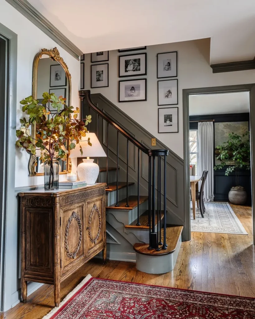
Lauren collected every color in her house into one list: Swiss Coffee as a slightly creamy white, Chantilly Lace as a crisp white in the office and hallways, Wrought Iron on all the interior doors, and deeper blues and greens in smaller rooms.
My favorite trick is in the foyer. Instead of renting scaffolding to paint a two-story wall, she painted the trim Sherwin-Williams Willowleaf, a green-gray, and left the walls white. Her process is simple too: sample pots on white foam boards, taped up and checked through the day and evening.
Worth borrowing: if a wall is too big or too high to paint, color the trim instead. It adds just as much personality for a fraction of the work.
2. Mostly one white, with pockets of deep color
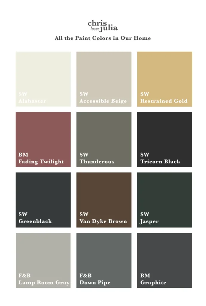
Julia’s palette looks bold on paper, but she explains that the house is roughly 70 percent Alabaster, with pockets of color in smaller rooms: Greenblack in the family room, Lamp Room Gray in the closet, Restrained Gold on cabinets.
She ties it together by repeating tones rather than adding new ones. Accessible Beige is the trim color in most rooms, and a color used in one room shows up again in another as tile, wallpaper or art.
Worth borrowing: pick one main wall color for most of the house, then let two or three deeper colors repeat in smaller spaces. It keeps a colorful house from feeling choppy.
3. Undoing fifteen-minute paint choices, one room at a time
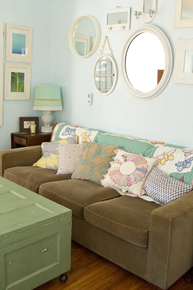
When this blogger and her husband bought their house, they picked every paint color in about fifteen minutes at the hardware store. The result was saturated colors that did not go together, and she spent years repainting room by room.
Her fix was color flow: repeat a color from one room somewhere else. The blue of the front door turns up on an upstairs bench and a bathroom mantel, and the mint from the kitchen walls appears on the living room pendants.
Worth borrowing: you do not need matching walls for a house to feel connected. Repeat each accent color in at least two places, even on a lamp or a bench.

For a Habitat for Humanity showhouse, Sherry and John wanted navy with light trim. They held nine swatches against different sides of the house, and several eliminated themselves right away by reading almost black or too light.
Three test pots went straight onto the siding, two coats each. In person, Newburg Green felt friendlier than the darker navies and contrasted better with the roof, so it won, with Steam as a soft white trim.
Worth borrowing: brush two coats of your top three colors right on the siding, on more than one side of the house, and compare them against the roof.
5. A modern exterior where the trim matches the siding

Amanda Croft is a designer, and she still admits the fan deck can feel overwhelming. Her family started from their saved inspiration boards, then tested samples on siding scraps and on the house itself before choosing.
The interesting rule: instead of one light trim color, trim is painted the same color as the siding next to it. They kept Grays Harbor, the siding color from their previous home, and paired it with Extra White, Cadet on the ceilings and fascia, Cedar Bark stain and Tricorn Black doors.
Worth borrowing: on a modern house, try painting the window trim the same color as the siding around it. It gives a cleaner look than a contrasting white outline.
6. A dark top with painted brick below
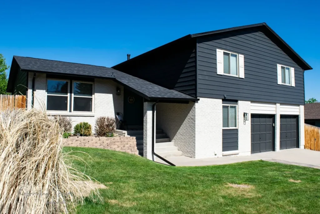
After hail damage meant a new roof anyway, Lisa and her husband repainted the whole exterior and hired painters for safety and speed. They first thought the brick should be dark and the siding white, but a paint visualizer app showed them the reverse looked better.
They chose Sherwin-Williams Iron Ore for the siding, Accessible Beige for the brick (a soft color, because pure whites can glow blue outside) and Lagoon for the front door. They tested swatches out of sight behind the chimney before committing.
Worth borrowing: upload a photo of your house to a paint visualizer to test where each color goes, then confirm with real samples outside before you buy gallons.
7. One favorite white, one main gray, and the gray at half strength
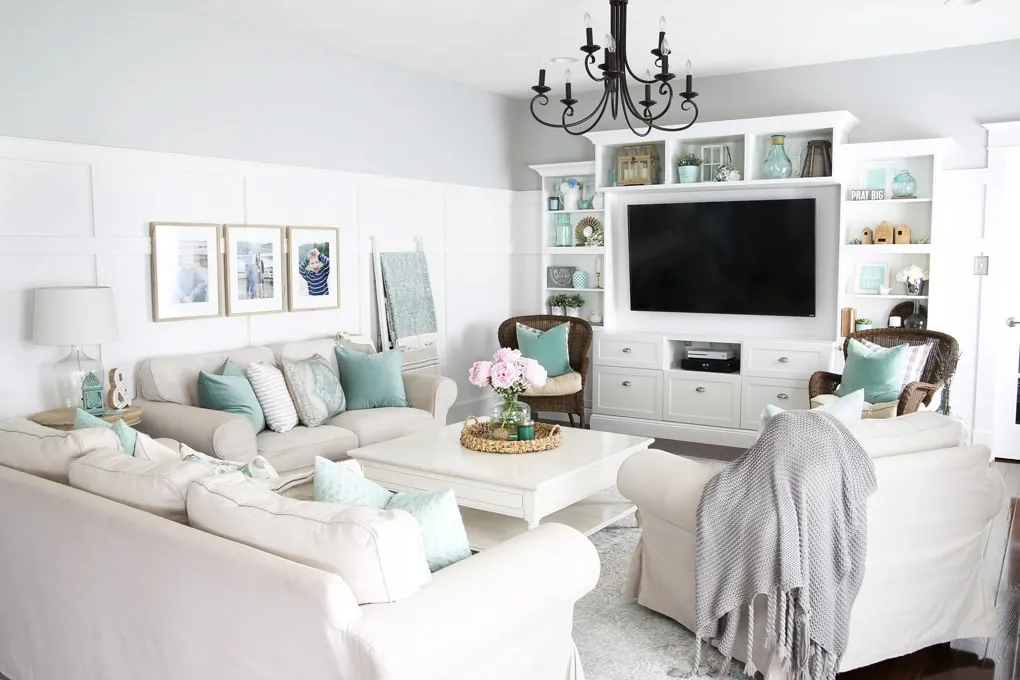
Abby spent years repainting the builder’s dingy white room by room, and her system is easy to copy. One white for all trim and the board and batten. One main neutral, Behr Silver City, for halls and most rooms. One darker color for drama, and a single pop of aqua in the dining room, the one room that does not flow into the others.
My favorite idea: when she wanted a lighter version of her gray for the sunroom and a dark mudroom, she did not start the search over. She had the store mix Silver City at half strength, which keeps the same undertone, just lighter. She also tests every color on movable sample sheets and leaves them up for a few days.
Worth borrowing: once you find a neutral you love, ask the paint store to mix it at 50 percent for darker or smaller rooms. Same undertone, no new search.
8. A gray palette that took years of trial and error
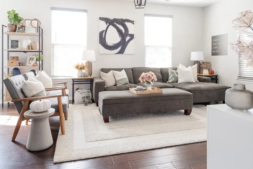
Christene’s townhome came with yellow walls and ceilings everywhere. Overwhelmed by about 20 paint chips, she searched Pinterest for her favorites to see them on real walls, then painted over the years until the yellow was gone.
She is honest about the misses. A dark gray made her dining room feel too heavy, so she repainted it with a lighter gray and kept the dark one only in a small nook. And the pinkish gray in her bedroom is not her favorite, but she has decided to live with it for now. Most of the house is one light blue-gray that helps the small rooms feel bigger.
Worth borrowing: if a dark color feels too heavy across a whole room, do not throw it away. Keep it for a nook, a niche or one wall where it can add contrast.
A simple way to choose your colors
Start with the things that stay: floors, cabinets, roof, brick or stone. Narrow it to three samples, paint large swatches and look at them morning, afternoon and evening. For exteriors, my exterior color pairing helper gives trim and door ideas by siding color, and the before and after exterior paint ideas show the results. There is more in the paint and color hub.
Credits and sources
Every photo in this roundup belongs to the blogger credited directly under it, and each credit links to the original post. Please visit them for the full project, the materials they used and many more photos. If you are one of the featured bloggers and would like a photo changed or removed, email me at [email protected] and I will take care of it.